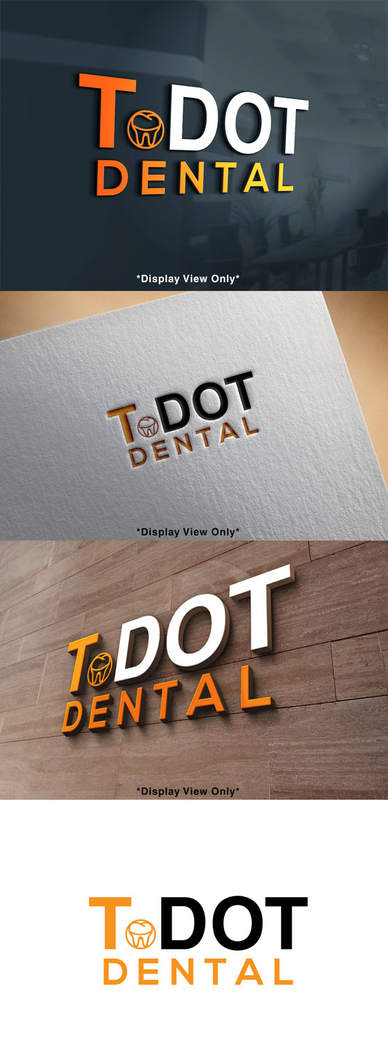
Dental office in Toronto Named T-Dot Dental
Vous souhaitez remporter un projet comme celui-ci ?
Ce client a reçu 128 designs de logo de la part de 61 designers. Il a choisi ce design de logo de Mylogo 3 comme design gagnant.
Inscrivez-vous Trouvez des Projets de Design- Garanti
-
 C$250
C$250
-
 128 designs
-
 61 designers
Brief de Design de Logo
Logo for a dental office that is in downtown Toronto , the demographic are mostly millennials, the office is modern simple. And the colour theme is mainly “orange , white and Grey” The name of the office is T-DOT Dental , the name is like a “kool” abbreviation for Toronto. My thoughts is to have "T" in Orange or White and "Dot" in the other colour ( vice -versa) , if the T in orange then dot in white.
want to make sure it is copy righted and not being used somewhere else. If we can add a 🦷 tooth or small smile line
Marché(s) Cible(s)
young Millennials.
Secteur / Type d'entité
Dental Clinic
Texte du logo
T.DOT Dental
Styles de logo qui vous intéressent
Logo d'Enseigne
Logo contenu dans une forme
Logo pictural
Un objet réel (texte facultatif)
Logo de Lettermark
Acronyme ou logo texte (texte seulement)
Aspect
Chaque curseur illustre les caractéristiques de la marque client et le style que doit transmettre votre design de logo.
Élégant
Audacieux
Léger
Sérieux
Traditionnel
Moderne
Sympathique
Professionnelle
Féminin
Masculin
Coloré
Conservateur
Économique
Haut de gamme
Exigences
Doit avoir
- Either a small tooth or teeth smile line.
Bien d'avoir
- something representing Toronto ( like CN tower)
Ne doit pas comporter
- no tooth brushes or smiling tooth ( nothing cheesy)