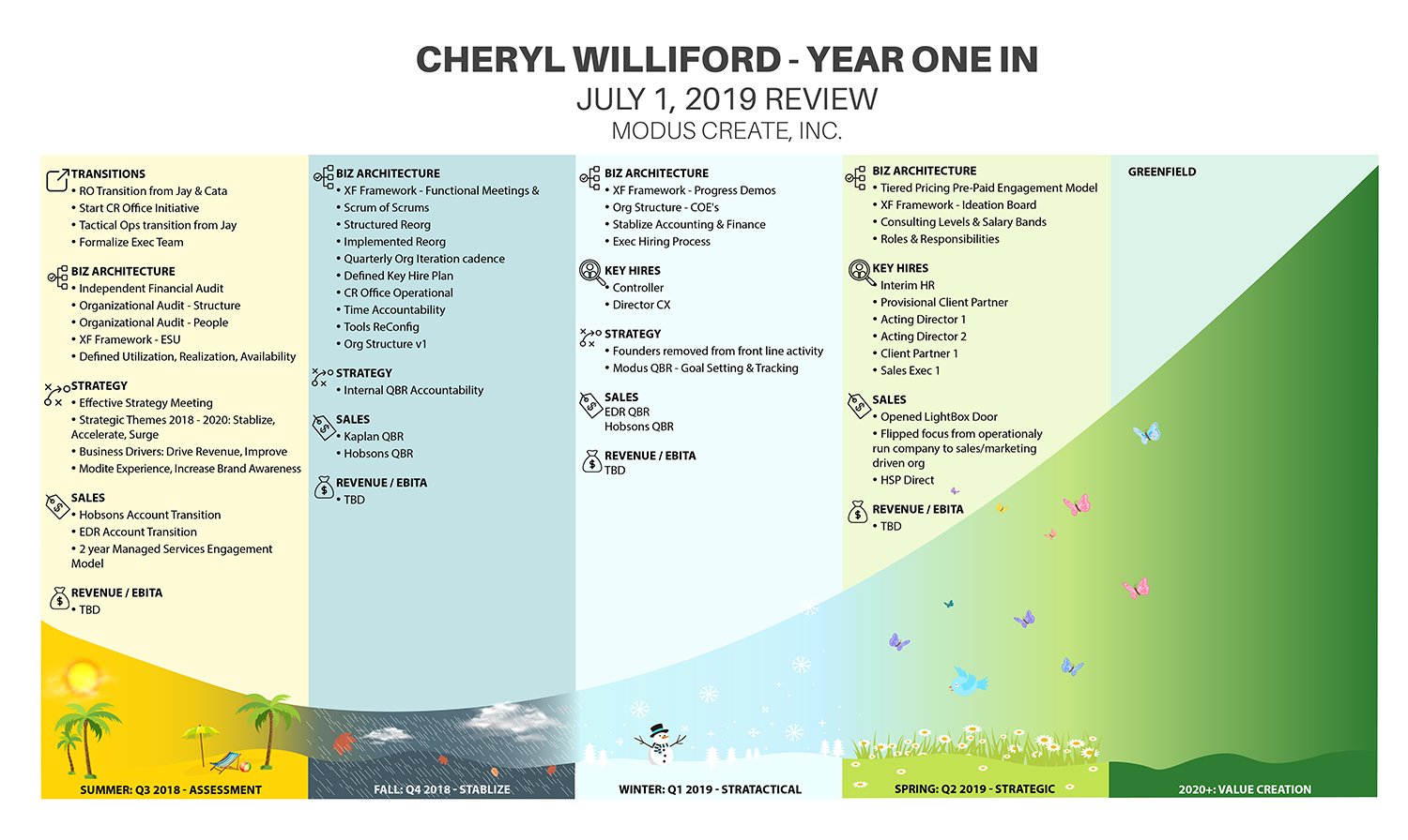
Executive Performance Review mapped on J-curve
Gagnant
Vous souhaitez remporter un projet comme celui-ci ?
Ce client a reçu 33 designs infographie de la part de 12 designers. Il a choisi ce design infographie de IndreDesign comme design gagnant.
Inscrivez-vous Trouvez des Projets de Design- Garanti
-
 US$190
-
 33 designs
-
 12 designers
Brief de Design Infographie
I need to turn an executive company performance review into a visual infographic. The list of accomplishments is grouped into four calendar quarters. Each quarter needs a subtle representation of the season. The four quarters and associated list of accomplishments need to be mapped to a J-curve. - Spreadsheet with accomplishments attached (Throughput)- Sample image of a J-curve. You can google J-curve to see more images.- The title should be "Cheryl Williford Year in Review"
Marché(s) Cible(s)
Board of Directors
Aspect
Chaque curseur illustre les caractéristiques de la marque client et le style que doit transmettre votre design de logo.
Élégant
Audacieux
Léger
Sérieux
Traditionnel
Moderne
Sympathique
Professionnelle
Féminin
Masculin
Coloré
Conservateur
Économique
Haut de gamme
Exigences
Bien d'avoir
- This will be presented to a company founder that is an artist and customer experience expert. He is very visual so a nice visual representation of the data will be impactful. He also uses the phrase that you have to live with or work with someone for four seasons before you really know them. This is why I have the seasons mapped to the quarters. The Fall season motif should be gloomy and stormy.
Fichiers
Télécharger tous les fichiers - 0,0 MBPNG
j_curve.png
jeudi 23 mai 2019
XLSX
Cheryl Year in Review v2 Saturday, 25 May 2019 15:26:49
samedi 25 mai 2019
Paiements
1e place
US$150
Primes de participation x 4
US$10