Recruitment business focussing on real human connections needs a logo
Vous souhaitez remporter un projet comme celui-ci ?
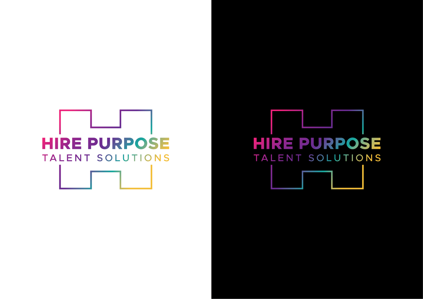
Ce client a reçu 141 designs de logo de la part de 50 designers. Il a choisi ce design de logo de art by SUGU comme design gagnant.
Inscrivez-vous Trouvez des Projets de Design-
 A$150
A$150
-
 141 designs
-
 50 designers
Brief de Design de Logo
We're improving on the value delivered through traditional recruitment business models, by putting significant focus on the ongoing wellbeing of the people we place, especially during the first year of their new role. Healthy, happy people perform better at work too, and we're functioning a bit like a recruitment agency and life coaching business rolled into one.
We want our logo to convey real human connections, and our vision to improve the overall wellbeing of the people we interact with, rather than the transactional nature of most recruitment businesses. Emphasis please on 'Hire Purpose' with 'talent solutions' appearing as more of a secondary, less emphasised tagline.
Marché(s) Cible(s)
Australian employees and hiring managers, primarily in the Healthcare, Financial Services and IT sectors.
Secteur / Type d'entité
Recruitment
Texte du logo
Hire Purpose Talent Solutions (or HIRE PURPOSE talent solutions)
Styles de logo qui vous intéressent
Logo pictural
Un objet réel (texte facultatif)
Logo mot symbole
Logo (texte seulement)
Couleurs
Le designer choisit les couleurs à utiliser dans le design.
Aspect
Chaque curseur illustre les caractéristiques de la marque client et le style que doit transmettre votre design de logo.
Élégant
Audacieux
Léger
Sérieux
Traditionnel
Moderne
Sympathique
Professionnelle
Féminin
Masculin
Coloré
Conservateur
Économique
Haut de gamme
Exigences
Doit avoir
- Looking for either a wordmark or combination mark, with 'Hire Purpose' or 'HIRE PURPOSE' as the primary focus, and 'talent solutions' as more of a secondary tagline ('talent solutions' has to be there, but smaller, lower case, and more subtle). Bold, vibrant colours. Avoid using Blue as a main colour.
Bien d'avoir
- I like the idea of the 'H' being symbolic of two people meeting/shaking hands, but this isn't essential, and only if can be achieved in a 'not looking like a 1990's website' kind of way. We're looking for vibrant, bold colours. I like the idea of neon signage, but only if it can be made not to look like a strip club. I'm not a designer though, so I'm very open to creative license.
Ne doit pas comporter
- My project should not have:
- 1. Anything intricate, overcomplicated, etc - prefer a clean, simple approach. e.g. whilst I like the symbolism of people meeting/shaking hands, I don't want to see an actual handshake illustrated in a design
- 2. Anything cartoonish
- 3. A 'mascot'
- 4. The 'Hire purpose' play on words is about being a recruitment business aiming to have a greater impact on our people; I want a logo that won't be confused with e.g. a religious charity organisation, or a tool hire business.
- 5. We'd like to avoid the colour blue.