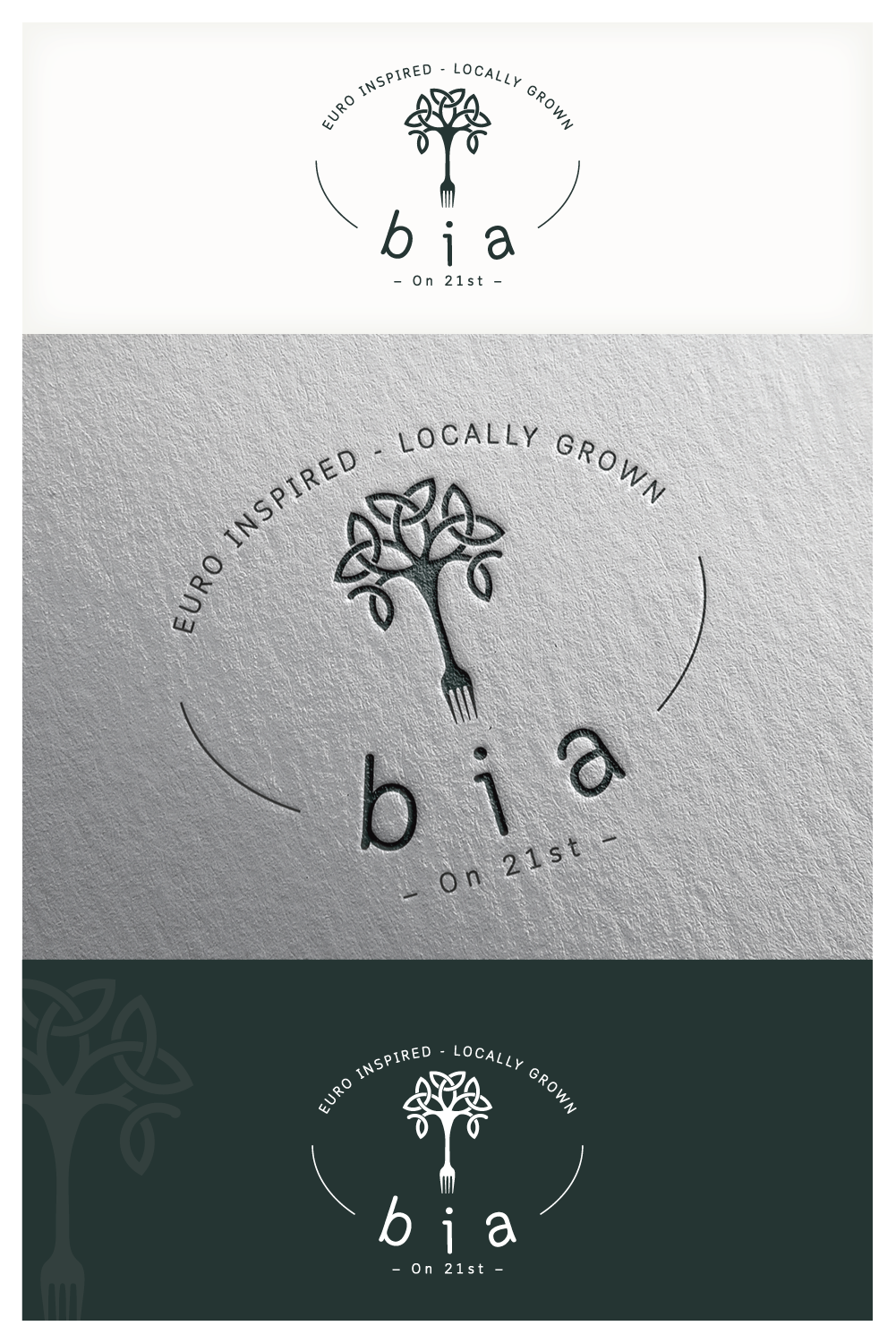
Fine Dining Restaurant with an upscale pub needs a logo

Vous souhaitez remporter un projet comme celui-ci ?
Ce client a reçu 427 designs de logo de la part de 87 designers. Il a choisi ce design de logo de DicéArt comme design gagnant.
Inscrivez-vous Trouvez des Projets de Design- Garanti
Brief de Design de Logo
We are in the process of building a 13,000 sq ft formal dining restaurant and authentic pub from ground up. We are looking for the perfect logo to define our concept. A logo that will be our brand for multiple locations. I have include some key points of our concept in the file uploads. we would like graphic artists to compete for our logo design.
BIA - Gaelic/Irish word for “Food” is the name of our first location.
BIA on 21st or Bia on 21st (BIA on top, 21st below)
(Slogan) Euro Inspired — Locally Grown
We would like to have two logos; one for BIA and the other for BIA and 21st street. We are open to upper and lower case lettering and a creative font style. Being a formal dining restaurant we ask you to refrain from using bright florescent coloring. Please read concept points below to understand our vision.Thank you and I look forward to reviewing you designs.
Mises à jour
I am gauranteeing this project. I updated my brief and uploaded some example pics of logo style that we vision for our project. I hope that each of you will review the updates and give it another go. We have been very impressed by a lot of the design so far. I did not give you enough detail, hopefully the uploaded examples will help.
BIA or Bia on top
and on 21st Street underneath
An illustration or symbol represention food next to or incorporated into BIA would be great. I was thinking a wheat stalk and have uploaded some wheat illustrations as an example. It does not have to be a wheat stalk, I am using it as an example. Feel free to use your own imagination.
Thank you for your efforts, I like for to reviewing your work.
Added Monday, April 8, 2019
Please check out example uploads 17, 12, 6 and 3 to give you a better idea of what we Invision.
BIA
On 21st Street
(On 21st Street has to be underneath Bia or BIA)
Use a food illustration with Bia or BIA
I am sending this to all designers but some of you have go it and understand what we are looking for.
Others are just too fun & playful, we are looking for something more sophisticated and serious.
I am just trying to point everyone in the right direction.
There is some great talent and we really appreciate your efforts. The winning design will work/freelance directly with us on future projects.
Thank you and look forward to working with you in the future.
Added Monday, April 8, 2019
I would also like to try some lighthouse illustrations incorporated into the design.
Thank you
Added Monday, April 8, 2019
Can we try some designs using illustrations of light houses, seafood or Celtic knots.
A lot of the designs are similar and I would like to see some other options.
Thank you for your time and the attention you have given this project.
Added Tuesday, April 9, 2019
A large percentage of our marketing will be strategically targeted towards young professionals,. Our concept is geared towards a modern building design & decor style. Our European inspired cuisine & beverage is prepared using creative methods and ingredients, innovative technics and aesthetically pleasing presentations
Our logo should reflect our concept
A clean, hip, cosmopolitan style logo should be your focus on this go around.
Please submit modern conservative style logo design In the following layout
BIA
—On 21st—
Euro Inspired - Locally Grown
(Slogan would be small font)
Thank you for your time and effort. We look forward to seeing your revised designs.
I have uploaded some logo design samples in the brief to give you a better vision.
Added Wednesday, April 10, 2019
Need extra days to review
Marché(s) Cible(s)
Young Professionals Age 25 - 45
Texte du logo
1. BIA 2. BIA on 21st or Bia on 21st (Slogan) Euro Inspired — Locally Grown
Styles de logo qui vous intéressent
Logo pictural
Un objet réel (texte facultatif)
Logo mot symbole
Logo (texte seulement)
Logo de Lettermark
Acronyme ou logo texte (texte seulement)
Styles de police à utiliser
Couleurs
Le designer choisit les couleurs à utiliser dans le design.
Aspect
Chaque curseur illustre les caractéristiques de la marque client et le style que doit transmettre votre design de logo.
Élégant
Audacieux
Léger
Sérieux
Traditionnel
Moderne
Sympathique
Professionnelle
Féminin
Masculin
Coloré
Conservateur
Économique
Haut de gamme
Exigences
Doit avoir
- We are looking for something formal. Not too much color, more earth tones.
- Modern style with hip font
- PLEASE CHECK THE UPLOADS FOR EXAMPLES OF OUR STYLE
Bien d'avoir
- BIA or Bia (on top)
- — on 21st — (below)
- Euro Inspired — Locally Grown (small font and below “on 21st”)
- You may try some with a black & white illustration of a tree.
Ne doit pas comporter
- We would like it to have a clean look using font that is easy to read.