New Logo for Screen Print and Embroidery Company
Vous souhaitez remporter un projet comme celui-ci ?
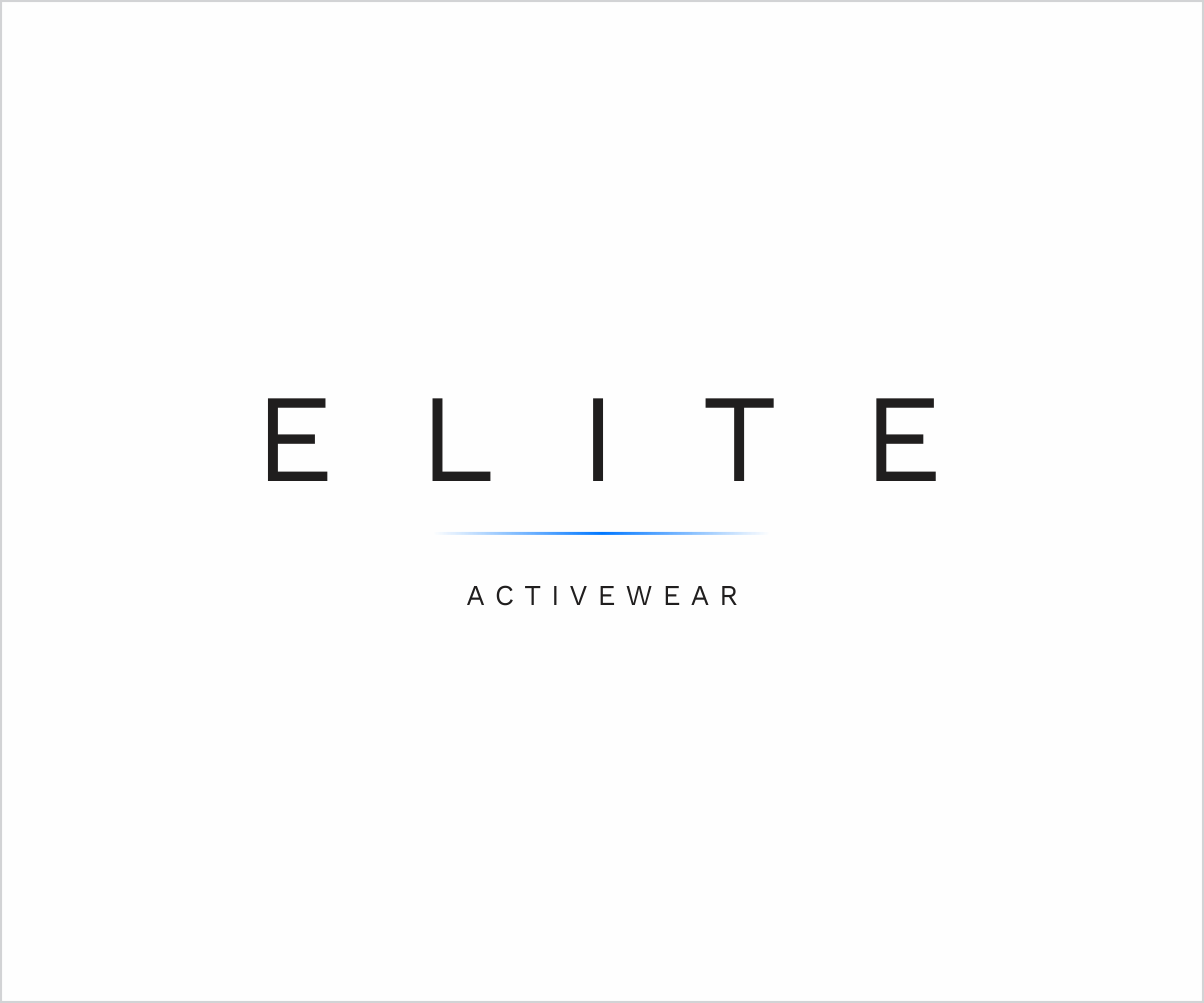
Ce client a reçu 156 designs de logo de la part de 61 designers. Il a choisi ce design de logo de chameerakasundb comme design gagnant.
Inscrivez-vous Trouvez des Projets de Design-
 US$150
-
 156 designs
-
 61 designers
Brief de Design de Logo
New logo for a screen print and embroidery company based in the USA called Elite Activewear. We have attached several sample images of logos that we found on the internet that we like (stylistically). These are just samples of styles that we like and do not have any relationship to our company or industry. Our objective: clean, simple, modern, potentially a pop of color.
Mises à jour
Thank you everyone for the submissions! We will begin providing feedback shortly. One other thing we wanted to mentioned regarding the samples we provided is that we don't need to have an animal or anything similar to the images in the sample logos we included. We included them to show the simplicity, style, font & color of the logos. Feel free to use samples completely unrelated to the ones we posted also. Thanks!
Added Thursday, March 28, 2019
Hello,
We wanted to let everyone know that we have opened the contest back up until the end of the week. We appreciate all of the great designs we have received so far.
We were speaking with our web developer today and he wondered whether it would be possible to also see some examples of typography based logos vs. image-based logos. Below is a link to a website that contains some nice examples. We received many unique designs and have narrowed our list down to 5-10 favorites but we are not quite there yet. Our web designer pointed out several things: 1) He said that because our business focuses on embroidery, screen printing and promotional items that we really shouldn't have any items related to the industry in the logo because we do so many different things 2) simple and elegant is better which he pointed out to the link below of some elegant typography based logos 3) The name of our business is Elite Active Wear but he suggested that we have some logos that just say the word "ELITE" and some that say "ELITE ACTIVEWEAR" with Activewear being one word versus "Active Wear". We were thinking you could get creative with the font in various forms. Our target market is really broad and includes companies, schools, churches, individuals so he said that simple elegant variations of typography would be the most versatile. That being said, if there are some more great ideas of completely unique image designs to go with the business name, we are still open to those also and several current ones in mind out of the already submitted designs. Lastly, we got a lot of animals that our designer pointed out really don't have anything to do with our business unless we create a story on how they can relate. Sorry for any confusion and please send us messages if you have any questions and thank you all once again.
https://www.behance.net/gallery/78220273/Logos-Marks-01?tracking_source=search%7CLogos
Please feel free to send a message with any questions.
Thanks!
Added Tuesday, April 9, 2019
Marché(s) Cible(s)
Corporations, colleges, schools, gyms, churches, individuals, charities
Secteur / Type d'entité
Screen Printing
Texte du logo
Elite Activewear
Styles de logo qui vous intéressent
Logo pictural
Un objet réel (texte facultatif)
Logo abstrait
Conceptuel / symbolique (texte facultatif)
Styles de police à utiliser
Aspect
Chaque curseur illustre les caractéristiques de la marque client et le style que doit transmettre votre design de logo.
Élégant
Audacieux
Léger
Sérieux
Traditionnel
Moderne
Sympathique
Professionnelle
Féminin
Masculin
Coloré
Conservateur
Économique
Haut de gamme
Exigences
Doit avoir
- Unique
- Simple but elegant - Below is a link our web designer provided as examples
- https://www.behance.net/gallery/78220273/Logos-Marks-01?tracking_source=search%7CLogos
Bien d'avoir
- We originally wanted a unique object to go with our text, now it isn't completely a must have, if someone came up w a simple object to go with our text, we aren't opposed if it is a nice complement and is simple.
Ne doit pas comporter
- Avoid hard to read fonts like elaborate cursive.
- Harsh colors