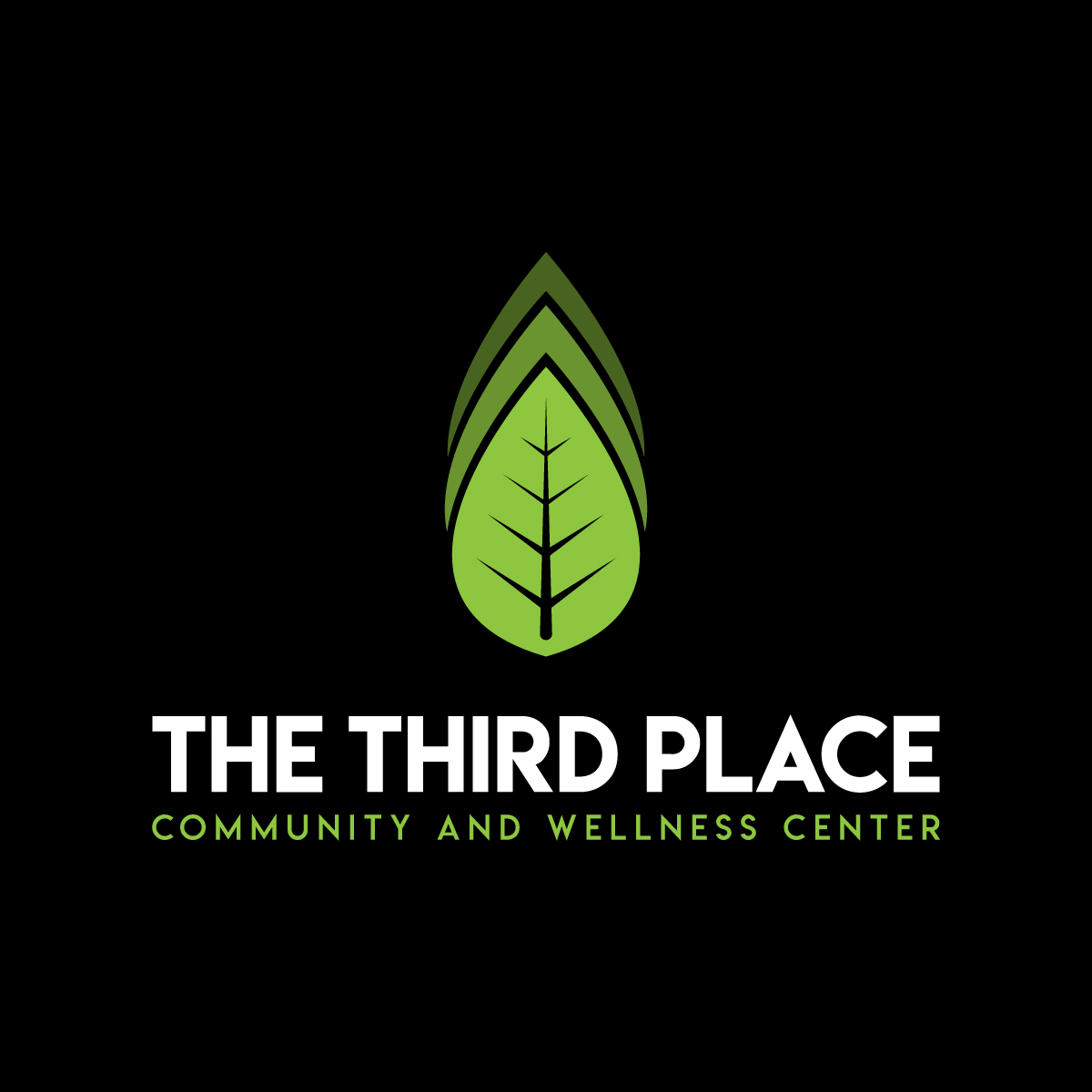
The Third Place, an affordable and accessible holistic health, wellness community center
Vous souhaitez remporter un projet comme celui-ci ?
Ce client a reçu 279 designs de logo de la part de 34 designers. Il a choisi ce design de logo de Arrow Designs comme design gagnant.
Inscrivez-vous Trouvez des Projets de Design-
 US$300
-
 279 designs
-
 34 designers
Brief de Design de Logo
This is a new organization that will have both a brick-and-mortar physical building along with a technology virtual platform that provides both an in-person local community experience (coffee shop, art gallery, performance center for small live events, conference rooms for local groups to use, etc.) with an extended virtual platform of health and wellness services available to anyone in the community from practitioners all over the world. The design should try to communicate the following concept from Wikipedia: The Third Place is the social surroundings separate from the two usual social environments of home ("first place") and the workplace ("second place") where you relax in public, encounter familiar faces and make new acquaintances.With the added element of wellness if possible....
The Third Place will support people in the context of Community to:
-Connect (social, emotional wellness)
-Move (physical, emotional wellness)
-Nourish (physical, emotional, spiritual wellness)
-Be (emotional, physical wellness)
Mises à jour
Hello My husband's mother passed away unexpectedly. The service is over next 2 days - 3/21 and 3/22. Please advise. Thank you! Di Cullen
Texte du logo
The Third Place Community and Wellness Center
Styles de police à utiliser
Couleurs
Couleurs choisies par le client et à utiliser dans le design de logo:
Aspect
Chaque curseur illustre les caractéristiques de la marque client et le style que doit transmettre votre design de logo.
Élégant
Audacieux
Léger
Sérieux
Traditionnel
Moderne
Sympathique
Professionnelle
Féminin
Masculin
Coloré
Conservateur
Économique
Haut de gamme
Exigences
Doit avoir
- Concept of community and wellness - physical, emotional and spiritual.
- See attached file--please DO NOT use these exact icons as I copies this from an article I read that capture the essence of what we are trying to do with the Third Place.
- Look good as color and black on white (and inverted white on black).
Ne doit pas comporter
- The design should be done to support different color schemes but please do NOT use red, blue or yellow as primary design colors.