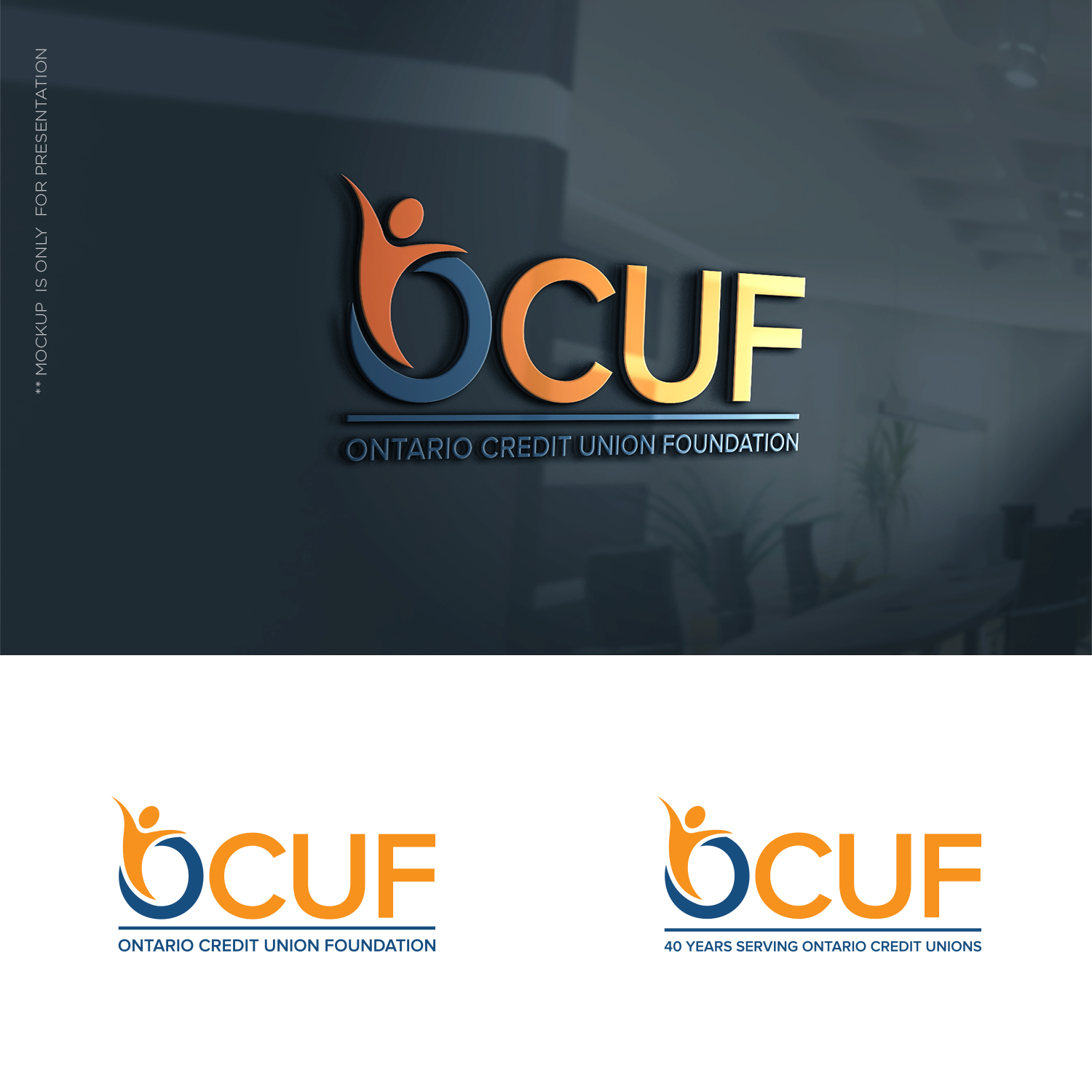
Credit Union Foundation logo refresh.

Vous souhaitez remporter un projet comme celui-ci ?
Ce client a reçu 154 designs de logo de la part de 41 designers. Il a choisi ce design de logo de designbysy comme design gagnant.
Inscrivez-vous Trouvez des Projets de Design- Garanti
Brief de Design de Logo
Looking for an update of our logo. It is a bit conventional and still usable, but because we turn "40" this year (1997 - 2019) we were thinking we might do a logo "refresh". Ideally you could incorporate reference to the "40 years serving Ontario Credit Unions" that would come off in 2020 and revert to a standard (new) logo. Hopefully that makes sense. A new logo with a 40 year application that returns to the new logo (without the 40) in 2020.
Marché(s) Cible(s)
Ontario (Canada) Credit Unions are our members.
Secteur / Type d'entité
Financial Service
Texte du logo
Ontario Credit Union Foundation (or if OCUF is in logo) could be "Serving Ontario Credit Unions"
Couleurs
Couleurs choisies par le client et à utiliser dans le design de logo:
Aspect
Chaque curseur illustre les caractéristiques de la marque client et le style que doit transmettre votre design de logo.
Élégant
Audacieux
Léger
Sérieux
Traditionnel
Moderne
Sympathique
Professionnelle
Féminin
Masculin
Coloré
Conservateur
Économique
Haut de gamme
Exigences
Doit avoir
- Colours we have used are #1f4d7f and #F99106 (not stuck on these but would provide some continuity perhaps, or surprise me!
Bien d'avoir
- We have use "peeps" in our current logo, can be viewed at www.ocuf.org. It was a take off of the international credit union symbol of people holding a globe (which we don't want). This worked well as we were able to make icons using them. Again not a must have - wanted to give as much info as possible.