Mobile Place Search app needs a UI design
Vous souhaitez remporter un projet comme celui-ci ?
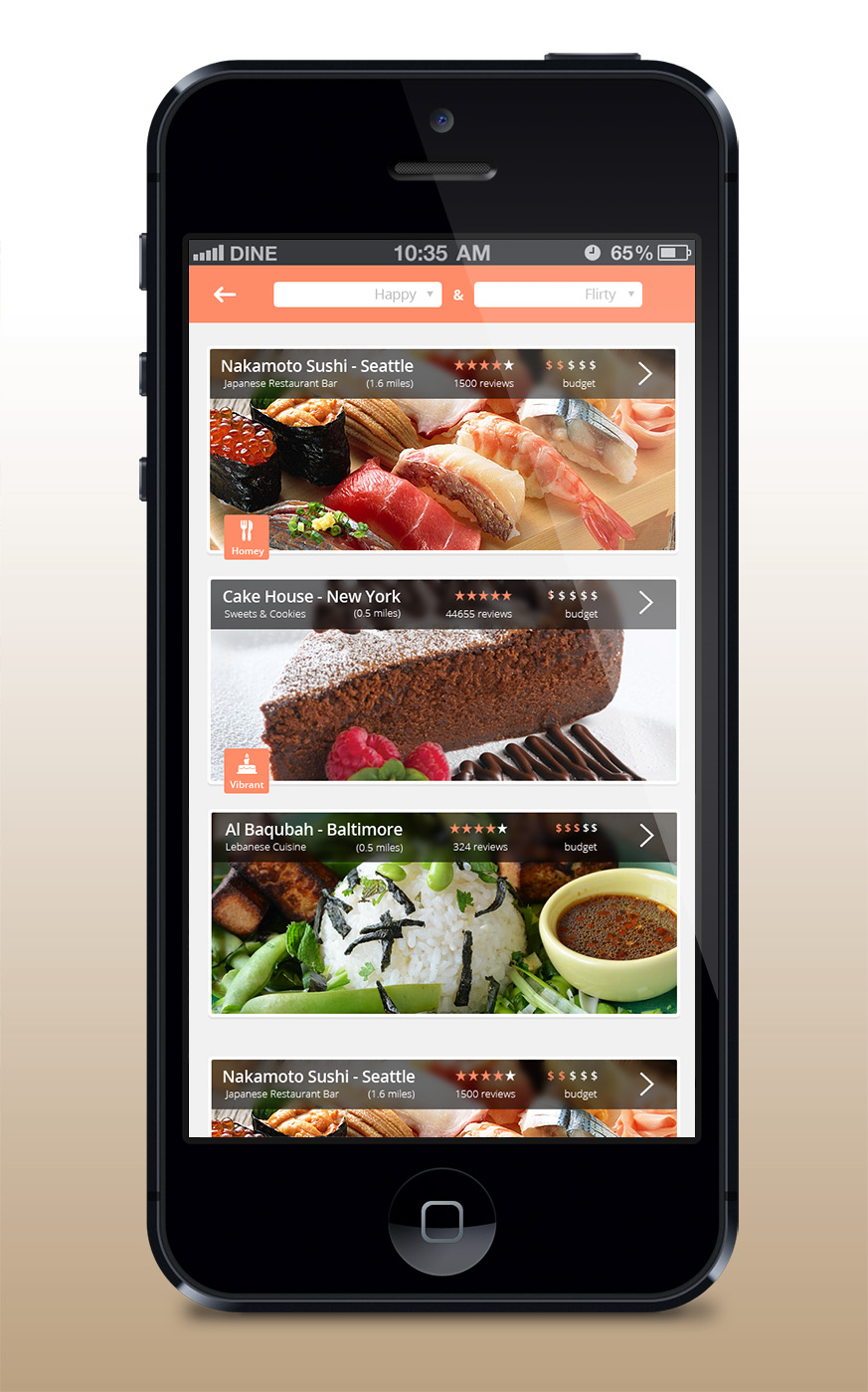
Ce client a reçu 17 designs application de la part de 4 designers. Il a choisi ce design application de eMango comme design gagnant.
Inscrivez-vous Trouvez des Projets de Design- Garanti
-
 US$180
-
 17 designs
-
 4 designers
Brief de Design Application
We need a new UI overhaul for our iPhone place search app. The app, Vybe, is a personal mobile search platform that helps users find activities (basically places like restaurants, parks, etc) and make decisions by inputting their mood and factoring in other things (location, weather, time).
The basic idea for the UI is to have a simple home screen that is pretty bare, just a way to select your mood and then a button to search. Right now the mechanism for selecting mood sorta looks like Songza's UI: (http://goo.gl/MfKOQW), except the first row consists of 1. Smiley face 2. No feeling Face 3. Sad Face 4. Hungry Face, and after the user selects one of those, it branches down into a second row that goes into more in depth moods like lazy, adventurous. I'm not completely satisfied with this mechanism, and kudos to any other creative ways to select moods that you can come up with.
The next screen after the user taps the search button of course brings up the results, and the results screen should sorta resemble this: http://imgur.com/cxD0E80. Basically the top should have two boxes so you can change your original search query, and below that should be a table view displaying the places. The tableview can really be anything, but I like Hoteltonight's tableview, Ness' way of display restaurants, and http://imgur.com/knCgxIv.
The final screen, the detail view, should somehow display all a place's data, photo gallery, address, map, hours, ratings, etc.
The color theme I was thinking was salmon colored, but I'm open to all color schemes, as long as it is clean and iOS 7 themed.
*Note: If I like your design, there is a high chance that I will contract you for future work on the app (and others)
Mises à jour
I forgot to specify the specific moods that we currently use, but here they are:
Happy
- Adventurous
- Romantic
- Active
- Flirty
- Naughty
- Bored
- Fun
- Hipster
- Party
- Family Friendly
Moderate
- Bored
- Studybug
- Chill
- Fun
- Study Break
- Hipster
- Party
- Family Friendly
Sad
- Stressed
- Tired
- Cranky
- Lonely
- Rejected
- Study break
- Depressed
- Party
Hungry
- Fast Food
- Chinese
- Japanese
- Korean
- Italian
- French
- Mexican
- American
- Fusion
- Snack
- Sweets
- Tipsy (drunk)
- Thirsty
(depending on time of day- )
Breakfast
Lunch
Dinner
Random
Search (Open a search bar below)
Added Wednesday, January 15, 2014
Marché(s) Cible(s)
Wide range of users, think users of Yelp.
Secteur / Type d'entité
Work
Styles de police à utiliser
Aspect
Chaque curseur illustre les caractéristiques de la marque client et le style que doit transmettre votre design de logo.
Élégant
Audacieux
Léger
Sérieux
Traditionnel
Moderne
Sympathique
Professionnelle
Féminin
Masculin
Coloré
Conservateur
Économique
Haut de gamme
Exigences
Doit avoir
- iOS 7 Optimized design, clean, simple, fresh. Mostly flat design.
Bien d'avoir
- Main screen, tableview screen, and the detail view screen.
Ne doit pas comporter
- iOS 6 design elements