Down In Splendour - logo design for a UK based alt-rock band
Vous souhaitez remporter un projet comme celui-ci ?
Ce client a reçu 133 designs de logo de la part de 41 designers. Il a choisi ce design de logo de JACQUI comme design gagnant.
Inscrivez-vous Trouvez des Projets de Design- Garanti
-
 NZ$240
-
 133 designs
-
 41 designers
Brief de Design de Logo
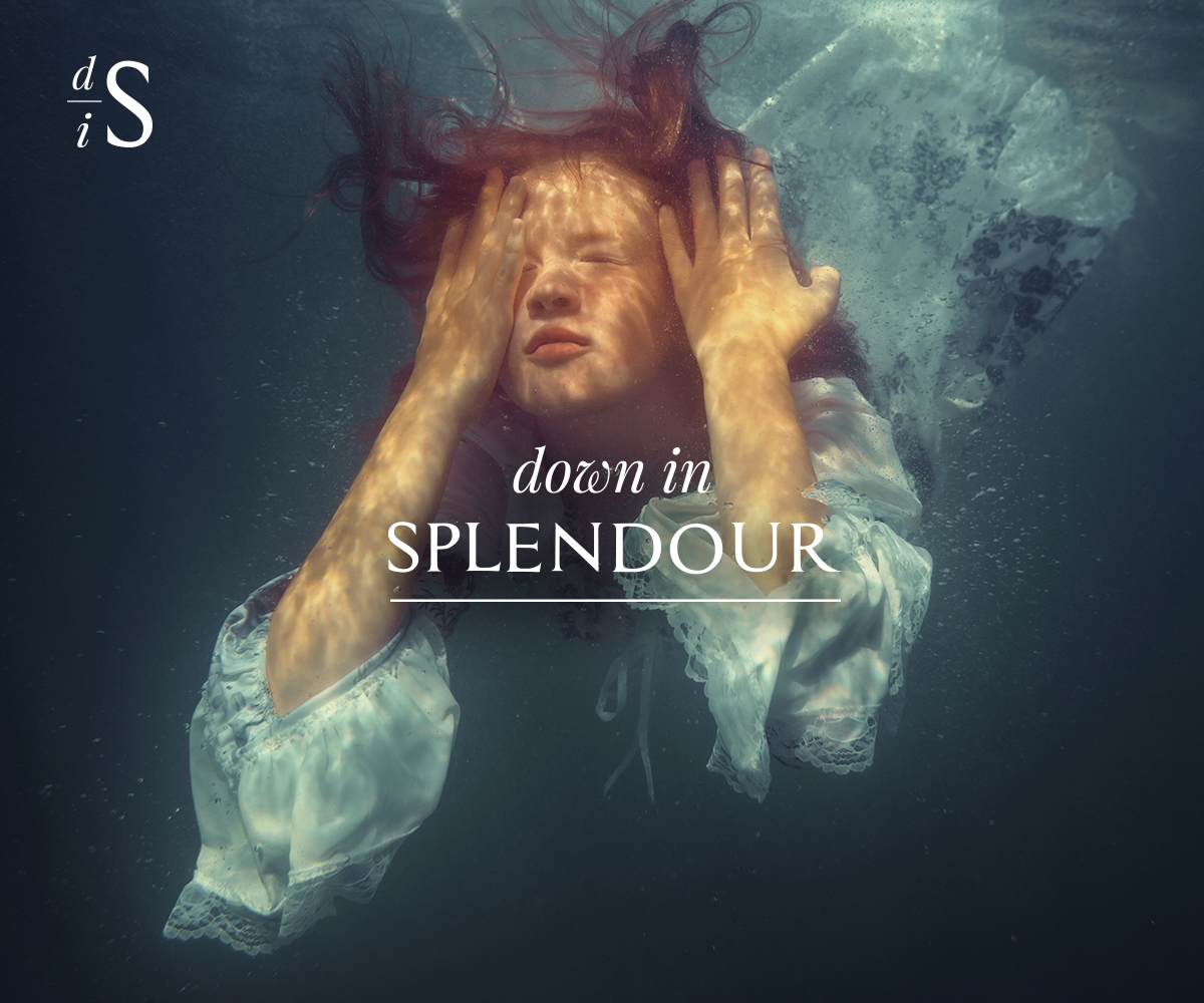
Down In Splendour are a London based alternative rock band. Their music encompasses alt-rock, psychedelic, progressive, world and acoustic.The band are looking for a logo that can be used in a variety of formats and captures the look and feel of their music.The logo will be used in a variety of media and formats. The included image (example: Girl Under Water) has been used as a backdrop at Down In Splendour concerts and provides a sense of the feel of the band and style needed. A striking, organic and flexible logo that lends itself to multiple uses, formats and placement.A screenshot of the Down In Splendour website (under construction has also been attached).Key Inclusions1) White/Black/Reversible. Organic feel. No colour inclusions, but the format should allow for the logo to be potentially rendered in colour if needed in the future. (examples attached - Pink Floyd)2) Simple but striking, and versatile. It will need to work in a variety of settings e.g. web, social media, album covers, posters, T-shirts, vinyl3) Striking font, but bear in mind that the font should be flexible enough to sit in a variety of placements. Ie. Not so extreme that it jars with everything else likely to be around it. Fonts can be adjusted for impact if desired. (examples attached - The Beatles, Abba4) Workable in a portrait and landscape setting5) Two formats:a. Full: Down In Splendour (example: Foo Fighters)b. Abbreviated: using first letters – DiS (avoiding the sense of ‘dissing’ someone though) – suggest the emphasis goes on the ‘D’ and the ‘S’ with the ‘I’ smaller or less emphatic. (example: FF - Foo Fighters)
Marché(s) Cible(s)
Contemporary music fans with an interest in alternative rock, progressive, psychedelic, world and folk music. Keen to avoid the usual rock cliches.
Texte du logo
Down In Splendour
Styles de logo qui vous intéressent
Logo mot symbole
Logo (texte seulement)
Logo de Lettermark
Acronyme ou logo texte (texte seulement)
Styles de police à utiliser
Couleurs
Couleurs choisies par le client et à utiliser dans le design de logo:
Aspect
Chaque curseur illustre les caractéristiques de la marque client et le style que doit transmettre votre design de logo.
Élégant
Audacieux
Léger
Sérieux
Traditionnel
Moderne
Sympathique
Professionnelle
Féminin
Masculin
Coloré
Conservateur
Économique
Haut de gamme
Exigences
Doit avoir
- Simple, elegant and striking. Down In Splendour is fairly sophisticated alt-rock music, so we are keen to avoid cliched rock imagery.
Bien d'avoir
- A reversible format black/white and also an abbreviated/icon logo - as detailed in the project description.
Ne doit pas comporter
- Should avoid the standard rock image cliches. Down In Splendour is fairly sophisticated alt-rock music.