40 is the new 20: How to make your 40s the best years of your life
Vous souhaitez remporter un projet comme celui-ci ?
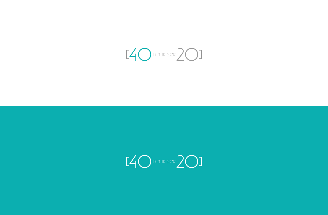
Ce client a reçu 195 designs de logo de la part de 104 designers. Il a choisi ce design de logo de GLDesigns comme design gagnant.
Inscrivez-vous Trouvez des Projets de Design- Garanti
-
 US$300
-
 195 designs
-
 104 designers
Brief de Design de Logo
I need a logo for my brand 40 is the new 20. My main audience is women between 35 and above who are looking to live a healthier life. We give tools to be better mentally, physically and with nutrition. We do a lot of fitness but not so much yoga or pilates related. This movement is more edgy and with practical tips for the active woman. We have been using a very simple design we made at home, but now its time to create professional logo. We will be using logo on presentations, social media and also on some merchandise like t-shirts, hats, and batting suits.
Marché(s) Cible(s)
My main audience is women between 35 and above who are looking to live a healthier life. They want to look good and feel great!
Texte du logo
40 is the new 20
Styles de logo qui vous intéressent
Logo pictural
Un objet réel (texte facultatif)
Logo de figurine
Logo avec illustration ou personnage
Logo mot symbole
Logo (texte seulement)
Styles de police à utiliser
Couleurs
Couleurs choisies par le client et à utiliser dans le design de logo:
Aspect
Chaque curseur illustre les caractéristiques de la marque client et le style que doit transmettre votre design de logo.
Élégant
Audacieux
Léger
Sérieux
Traditionnel
Moderne
Sympathique
Professionnelle
Féminin
Masculin
Coloré
Conservateur
Économique
Haut de gamme
Exigences
Doit avoir
- I like teal color and you can combine with any other color
Bien d'avoir
- It must have the full name 40 is the new 20