

 Rafraîchir
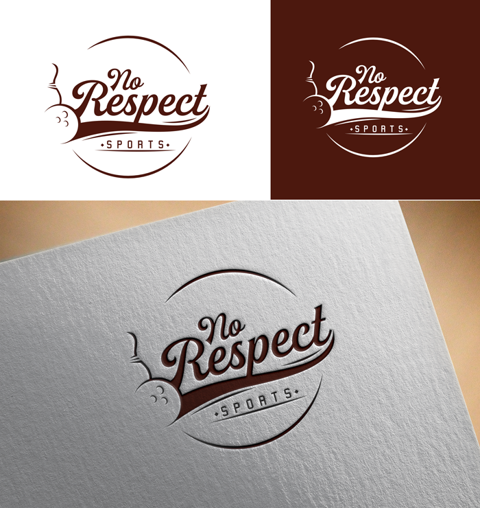
No Respect Sports Productions Logo
Vous souhaitez remporter un projet comme celui-ci ?
Ce client a reçu 54 designs de logo de la part de 19 designers. Il a choisi ce design de logo de victor2 comme design gagnant.
Inscrivez-vous Trouvez des Projets de Design
- Garanti
-
 US$150
-
 54 designs
-
 19 designers
Brief de Design de Logo
We are looking to create a logo for a brand new company called No Respect Sports Productions. We are inspired by a comedian from the 1970s and 1980s from our youth named Rodney Dangerfield. Rodney famously used the lines "I get no respect" in a lot of his bits. Here is a commercial from 1982 where he is in a position to win for his team if he only gets one bowling pin and he fails.
https://www.youtube.com/watch?v=J6SBtg9VQ9M
Marché(s) Cible(s)
People that play Fantasy Football, which probably biases toward men ages 25-44 in the United States.
Secteur / Type d'entité
Entertainment
Texte du logo
No Respect Sports
Styles de logo qui vous intéressent
Logo pictural
Un objet réel (texte facultatif)



Logo de figurine
Logo avec illustration ou personnage
Styles de police à utiliser

Couleurs
Le designer choisit les couleurs à utiliser dans le design.
Aspect
Chaque curseur illustre les caractéristiques de la marque client et le style que doit transmettre votre design de logo.
Élégant
Audacieux
Léger
Sérieux
Traditionnel
Moderne
Sympathique
Professionnelle
Féminin
Masculin
Coloré
Conservateur
Économique
Haut de gamme
Exigences
Doit avoir
- We are looking for the logo to play off the video above incorporating bowling into the icon of the logo somehow in a stylistic way to symbolize the sports part of the No Respect Sports, but also in homage to the comedian Rodney Dangerfield. We are looking for a logo that incorporates a style from that era i.e. early 1980s in the United States.
- We are very much open to ideas on how bowling imagery is used in the logo. Use of a bowling ball or bowling pin could be abstract. The bowling icon could represent a gutter ball to reference the video and the spirit of No Respect.
- The logo must be able to be produced black and white as well as color.
Bien d'avoir
- The winning logo will have a feel that the entire visual language of the company can be built around. Designers should feel free to have fun with the concept leveraging style and color from the early 1980s.
Ne doit pas comporter
- I can't think of any should not haves.


