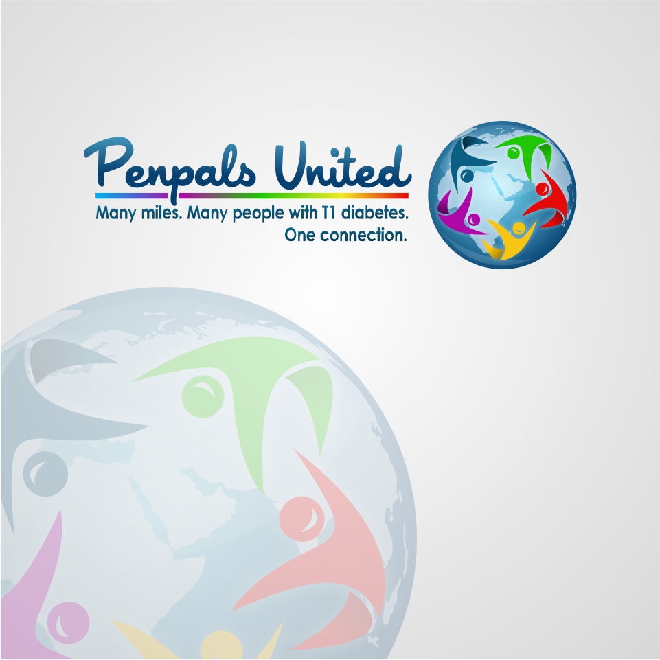
*Guaranteed Project* International Nonprofit Needs a Face Lift

Vous souhaitez remporter un projet comme celui-ci ?
Ce client a reçu 173 designs de logo de la part de 71 designers. Il a choisi ce design de logo de mateus_jordann comme design gagnant.
Inscrivez-vous Trouvez des Projets de Design- Garanti
Brief de Design de Logo
Penpals United needs a consultation of its logo and overall design. The organization has had the same logo for over ten years. We like it, but it needs to be updated to show that we are moving beyond our original mission. Before, we did online support groups for people with type one diabetes in resource-poor communities worldwide. Now we are focusing on practical app content that will be accessible to that same population but now on a global scale. We are confident this app will be downloaded by many people worldwide. We worked with over 350 kids in India who were very engaged, and 100's of kids in Africa and South America. Now we are going to scale and make this app accessible to anyone with T1d, especially those in resource poor communities, which our content will target. This WILL change lives. We have engaged an app developer who has requested that we get our new logo soon. I am the Founder/President and very engaged. I have been involved for over 10 years. I also have a dedicated volunteer staff of two-three here in the US and India.
Old logo is attached.
Marché(s) Cible(s)
Resource poor communities worldwide.
Secteur / Type d'entité
Non Profit
Texte du logo
Penpals United. (Tagline: Many miles. Many people with T1 diabetes. One connection.)
Couleurs
Le designer choisit les couleurs à utiliser dans le design.
Aspect
Chaque curseur illustre les caractéristiques de la marque client et le style que doit transmettre votre design de logo.
Élégant
Audacieux
Léger
Sérieux
Traditionnel
Moderne
Sympathique
Professionnelle
Féminin
Masculin
Coloré
Conservateur
Économique
Haut de gamme
Exigences
Doit avoir
- Old logo is attached, but new one does not necessarily need to have a globe in it. We are also open to designs that incorporate diabetes somehow, but this not required.
- 1. what are the top 7 words you would use to describe your business.
- listed in > order.
- (examples: bold, masculine, approachable, confident, friendly, modest, eccentric, demure, maternal, hip, simple, etc.)
- JT: Empathetic, global, supportive, connective, practical, youthful, fun
- 2. what are the top 5 words you would NOT use to describe your business?
- listed in > order.
- JT: Judgemental, cynical, closed, preachy, theoretical
- 3. what 5 words you would use to describe your ideal client?
- listed in > order.
- (ex: authentic, trendy, young, informed, type A, wealthy, political, educated, busy, athletic, environmentally conscious, single, well traveled, etc.)
- JT: inquisitive, positive, empathetic, adaptable, friendly
- 4. what words you would NOT use to describe your ideal client/audience/customer?
- listed in > order.
- JT: close-minded, challenging, cynical
- 5. what other companies do you see targeting this same audience?
- JT: Life for a Child, MyGlu
- 6. what do you like / dislike about these businesses?
- (ex: logo, company culture, employees, office space, management style, advertising campaigns, etc.)
- JT: Like the culture, dislike the lack of emphasis on developing countries
- 7. who is your biggest competition?
- (ex: specific company names, alternate industry with similar capabilities, if your potential clients didn't use your good or service whose would they use?)
- JT: I wouldn’t classify them as competition, but similar organizations are Life for a Child and the International Diabetes Federation.
- 8. what do you do better and/or different than your competition?
- JT: We focus on resource-poor communities worldwide.
- 9. what exactly do your clients pay you to do in three words or less?
- (ex: make them money, educate them, protect them, find them love, etc.)
- JT: support them
- 10. what day-to-day things are important to your customer?
- (family, money, the environment, education, freedom, etc.)
- JT: practical knowledge
- 11. how many employees do you have (including volunteers, interns, remote workers)?
- JT: 5
- 12. how many of your employees are in each of these age brackets?
- JT:
- 18-25: 4
- 26-35: 1
- 36-50: -
- 51-x : 2
- 21. what about your current logo do you like + what do you dislike?
- JT: Like: global aspect (i.e. globe), though we are not attached to this; dislike: It looks too much like clip-art. It is not custom to us.
- 22. list 5 companies with logos that you like in > order.
- JT:
- 1) Young Leaders in Diabetes
- 2) Beats
- 3) Google
- 4) Twitter
- 5) At&t
- 23. share at least one reason or justification for each of your above logo selections
- (I like how literal it is, I like that it can be used independent of the company name, I like the clean lines, I like the organic feel of the design, I like the colors, I like that it appeals to a large audience, I like that it assumes its customer is intelligent, I like that the "B" in the name is made to look like a bunny, etc)
- 1) Multiple colors, movement
- 2) Simplicity, functionality (almost seems like the circle and the B are part of a headphone)
- 3) Simplicity, multiple colors
- 4) Functionality (bird = tweet), fresh looking
- 5) Globe looks cool, modern looking
- 24. list any logos you have seen that you do not like (either in general or logos with design elements that you do not think would work for your company) + explain.
- International Diabetes Federation (too mechanical)