

 Rafraîchir
Logo Needed for a Non-profit Self-improvement Program!
Vous souhaitez remporter un projet comme celui-ci ?
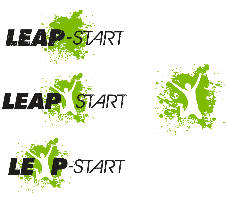
Ce client a reçu 29 designs de logo de la part de 14 designers. Il a choisi ce design de logo de DownsArt comme design gagnant.
Inscrivez-vous Trouvez des Projets de Design
- Garanti
-
 A$200
A$200
-
 29 designs
-
 14 designers
Brief de Design de Logo
What we need:
We need a logo design for a not-for-profit start-up called 'Leap-Start'. We'd like to see Leap-start is a performance-improvement program aimed at helping people – especially young people – realise their potential and achieve success. We'd like to see something with a white backdrop and preferably only one colour. The colour you choose should have positive associations (i.e. blue, green, but NOT red).
The final design should communicate growth and positive impact, but should not be corny or immature. We want it to be cool enough that we can put it on a t-shirt and young people will buy it. Refer to the following page for an example of a logo we like, as well as a wordpress template similar to the one we'll use.
http://www.templatemonster.com/demo/36235.html
Another example of a logo we like is below. This logo uses appropriate colours and a nice icon that we can put in the browser tab.
https://www.oneflare.com.au/
Who we are:
We understand that achievement can be measured in any number of ways and that success is entirely unique to the individual who defines it. But we also believe that – no matter how unique success may be – it’s powered by a single, common framework that, if taught effectively, can be followed by anyone. This framework is at the centre of everything we offer at Leap-start, from our online resources (success strategies, techniques, stories, etc.) and in-school workshops (to university and high-school students), to our ambassadors’ network (a group of young leaders in society, business, and athletics) and Leap-start 'feats' (challenges we set ourselves, including marathons and climbing mountains). So what's the end result? Simple. You'll Leap-start your life, reach your potential, and who knows… maybe even change the world.

Mises à jour
Let's try to make this design more 'personable' and 'youth friendly'.
Added Friday, March 16, 2012
After further consulting with the team, we've decided to take a more 'personable' view with the logo. The examples provided above look too much like a computer software company and less like a non-profit self-improvement program. Make the logo more real-life - perhaps with a silhouette of a person... Be creative - we're looking forward to seeing more designs!
Added Monday, March 19, 2012
Marché(s) Cible(s)
Young people
Secteur / Type d'entité
University
Texte du logo
Leap-Start
Styles de logo qui vous intéressent
Logo mot symbole
Logo (texte seulement)


Logo de Lettermark
Acronyme ou logo texte (texte seulement)



Aspect
Chaque curseur illustre les caractéristiques de la marque client et le style que doit transmettre votre design de logo.
Élégant
Audacieux
Léger
Sérieux
Traditionnel
Moderne
Sympathique
Professionnelle
Féminin
Masculin
Coloré
Conservateur
Économique
Haut de gamme
Exigences
Doit avoir
- Try to use a dash between Leap and Start (i.e. Leap-start) as this is our URL.