COdude Labs logo design and mission statement
Vous souhaitez remporter un projet comme celui-ci ?
Ce client a reçu 101 designs de logo de la part de 42 designers. Il a choisi ce design de logo de designmind78 comme design gagnant.
Inscrivez-vous Trouvez des Projets de Design-
 US$150
-
 101 designs
-
 42 designers
Brief de Design de Logo
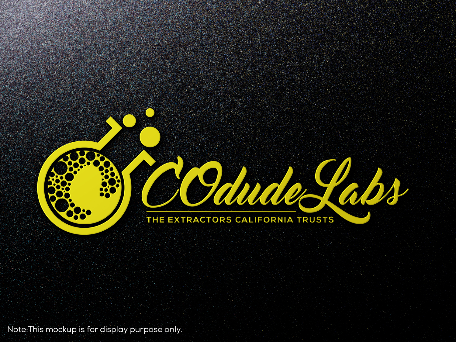
We are a CO2 extraction company based out of the central valley of California and provide a service for various companies to have us make concentrated variations of their product such as hops, lavender, and have even dabbled in the cannabis portion. We are a company that fully believes that we can make a debt in the ongoing opioid epidemic that is taking America by storm. We're believe we can prevent future deaths of opioids by presenting an alternative before someone has to visit the doctor abd be forced to deal with the consequences of pain killers. We would like a simple design that has a simple yet sophisticated feel that embodies our company. We would like to have the font of the company in a nice legible cursive of sorts and maybe incorporate a gold drip somewhere in there. The main colors were wild want would be black and gold; however, we have been thinking about a white and gold as well so we could be open to that. Would like to have the "dude" portion of our name in the top right like it is for CO2 in the periodic table
Texte du logo
COdude Labs "The Extractors California Trusts"
Styles de logo qui vous intéressent
Logo mot symbole
Logo (texte seulement)
Logo de Lettermark
Acronyme ou logo texte (texte seulement)
Styles de police à utiliser
Aspect
Chaque curseur illustre les caractéristiques de la marque client et le style que doit transmettre votre design de logo.
Élégant
Audacieux
Léger
Sérieux
Traditionnel
Moderne
Sympathique
Professionnelle
Féminin
Masculin
Coloré
Conservateur
Économique
Haut de gamme
Exigences
Doit avoir
- An ability to change our mission statement in the future with the designer. Be able to use the file to make various t shirts and a canopy for trade shows
Bien d'avoir
- Gold drip somewhere implemented either in the font, on top, towards the end or on the bottom. Would like to have the "dude" portion of our name in the top right like it is for CO2 in the periodic table