Signage needed for Fancy Food Show and Natural Products West
Vous souhaitez remporter un projet comme celui-ci ?
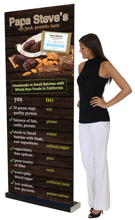
Ce client a reçu 32 designs de panneau de la part de 4 designers. Il a choisi ce design de panneau de Sbss comme design gagnant.
Inscrivez-vous Trouvez des Projets de Design- Garanti
-
 US$160
-
 32 designs
-
 4 designers
Brief de Design de Panneau
33x81" sign needed for tradeshows. 60k-80k people will be seeing this sign so we need a great design that catches them.
Visit http://www.papasteves.com to get a sense of our brand and marketing.
Top half of the sign at very top is most important because a person about 5ft.5 tall will stand in front of it with a table in front of them. So top have is more important than bottom. There might be time we put the sign to the side so the bottom section would be seen at that time.
So you will want to have the logo at the top to grab people's attention. Then work your way down the elements on page as in attached examples provided.
Need to include a shot of the product or products do they know what it is then incorporate the ingredients into the key image that is the main focus for the sign as well. Should be simple and come together like the product there. You probably will have to photoshop it in since no imagery exists of product and ingredients together.
Good examples are http://shop.thepurebar.com/Banana-Coconut/p/PURE-001155&c=PureBar@Bars
http://shop.thepurebar.com/Chocolate-Brownie/p/PURE-001018&c=PureBar@Bars
Marché(s) Cible(s)
Commercial buyers: Whole Foods, Amazon, Sprouts, natural foods markets.
Secteur / Type d'entité
Marketing
Styles de police à utiliser
Autres polices appréciées:
- Maybe try to use the one Groundwork Coffee uses in some way
Aspect
Chaque curseur illustre les caractéristiques de la marque client et le style que doit transmettre votre design de logo.
Élégant
Audacieux
Léger
Sérieux
Traditionnel
Moderne
Sympathique
Professionnelle
Féminin
Masculin
Coloré
Conservateur
Économique
Haut de gamme
Exigences
Doit avoir
- must use copy from screenshot image in some way to emphasize points about the product. It is the copy that has yes and no bullet points in the image. The other images are just references for style we like.
Must be 1" from top and side and 2" space at bottom.
Not busy or distracting backgrounds that make people look all over the place not knowing where to focus.
must have easy to focus imagery and text and easy for audience to know where to look 1st, 2nd, 3rd, etc.
Organic, natural foods, earthy looking feel to it, looks like something you would see in whole foods advertising. Farmers homemade appeal.
Emphasize the yes and express the no's. somehow.
Don't worry about trying to communicate 90 things at once. Just make it friendly, yummy, and piquing the interest to come learn more.
Ne doit pas comporter
- no cheap clip art or crappy looking artwork , no slick looking commercial flashy stuff. This is simple, fresh, handmade product.