CRM Application Interface Design
Vous souhaitez remporter un projet comme celui-ci ?
Ce client a reçu 19 web designs de la part de 7 designers. Il a choisi ce web design de Ved Web Services comme design gagnant.
Inscrivez-vous Trouvez des Projets de Design- Garanti
-
 US$291
-
 19 designs
-
 7 designers
Brief de Web Design
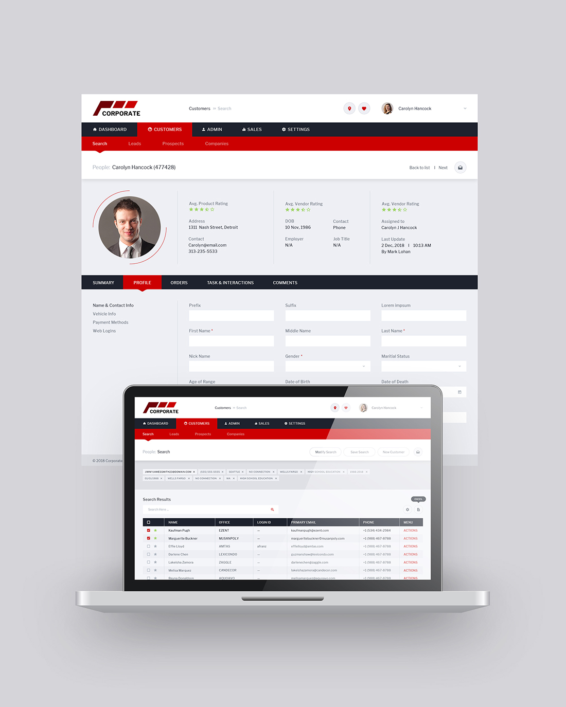
We have a wireframe / design draft for a CRM application (similar to Salesforce, Zoho, etc.). We need this draft to be restyled to create a more finished, polished application user interface. There is a specific branding color scheme that must be adhered to, but you may add secondary and tertiary colors as needed.
At a minimum, these branding colors are required to appear in the design:
#CC0000 : Primary brand color
#AA0000 : Primary shaded (e.g. hover) color
#DBEEF5 / #4A4A4A : Gray
Some other colors you may wish to add:
* "Error/warning" color of your choice
* "Informational / focus" color of your choice
Two screens are provided, both should be re-styled as you see fit in order to finish the design:
1. "Search for customers" screen
2. "View customer details" screen
Requirements:
1. Must have the navigation along the top, cannot switch to a left nav. Must also remain two-level navigation (primary nav at top with sub nav beneath it).
2. The design must use the primary red color in a thoughtful, balanced way, without overdoing it. Please make use of other colors if needed to offset the use of red.
3. Text must be high enough contrast to be readable. The wireframe/draft screens attached show a "washed-out" low-contrast UI with light gray text. That design theme should not be used in the final design.
Aside from the above requirements, please feel free to think creatively and present substantially different ideas. Some of the things we are open to changing include:
* Element style (eg. square vs. rounded corners, flat vs. depth)
* Use of color vs. grayscale
* Menus and navigation
* Light / dark theme
* Any other stylistic elements
* Minor layout changes can be made if needed, but elements should not be moved if that can be avoided.
Goals:
* This is a business application that is used frequently and for long periods, so should not have any unnecessary distracting elements.
* Looking for a design that is clean, professional, readable, usable, and intuitive.
Nombre de Pages Demandé
2 page
Styles de police à utiliser
Aspect
Chaque curseur illustre les caractéristiques de la marque client et le style que doit transmettre votre design de logo.