Pain as a sound system analogy diagram
Vous souhaitez remporter un projet comme celui-ci ?
Ce client a reçu 30 designs graphiques de la part de 5 designers. Il a choisi ce design graphique de kinan3 comme design gagnant.
Inscrivez-vous Trouvez des Projets de Design- Garanti
-
 A$100
A$100
-
 30 designs
-
 5 designers
Brief de Design Graphique
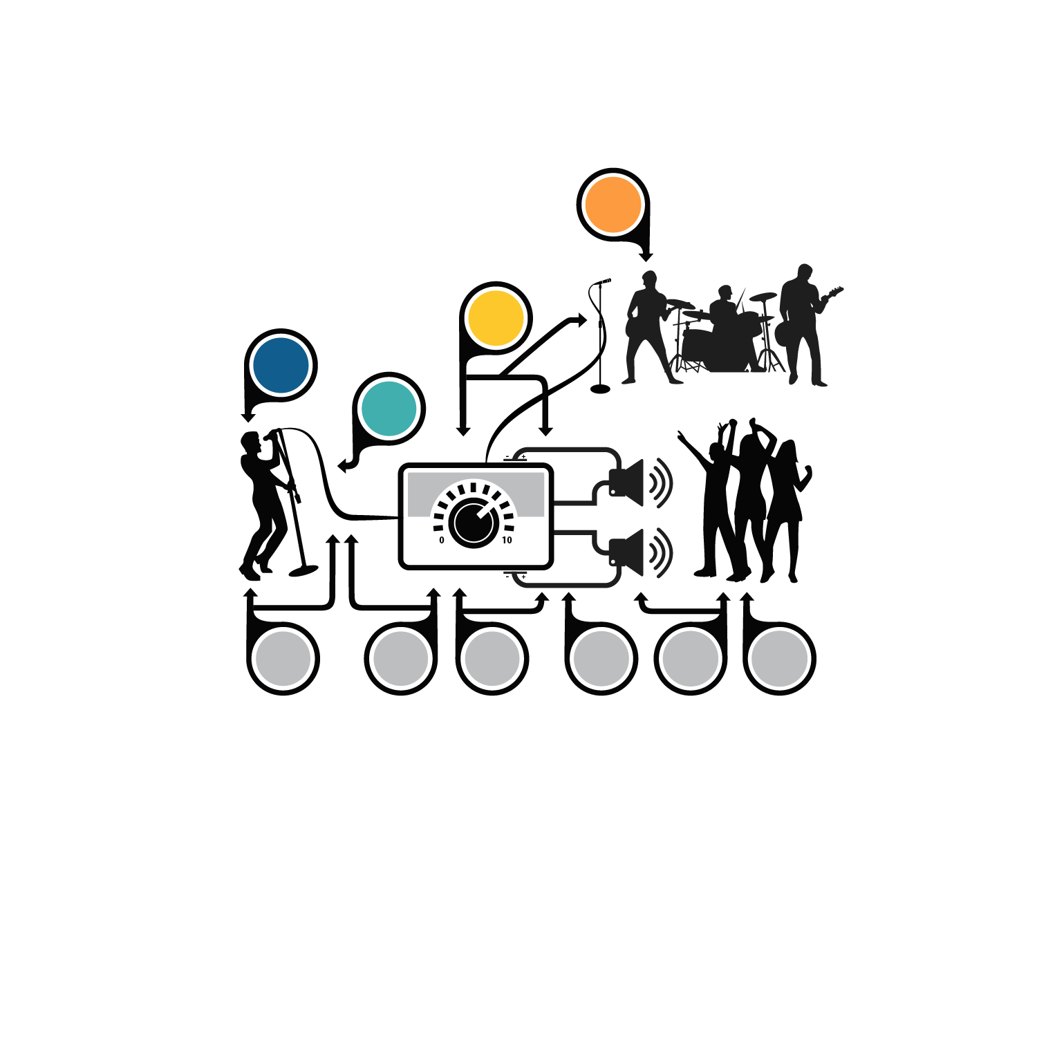
I am doing a talk this week. I have previously done it using hand drawings and Prezi, but I would like to get the hand drawings done so they don't look like rubbish. The Pictures attached are what I need and this is a link to a version of the talk. https://prezi.com/wecyppgfaoas/?utm_campaign=share&utm_medium=copy&rc=ex0shar
What I need is
1. Make the picture look professional (Version 1)
2. A version with no bubbles (Version 2)
3. A version of the picture with no connecting lines (Version 3)
4. A version of the picture with no orange bubbles (Version 4)
5. A version of the picture with no blue bubbles (Version 5)
6. Each of the components of the picture as individual pictures
I have included a diagram called "explanatory diagram" that labels each picture so it is hopefully clear what my bad drawings are. Please add your style to the pictures.
Thanks
Dan
Marché(s) Cible(s)
The target audience for this talk will be people suffering chronic pain and doctors that look after them
Couleurs
Le designer choisit les couleurs à utiliser dans le design.
Aspect
Chaque curseur illustre les caractéristiques de la marque client et le style que doit transmettre votre design de logo.