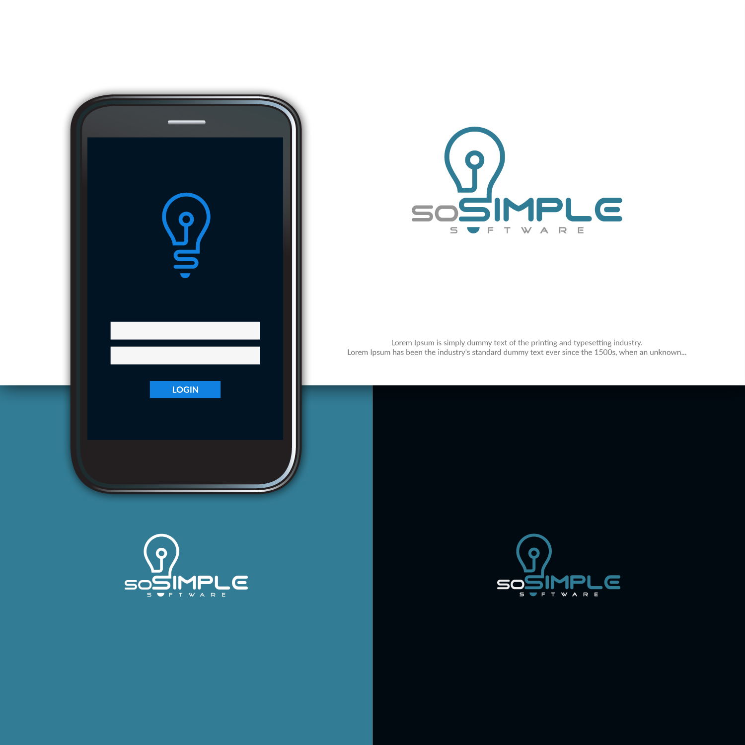
Logo design for soSIMPLE Software branding
Vous souhaitez remporter un projet comme celui-ci ?
Ce client a reçu 124 designs de logo de la part de 70 designers. Il a choisi ce design de logo de ideaz2050 comme design gagnant.
Inscrivez-vous Trouvez des Projets de Design-
 US$150
-
 124 designs
-
 70 designers
Brief de Design de Logo
Designing new logo for a brand we've been using for years. We've previously just used lettering, or in combination with our company logo.
Some of the values we're looking to portray: Clean, simple, quality software. modern, forward-thinking, innovators.
We've been playing around with the lightbulb idea. But some of the reaction has been that while it captures the "simple" part, it doesn't capture the "modern" part. I think if we could stylize or modernize the light bulb it might work better.
Not necessary, but if we gracefully include elements of our company logo, that would be nice. That's why we chose teal as the color.
Mises à jour
Need extra days to review
Marché(s) Cible(s)
FileMaker Pro developers and power-users.
Secteur / Type d'entité
Business Software
Texte du logo
soSIMPLE Software
Styles de logo qui vous intéressent
Logo pictural
Un objet réel (texte facultatif)
Aspect
Chaque curseur illustre les caractéristiques de la marque client et le style que doit transmettre votre design de logo.
Élégant
Audacieux
Léger
Sérieux
Traditionnel
Moderne
Sympathique
Professionnelle
Féminin
Masculin
Coloré
Conservateur
Économique
Haut de gamme
Exigences
Doit avoir
- Color teal from company logo.
Bien d'avoir
- Project description says most of it. I'm liking the lightbulb idea, but needs to be more modern. I also like that the lightbulb has the letter "S" in the stem. But it looks a little old-fashioned, and we need modern.