

 Rafraîchir
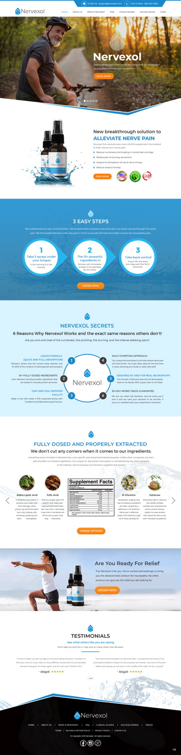
Nutritional Supplement Brand In Need Of Website Redesign
Vous souhaitez remporter un projet comme celui-ci ?
Ce client a reçu 62 web designs de la part de 20 designers. Il a choisi ce web design de pb comme design gagnant.
Inscrivez-vous Trouvez des Projets de Design
- Garanti
-
 US$350
-
 62 designs
-
 20 designers
Brief de Web Design
We are in need of a website overhaul/redesign, one that will make our product/brand/company, which is a natural liquid nerve pain relief supplement, appear more sophisticated, luxurious and appealing.
Current Site & Sales Letter are found here with all the copy & text needed:
https://www.nervexol.com/limited
https://www.nervexol.com/letter
It is functioning fine for now and is fairly professional, but conversions are low. It is currently custom coded and has 80%+ from an information perspective, but a modern refresh is simply needed, with a focus on a clear message.
What we'd like to do now is really bring focus to the benefits of the product, the ingredients, the value proposition and accentuate the energy and vitality that the product brings back to people’s life.
We would like to keep the blue/grey/silver look and feel, as that feels professional and calming and ties into the unique selling proposition that it’s a liquid and not a pill.
Pages in the menu of the new site would be:
* Home
* About Us
* What Is Nervexol?
* FAQ
* Clinical Studies
* Success Stories
* Order
Look And Feel:
Professional, Modern & Luxurious (almost like an Ad Agency feel), yet personable and trustworthy. We don’t want it to look too cheesy/salesy like many of the supplement sites out there.
Thanks!
Adam
Marché(s) Cible(s)
People who suffer from Neuropathy and general nerve pain, and are in search for a natural solution to help improve their nerve pain…as opposed to getting drugs from the big pharma companies that have a ton of side effects. Primarily M/F in the 40+ age range. The target market is well aware of their problem, they are simply looking for a potential solution.
Secteur / Type d'entité
Health And Wellness
Nombre de Pages Demandé
5+ page
Styles de police à utiliser


Aspect
Chaque curseur illustre les caractéristiques de la marque client et le style que doit transmettre votre design de logo.
Élégant
Audacieux
Léger
Sérieux
Traditionnel
Moderne
Sympathique
Professionnelle
Féminin
Masculin
Coloré
Conservateur
Économique
Haut de gamme
Exigences
Doit avoir
- Clean site design that isn’t cluttered for the sake of filling the page. Don’t be afraid of white space from a modern look perspective (like Apple.com)
- Clear and user friendly menu of pages for easy navigation
- Prominent use of images to show people in their “after” or happier more active state.
- Product imagery and supplement facts that are prominently displayed. This is a good example — https://zumajuice.com/green-juice/
- A modern/luxurious feel is a must, as the product is priced on the higher end.
Bien d'avoir
- Large image as the top of the first page where I can put a sentence or two with the main tag line (tbd)...like these maybe:
- http://www.passion-for-excellence.com/
- https://www.texasbeardcompany.com
- Placeholders/pages where video can be used and molded into the design that can showcase how people will feel after being on the product. It’s not imperative that video is used, but I feel that it could be a way to make it modern and innovative. A good example is here: http://www.trask-industries.com/#/home