Logo for Waste Consulting Firm
Vous souhaitez remporter un projet comme celui-ci ?
Ce client a reçu 143 designs de logo de la part de 40 designers. Il a choisi ce design de logo de Sarah Graphic comme design gagnant.
Inscrivez-vous Trouvez des Projets de Design- Garanti
- Projet Lié 1
-
 A$150
A$150
-
 143 designs
-
 40 designers
Brief de Design de Logo
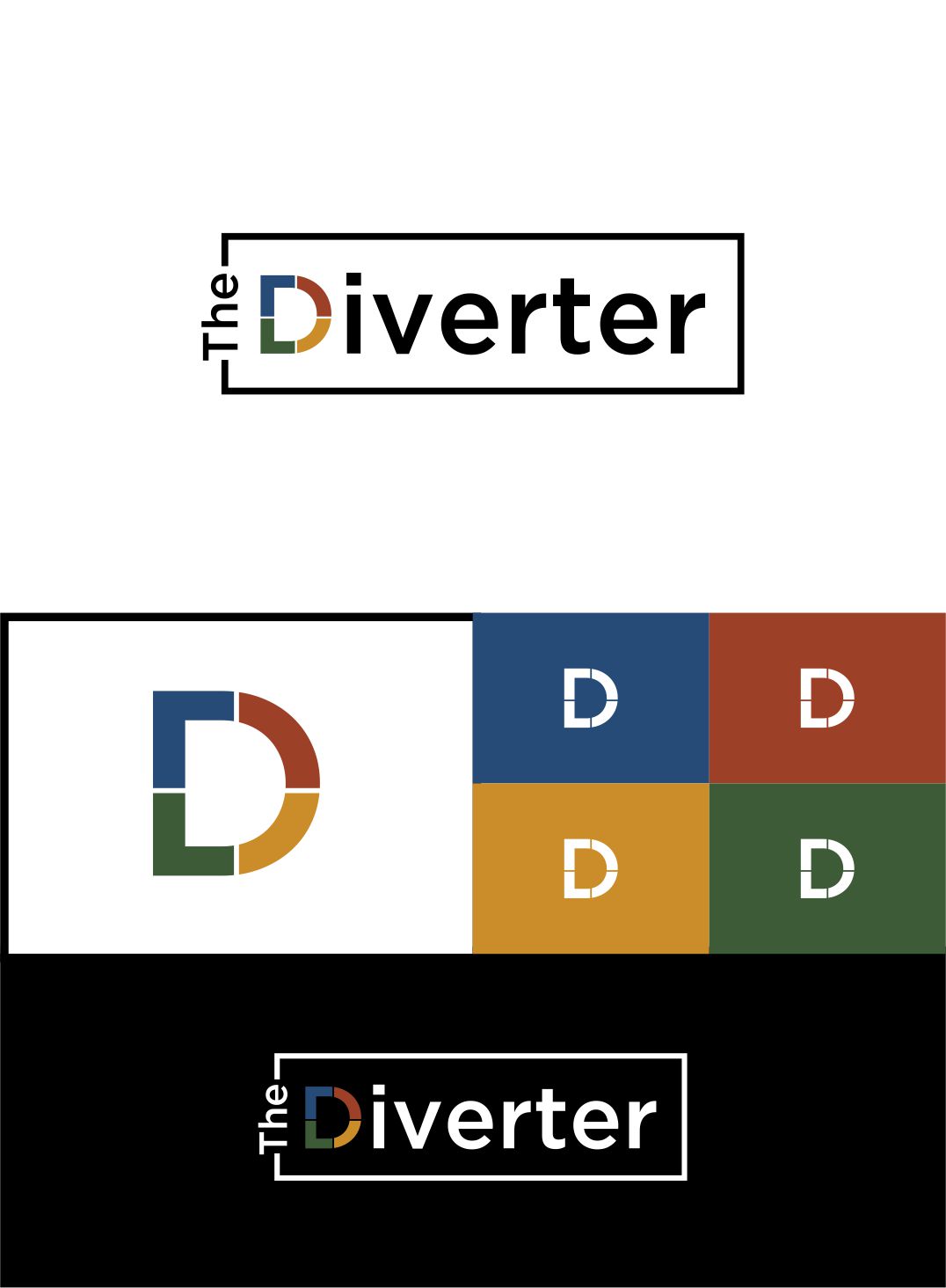
We need a logo design for a new consulting firm and industry website based in Australia. The name is "The Diverter."
We have a website that waste and recycling industry professionals can access for information, podcasts and videos and we provide consulting services to waste companies and government on waste and recycling management, tendering, strategy, etc.
We would like to see designs that are not too corporate, exude knowledge and innovation and are a little bit edgy.
We like a logo that does not have a separate symbol, ie, the words are the logo, with the "d" in diverter being able to stand on its own as the logo.
We like multi colour use but the logo should also look good as black on white or vice versa.
The whole words can be lower case.
In regards to the attached file with logos, we like abstract lettering, matte colours rather than bright, art/design type fonts and something cool. The file with the big D uses great colours. Perhaps a blue could be added in with the green, yellow and red.
Marché(s) Cible(s)
Waste Management professionals from all walks of life
Secteur / Type d'entité
Waste Management
Texte du logo
The Diverter
Styles de logo qui vous intéressent
Logo mot symbole
Logo (texte seulement)
Logo de Lettermark
Acronyme ou logo texte (texte seulement)
Styles de police à utiliser
Couleurs
Couleurs choisies par le client et à utiliser dans le design de logo:
Aspect
Chaque curseur illustre les caractéristiques de la marque client et le style que doit transmettre votre design de logo.
Élégant
Audacieux
Léger
Sérieux
Traditionnel
Moderne
Sympathique
Professionnelle
Féminin
Masculin
Coloré
Conservateur
Économique
Haut de gamme
Exigences
Doit avoir
- Earth tones of any colours used. One or more of colours below.
Bien d'avoir
- No words + extra logo component.
- The D in vertex should be strong enough to stand on its own as a logo of sorts.
Ne doit pas comporter
- a typical corporate look
Fichiers
Télécharger tous les fichiers - 0,5 MB
Paiements
Total
A$150
Date limite du projet
02 avr. 2018 18:37:18 UTCOptions du projet
Projet(s) Lié(s)
- offrant un design de carte de visite de A$39 au gagnant