Photographer / modern Logo Design
Vous souhaitez remporter un projet comme celui-ci ?
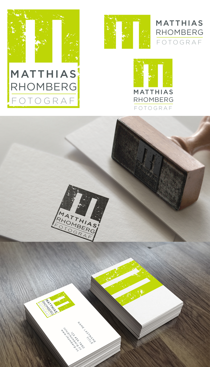
Ce client a reçu 210 designs de logo de la part de 56 designers. Il a choisi ce design de logo de Cherry Pop Design comme design gagnant.
Inscrivez-vous Trouvez des Projets de Design- Garanti
-
 €300
€300
-
 210 designs
-
 56 designers
Brief de Design de Logo
Dear designers, I really need a nice logo for my photography business based in western Austria.
The wording of my company is "Matthias Rhomberg . fotograf", which I used as a simple typo logo so far. You can see it here on the upper left: www.rhomberg.cc
Generally I like that logo, but it doesn't scale well and looks misplaced as soon as I try to combine it with my address etc. on a business card or letterhead
# style: The logo should be a real nice, modern, simple one, that feels at home on a stylish website. Please avoid too cheesy photography cliché icons, but I'd be open to some abstract graphical element that connects it to photography
# colors: I'd rather not use colors or grayscale (or a logo that has color, but also works in b&w) so that I can easily print it on a laser printer and mainly so that I can embed it in my pictures as a semi-transparent watermark which is not too intrusive *see update below*
# wording: It can either use "Matthias Rhomberg . fotograf" in some sort of form or just "RHOMBERG" or even just initials like "MR" or "R" and/or combine all that. The words can be arranged and placed as you see fits for a nice overall design as long as the order of reading stays as intended.
# my photography: I mainly shoot events, music, weddings, architecture and commercial stuff. So a watermark should be cool enough to fit a great concert shot and sophisticated enough to be on a reduced architecture shot as well.
Logos I like are for example:
http://www.larswieser.com/client/larswieserneu/static/images/lw.gif for it's reduced style, perfectly combining L and W
http://www.weissengruber-fotografie.at/wp-content/uploads/2013/04/weissengruber_logo_schwarz_lemongrass.png for it's professional and friendly look
Attached are a few tries that I gave it myself. That's how I might use it on my letter paper (back and front side). Please don't read too much into it and don't limit yourself to it. Maybe best if you don't look at it at all and just let your ideas flow and surprise me. I don't know.. ;)
I hope that's enough input for now, please don't hesitate to ask if I forgot something!
Oh .. and if you could include some ideas for stationery, too I would be stoked!
Thanks a lot guys, I'm really excited! :)
-
UPDATE: Thank you so much for your submissions so far! I've recognized that I love the modern, fresh and friendly colored elements, they are really great and hipster for web use, as long as the logo also works in plain black and white too. Yay! :)
UPDATE 2: If your logo is just initials, please include a variant with the full wording included in a nice layout/font because outside of just watermarks or facebook profile logos I'll need to do that. Thanks!
Secteur / Type d'entité
Architecture
Texte du logo
Matthias Rhomberg . fotograf (or just "R" combined with text?)
Styles de logo qui vous intéressent
Logo abstrait
Conceptuel / symbolique (texte facultatif)
Logo mot symbole
Logo (texte seulement)
Logo de Lettermark
Acronyme ou logo texte (texte seulement)
Aspect
Chaque curseur illustre les caractéristiques de la marque client et le style que doit transmettre votre design de logo.