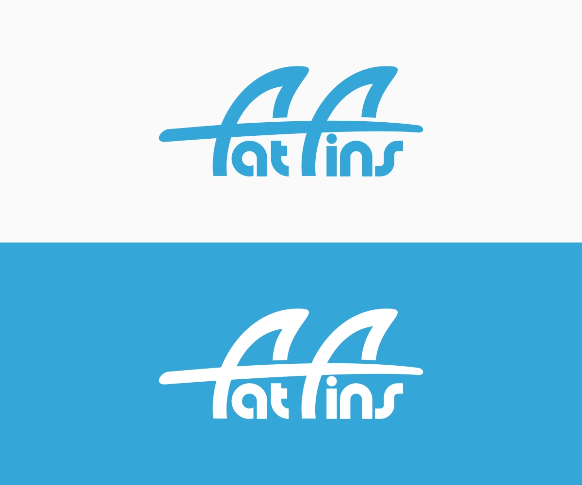
Graphic logo design for fat fins a surfing brand
Vous souhaitez remporter un projet comme celui-ci ?
Ce client a reçu 119 designs de logo de la part de 30 designers. Il a choisi ce design de logo de B8 comme design gagnant.
Inscrivez-vous Trouvez des Projets de Design- Garanti
-
 A$120
A$120
-
 119 designs
-
 30 designers
Brief de Design de Logo
Fin design company looking for a logo, fins are used on surfboard. The fins are safer and less likely to hurt than other fin designs, making it safer and more fun. Brand is called fat fins as the contact area is fatter than normal fins therefore preventing severe liaisons.
Would like to incorporate fin siluettes or surfboards into the wording. Eg top of the “f’s” for fat fin representing thrusters from a surfboard.
Would prefer custom typography.
Ultimately the logo will be used for merchandise branding and marketing so want to keep simple and timeless
Thank you and good luck
Secteur / Type d'entité
It Company
Texte du logo
Fat Fins
Aspect
Chaque curseur illustre les caractéristiques de la marque client et le style que doit transmettre votre design de logo.
Élégant
Audacieux
Léger
Sérieux
Traditionnel
Moderne
Sympathique
Professionnelle
Féminin
Masculin
Coloré
Conservateur
Économique
Haut de gamme
Exigences
Doit avoir
- Incorporate fins and surfboard into design
- It is also going to be a logo on cap and T-shirts needs to be cool, or retro
Bien d'avoir
- Try and create a feeling of movement. Surfing is dynamic. And fun.
- It’s that energy that can hurt.... fat fins save you
- Maybe word “fat” is wider bigger than “fins” like a bigger fin?!
Ne doit pas comporter
- Should not look like a Shark