

 Rafraîchir
Guaranteed: Spiritual business website project
Vous souhaitez remporter un projet comme celui-ci ?
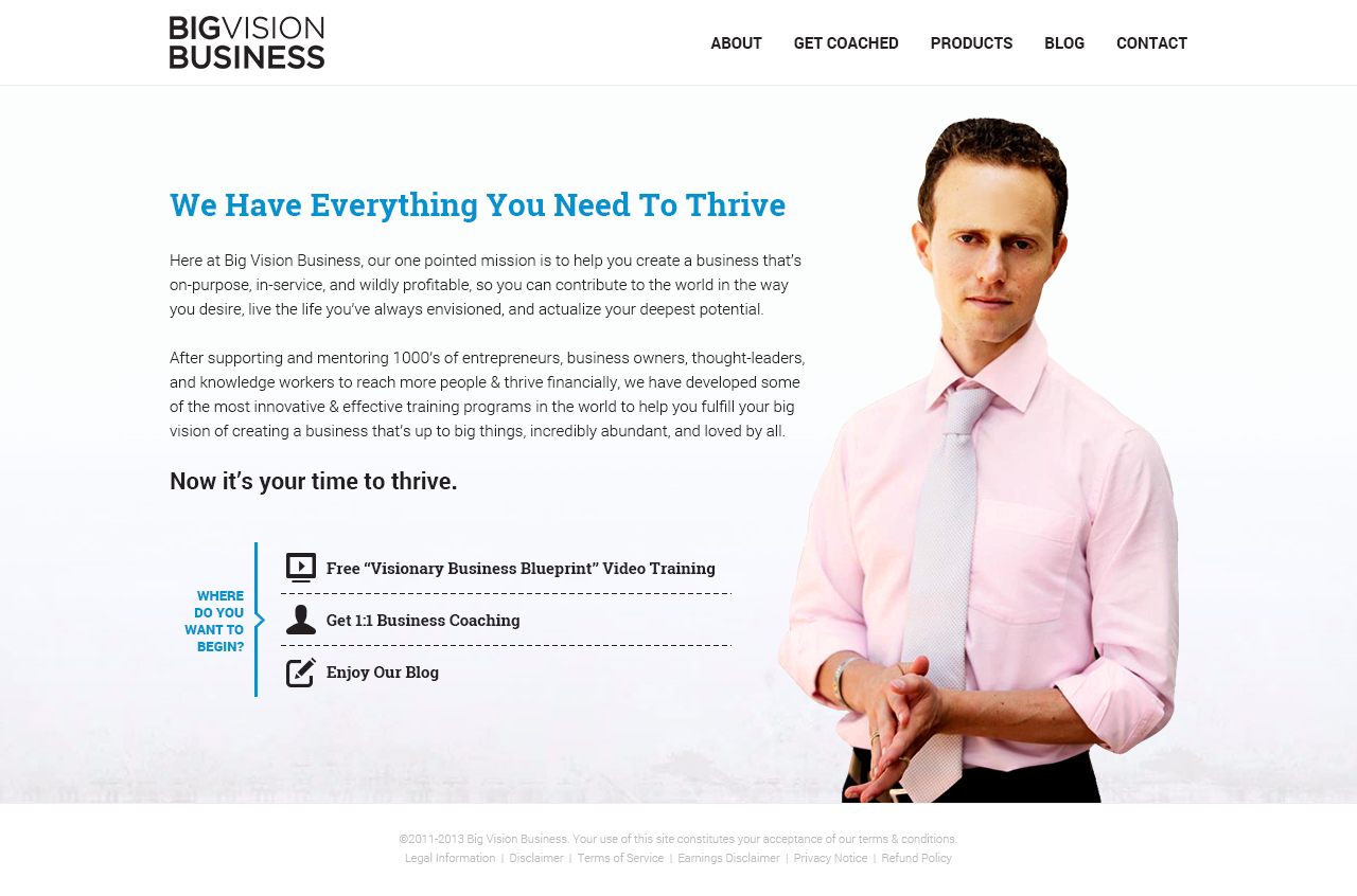
Ce client a reçu 47 web designs de la part de 15 designers. Il a choisi ce web design de MIND comme design gagnant.
Inscrivez-vous Trouvez des Projets de Design
- Garanti
-
 US$500
-
 47 designs
-
 15 designers
Brief de Web Design
NEW UPDATE: We want you to design the new "home page letter" which should feel like a personalized letter to the reader. Get creative here. It can be on a scroll. Or a unique background. Or anything. But it should feel like a "letter" where someone feels it's addressed just to them.
Then the three buttons at the end are "calls to action" to get them to click. So we need to make sure they are compelling and unique.
That said, here was the original brief.
We're re-designing our website and need to update our look. We are moving into a more visionary stance in our space, where spirituality and visionary business meet to create a new world. Because of this it has to mix an expansive, visionary feel while keeping it open, welcoming and grounded, because it's still a business site.
We like clean sites with lots of white space which is visually easy to engage with, and where the copy is easy to read. And if you are going to use images, we want them to be big and feel very alive. So that every part of the site has an energy to it that energizes you.
Please take a look at our current site: http://bigvisionbusiness.com. We want to have it feel like the same brand but give it a new energy aliveness and feeling. We don't have a lot of original photography, so keep that in mind when designing.

Mises à jour
We think it would help to give you some site examples of other websites we like and why, so you have some examples to draw from that you could use for inspiration...
http://www.appsumo.com/how-to-make-your-first-dollar/
We LOVE the layout of this page because:
- It all reads from the top down
- The only photos they use are of people or their products
- The images they use are all consistent (the hand-drawn graphics)
- The site has a very spacious look and feel
- It still feels friendly and inviting
- They use different backgrounds (yet always consistent) throughout the site
- Most of the actual colors are pretty muted excepted for their photos and their call to actions buttons.... so it makes the site feel comfortable and yet not loud all at the same time.
http://www.leadpages.net/
- We like the little icons
- The site is both clean, yet has subtle accents of color
- Images and product photos are big and compelling
- Sections of the page are broken up by subtle line breaks and color changes
http://www.omharmonics.com/
- Photos are big and compelling
- Subtle design elements on the photos gives it a unique feeling
- Site feels very clean and open
Hopefully these 3 sites give you some inspiration for the design of our website.
Added Tuesday, December 10, 2013
Project Deadline Extended
Reason: After reviewing all the designs, I'm noticing that it's difficult to innovate our current design very much. So that said, there is ONE specific page of the new site that has the opportunity to really be creative, which is the new home-page letter. So I'm going to stop asking you to create designs for the other pages and just focus on the single home-page letter that can have a more creative look and feel. So check out the new "site brief" and let your imagination run wild.
Added Friday, December 13, 2013
Please use the new "Homepage letter for BVB.com" document as the new brief. Here's the post I made earlier also...
NEW
UPDATE: We want you to design the new "home page letter" which should
feel like a personalized letter to the reader. Get creative here. It can
be on a scroll. Or a unique background. Or anything. But it should feel
like a "letter" where someone feels it's addressed just to them.
Then
the three buttons at the end are "calls to action" to get them to
click. So we need to make sure they are compelling and unique.
Added Friday, December 13, 2013
Marché(s) Cible(s)
70% women, 30% men. Mostly service providers like speakers, therapists, healers, and authors. Tend to have a "spiritual" vibe but we also want this site to feel like a business site.
Secteur / Type d'entité
Business
Styles de police à utiliser

Couleurs
Couleurs choisies par le client et à utiliser dans le design de logo:
Aspect
Chaque curseur illustre les caractéristiques de la marque client et le style que doit transmettre votre design de logo.
