LogoDesign for housebuilder in Norway!
Vous souhaitez remporter un projet comme celui-ci ?
Ce client a reçu 223 designs de logo de la part de 95 designers. Il a choisi ce design de logo de novita007 comme design gagnant.
Inscrivez-vous Trouvez des Projets de Design-
 US$150
-
 223 designs
-
 95 designers
Brief de Design de Logo
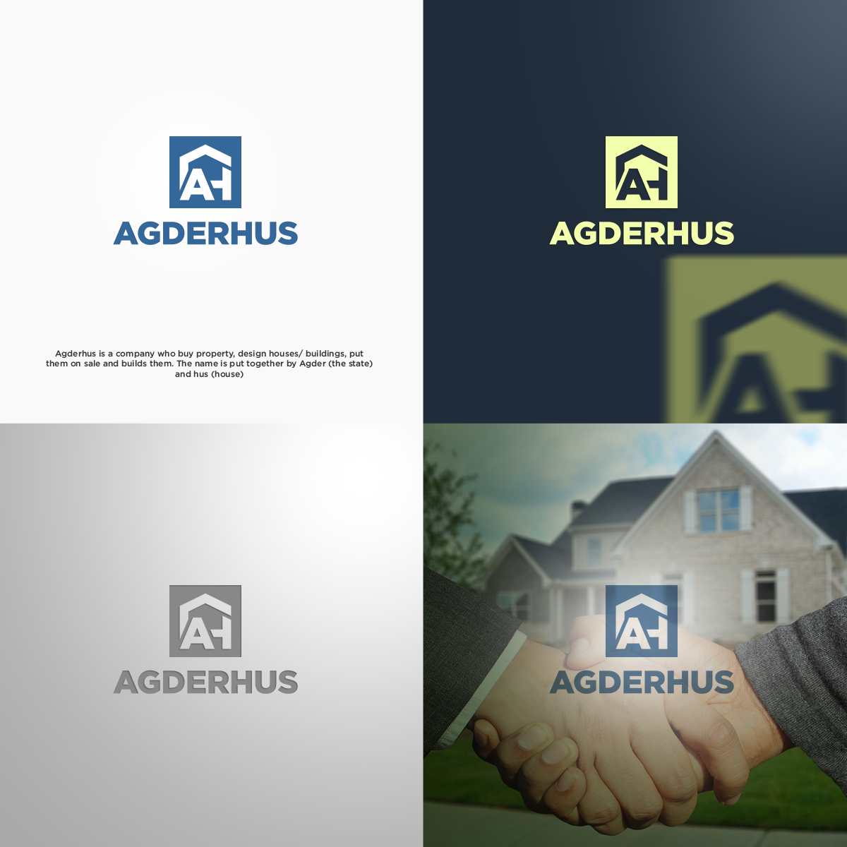
Agderhus is a company who buy property, design houses/ buildings, put them on sale and builds them. The name is put together by Agder (the state) and hus (house). We focus on the southern part of Norway and like to reach out to the average people. Looking for a logo wich is easy to see from a distance, easy to read while passing by in the car, and if possible- with a undertone of construction/building/house etc. This could be a symbol. Focus on AH could also be a possibility.
Marché(s) Cible(s)
1. Families with children. 2. Young adults. 3. People who wants a little more exclusive houses.
Secteur / Type d'entité
Real Estate Development
Texte du logo
Agderhus
Styles de police à utiliser
Aspect
Chaque curseur illustre les caractéristiques de la marque client et le style que doit transmettre votre design de logo.
Élégant
Audacieux
Léger
Sérieux
Traditionnel
Moderne
Sympathique
Professionnelle
Féminin
Masculin
Coloré
Conservateur
Économique
Haut de gamme
Exigences
Doit avoir
- se proj.description
Bien d'avoir
- I like the name to be in focus- unless you make a symbol stronger than the text:)
Ne doit pas comporter
- 1. I do not like 'common' online logo type with roofs/silouttes over the text.
- 2. Small text og small symbols
- 3. Traditional style