

 Rafraîchir
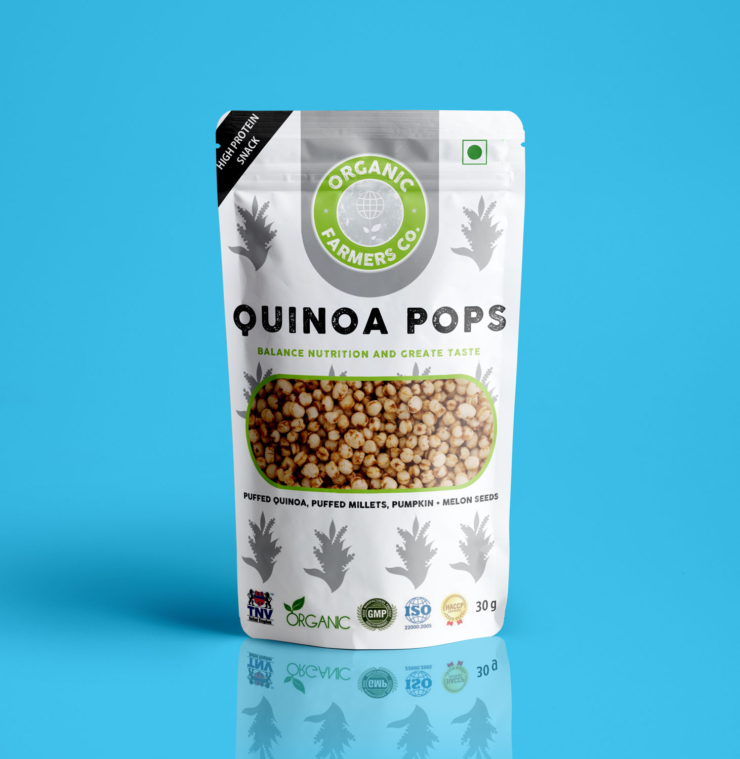
Quinoa | Superfood Snack Packaging
Vous souhaitez remporter un projet comme celui-ci ?
Ce client a reçu 9 designs emballage de la part de 4 designers. Il a choisi ce design emballage de Darvel Emmanuel comme design gagnant.
Inscrivez-vous Trouvez des Projets de Design
-
 US$120
-
 9 designs
-
 4 designers
Brief de Design Emballage
I need a packaging design for our snacking range, Quinoa POPS, brand is Organic Farmers Co. www.organicfarmersco.com that makes innovative health products using Quinoa . The product has an amazing crunch which indians love, so a play on the POPS would be nice in the packaging.The craft paper box currently is not convenient for snacking and is too big and boring. We are reducing the packaging from 100g to 30g so more customers pick up our product on check out counters of supermarket and hotel mini bars. The product is roasted, supports indian farmers, made in India, made for the local indian market (price sensitive+ value driven). Try to maintain a maximum of a 4 color palette as in future when we convert design to mass printing it will get expensive. Ingredients: Puffed Quinoa, Puffed Millets, Pumpkin + Melon Seeds. We are looking at a one time use format where we only have a pouch with a sticker front and back.
Marché(s) Cible(s)
The target market is middle to high income people, anyone willing to try something new + healthy without compromising taste but wanting BALANCED NUTRITION & and GREAT TASTE.
Secteur / Type d'entité
Health And Wellness
Styles de police à utiliser
Autres polices appréciées:
- Cocogoose Letterpress
Couleurs
Couleurs choisies par le client et à utiliser dans le design de logo:
Aspect
Chaque curseur illustre les caractéristiques de la marque client et le style que doit transmettre votre design de logo.
Élégant
Audacieux
Léger
Sérieux
Traditionnel
Moderne
Sympathique
Professionnelle
Féminin
Masculin
Coloré
Conservateur
Économique
Haut de gamme
Exigences
Doit avoir
- The design should be attractive, bright, convey SUPERFOOD but focus on TASTE & CRUNCH, FUN and snacking on the go, use our logo colors (green and white, along with a vibrant /natural color palette for flavours. The design should not look too upmarket that middle class consumers don't relate to it.
Bien d'avoir
- An image or illustration that highlights SUPERFOOD, 5 g protein, CRUNCH
Ne doit pas comporter
- Should not look too childish


