The Queen of Homewares is an online store specialising in all things for the home Bathroom, Kitchen,
Vous souhaitez remporter un projet comme celui-ci ?
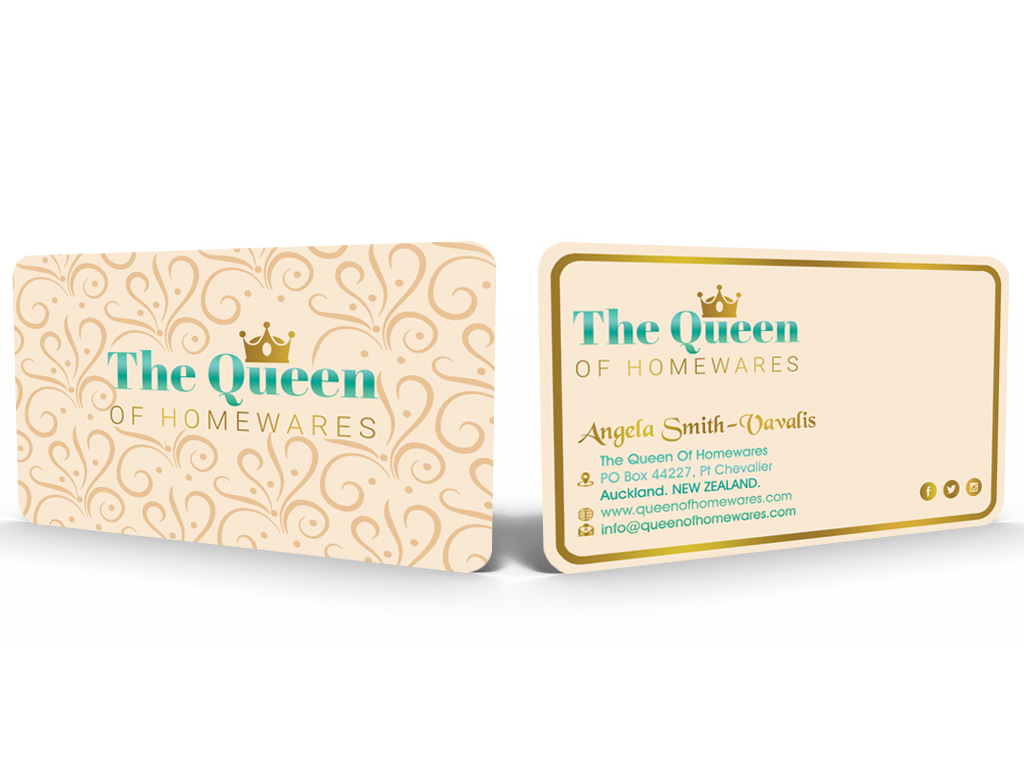
Ce client a reçu 57 designs de carte de visite de la part de 7 designers. Il a choisi ce design de carte de visite de Hardcore Design comme design gagnant.
Inscrivez-vous Trouvez des Projets de Design- Garanti
-
 NZ$100
-
 57 designs
-
 7 designers
Brief de Design de Carte de Visite
I need a business card designed that is professional and elegant, yet not conservative. We will be wanting to brand the entire business and will have videos made where we will be interacting with the product, testing the products and basically creating an online interactive community for all those people interested in all things to do with the Home and the activities that take place in and around the home.
Marché(s) Cible(s)
30-65yr old Men and Women who LOVE their Home and see it as their primary place of Happiness, their sanctuary!
Secteur / Type d'entité
Business
Coordonnées pour la Carte de Visite
www.queenofhomewares.com The Queen Of Homewares-PO Box 44227, Pt Chevalier, Auckland. NEW ZEALAND. info@queenofhomewares.com
Love your Home! Angela Smith-Vavalis
Styles de police à utiliser
Couleurs
Couleurs choisies par le client et à utiliser dans le design de logo:
Aspect
Chaque curseur illustre les caractéristiques de la marque client et le style que doit transmettre votre design de logo.
Élégant
Audacieux
Léger
Sérieux
Traditionnel
Moderne
Sympathique
Professionnelle
Féminin
Masculin
Coloré
Conservateur
Économique
Haut de gamme
Exigences
Doit avoir
- Attractive colours. Must feel Elegant, yet simple. A font that is rounded without sharp edges. Organic feel to the card, something raw with texture.
Bien d'avoir
- I like the logo deign that I gave in the photos, something feminine, but fun.
Ne doit pas comporter
- I dont like sharp edges, or linear design. I like organic, flowing, fractal type design. Something that looks beautiful in form when you look at it.