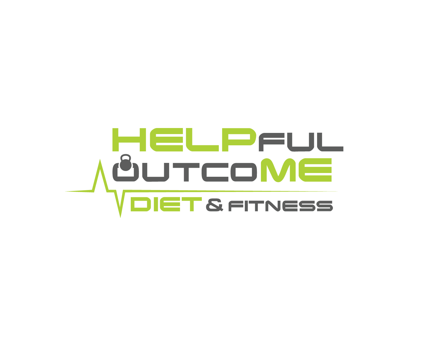
Company logo for my Fitness Brand

Vous souhaitez remporter un projet comme celui-ci ?
Ce client a reçu 94 designs de logo de la part de 15 designers. Il a choisi ce design de logo de Atec comme design gagnant.
Inscrivez-vous Trouvez des Projets de Design- Garanti
Brief de Design de Logo
I would like this logo to stand out on HELP ME and in the middle the “fuloutco” I would like like a heart beat rhythm above it or through it just want it to be creative. Looking like something you would see on a screen at a hospital monitor. I would like the first “O” in outcoME to be a Kettlebell I attached a picture below of the type of one I want. Please really try to make it look like an “O” as much as possible. This is a Fitness brand build around heart rate monitoring. If I could have it structure like:
HELPfuloutcoME
Or even
HELPful
outcoME
I would like it to be the same font throughout the design. But HELP ME JUST BOLDER to make it noticeable. I still want people to read it and knows what it says. I don’t want it to be super long in the middle or bunched together. I would love some creativity on even using some of the letters. Looking forward to seeing the ideas thanks!
Steven
Marché(s) Cible(s)
People looking to loose weight. Fitness Industry
Secteur / Type d'entité
Fitness
Texte du logo
HELPfuloutcoME
Styles de logo qui vous intéressent
Logo mot symbole
Logo (texte seulement)
Logo de Lettermark
Acronyme ou logo texte (texte seulement)
Styles de police à utiliser
Autres polices appréciées:
- In the middle I want some type of heartbeat font
Couleurs
Couleurs choisies par le client et à utiliser dans le design de logo:
Aspect
Chaque curseur illustre les caractéristiques de la marque client et le style que doit transmettre votre design de logo.
Élégant
Audacieux
Léger
Sérieux
Traditionnel
Moderne
Sympathique
Professionnelle
Féminin
Masculin
Coloré
Conservateur
Économique
Haut de gamme
Exigences
Doit avoir
- I want HELP to standout and ME
- I WANT the “fuloutco” to be in font of a heart beat pulse on a monitor
- I would like to see the first “O” in outcoME be a KETTLEBELL which I attached below.
Bien d'avoir
- Catchy trendy design
- I want HELP and ME to be the same fonts and colors
- I would like the middle same font but smaller with a heart pulse above or below something creative with it.
Ne doit pas comporter
- i Don’t want it to be hard too read. I want it clear to read