Financial Practice Logo
Vous souhaitez remporter un projet comme celui-ci ?
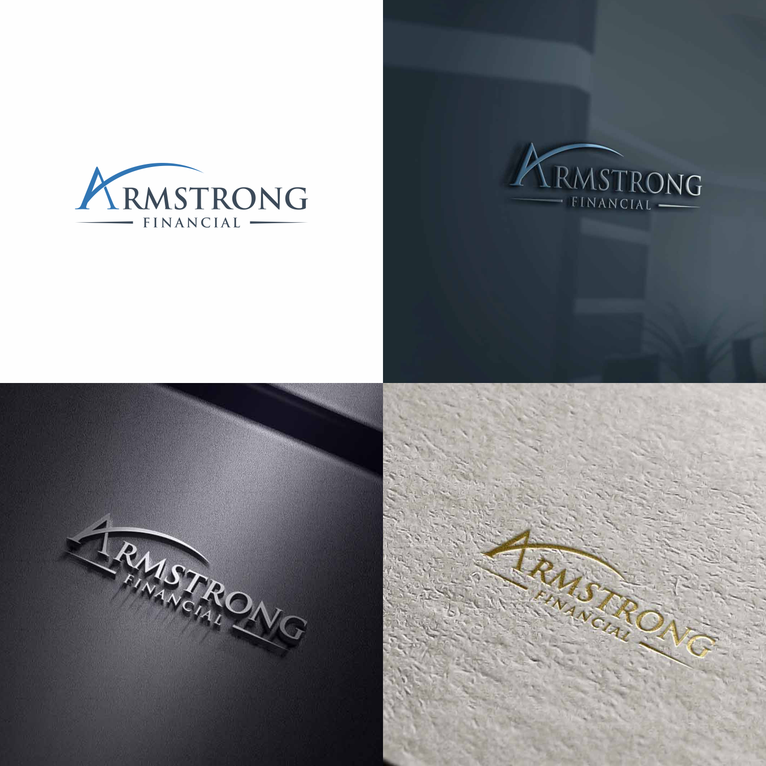
Ce client a reçu 267 designs de logo de la part de 83 designers. Il a choisi ce design de logo de setyopras878 (kak chen) comme design gagnant.
Inscrivez-vous Trouvez des Projets de Design-
 US$150
-
 267 designs
-
 83 designers
Brief de Design de Logo
The logo design will be used for a website, business card, stationary, and other promo items. The logo and text will have to compliment/work well with another logo design as both will appear together in some capacity. Please see the Northwestern Mutual logo, which is a navy font and gold, stylized column (attaching logo). The logo I need created is for Armstrong Financial, and I am thinking the design should primarily be with the letter “A" or “AF”. This is for a financial practice. Some attributes of the practice are: knowledge, integrity, and experience (as it relates to all things financial). I don’t really have any strong feelings for including a particular symbol or picture, I was thinking of more of a stylized logo design/stamp-like piece. However, I did think that perhaps using a key somehow, subtly, might work. The logo should be simple, but classic, and the design should communicate a sense of a solid foundation and moving forward/growth (this is for a financial practice). Again, the logo can include imagery/symbolism, but doesn’t have to—you can may be use more of a stylized design with the letters A/F. Also, if you do play around with including some symbols, just make sure they aren’t of a lion or a lighthouse. Not a fan of that. Nothing too over-the-top/too stylized. Main colors should be dark navy/blue hues, perhaps a dark-hunter green could work, highlighted with silver or gold. The design and logo will be used against a white background. I am attaching some logos I found that will give you an idea of my desired aesthetic and some things that I like for this reason or another that seem to work well. I like the idea of maybe intertwining the A and F if used together, and kind of encasing them in a shape or with a design. Also think the logo will work well to the left of the text, however, I am open to it being above or another location if it works better that way. I am also attaching the Northwestern Logo so you can see what it looks like. Thank you!
Mises à jour
Need extra days to review
Marché(s) Cible(s)
Clients, current and potential
Secteur / Type d'entité
Financial
Texte du logo
Armstrong Financial
Styles de logo qui vous intéressent
Logo abstrait
Conceptuel / symbolique (texte facultatif)
Logo de Lettermark
Acronyme ou logo texte (texte seulement)
Styles de police à utiliser
Couleurs
Couleurs choisies par le client et à utiliser dans le design de logo:
Aspect
Chaque curseur illustre les caractéristiques de la marque client et le style que doit transmettre votre design de logo.
Élégant
Audacieux
Léger
Sérieux
Traditionnel
Moderne
Sympathique
Professionnelle
Féminin
Masculin
Coloré
Conservateur
Économique
Haut de gamme
Exigences
Doit avoir
- Please see photo file 8 and 9 about logo specifications and preferred colors.