

 Rafraîchir
New B2C website design to help dads be better dads
Vous souhaitez remporter un projet comme celui-ci ?
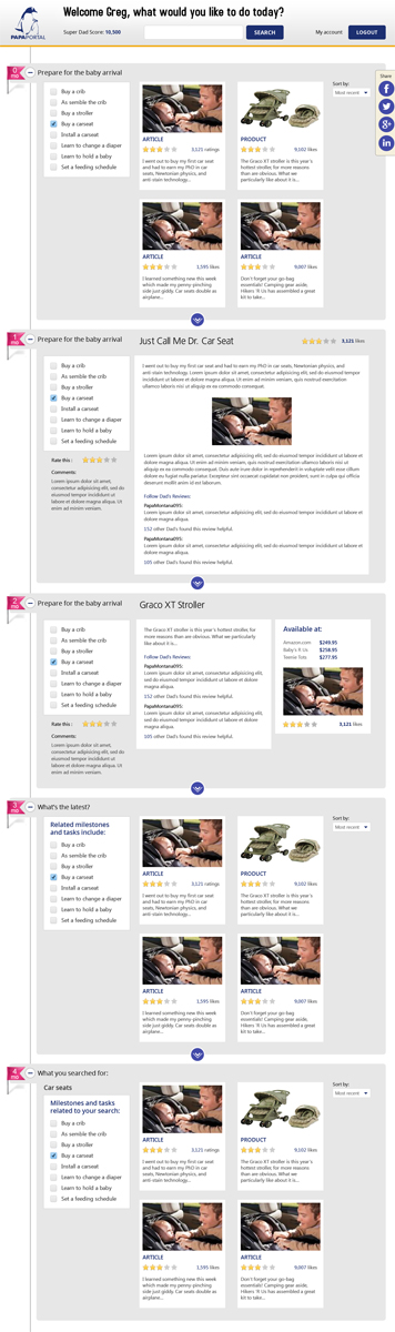
Ce client a reçu 167 web designs de la part de 8 designers. Il a choisi ce web design de RupalTechno comme design gagnant.
Inscrivez-vous Trouvez des Projets de Design
- Garanti
-
 US$600
-
 167 designs
-
 8 designers
Brief de Web Design
PapaPortal is a website to help dads be the “best dad you can be.”
We require our website to be designed into a PSD format, no coding necessary.
The general concept is a two-page design. The first page is the login page, the second page is the home page. Once at the home page, rather than navigating to and from different pages, the user will push and pull through different visual and functional layers of the hierarchy. In theory, this should add to the user experience by having a visual anchor of where they are (through layered pagination) as well as improving loading times since the new information should only be a delta in data load versus a brand new page load.
The general look-and-feel we are going for is clean, simple, minimal. This means that the winning design will show us a good eye for web-optimized typography, good use of white (negative) space, and good use of a visually pleasing grid.
We require a total of 6 page "views" plus the landing page. We note that many of the views are similar to one another.
Landing page
Milestone view
Task view
Content view, articles
Content view, products
Search view
What's new view
Please review all of the additional information provided as well as the attachments for examples.
Document: web_designs_views_descriptions.pdf: This document describes each of the pages needed for this design.
Document: web_designs_views_examples.pdf: This document provides a visual example of what we are looking for. Note these are examples only, not intended to limit the creativity of the designer. In order, the pages of the pdf are landing page top and bottom; milestone view; task view; content view, article; content view, product; search view; what's new view
PP_logo.ai: Vector file of our logo for incorporation into design.
We provide the following websites as good references for:
Typography:
http://mattbango.com/notebook/
Use of white space:
http://www.pixelumbrella.com/
http://surfstation.com/
Example for “scrolling” page concept as well as good balance of color, typography, and white space:
http://www.shiftconference.eu/
Please contact us with questions so that we can guide your design effort.

Mises à jour
Hello designers,
Added Wednesday, November 27, 2013
Project Deadline Extended
Reason: Final design requests have been sent out to finalist designers, want to give everyone time to do a good job.
Added Wednesday, December 04, 2013
Marché(s) Cible(s)
Fathers of young children ages 0-6 years old.
Secteur / Type d'entité
Product
Styles de police à utiliser

Aspect
Chaque curseur illustre les caractéristiques de la marque client et le style que doit transmettre votre design de logo.
Élégant
Audacieux
Léger
Sérieux
Traditionnel
Moderne
Sympathique
Professionnelle
Féminin
Masculin
Coloré
Conservateur
Économique
Haut de gamme
Exigences
Doit avoir
- Clean lines, minimal design concept
Incorporation of our logo (see attached document)
Header content is static for all views after landing page, see example
This page WILL be responsive, please keep that in mind when designing
The timeline bar should be to the left, with the timeline bar’s “milestones” also being responsive.
Designer is free to suggest font types, but any fonts used must be royalty-free and web-optimized. We request a minimum number of font types as well as fonts that load relatively fast. We reinforce that visually appealing typography is a significant factor in the winning design choice.
While we are not expecting the winning design to include code, please keep in mind that the final implementation needs to be optimized for desktop, tablet, and mobile platforms.
If you are using stock photography that is not generated by you, please provide where/how we can obtain imagery, as well as price.
All custom graphics must be available in original formats; Photoshop/GIMP layered files for layout design, and vector formats for logos, icons and other graphical elements.
Please incorporate “Blue” into design elements as you see fit, as the RGB 67 74 169 Blue is the primary color used in our brand. The complement to this blue is 255 202 0, a brownish orange. Feel free to use this color as well, although please keep it to a lesser amount.
Background color is your choice, do not feel the need to use the grey.
Ne doit pas comporter
- Excessive graphical content such that it affects loading times
Excessive use of too many font types such that it affects loading times