Univ of Minnesota disability insurance program
Vous souhaitez remporter un projet comme celui-ci ?
Ce client a reçu 22 designs de brochure de la part de 6 designers. Il a choisi ce design de brochure de creative.bugs comme design gagnant.
Inscrivez-vous Trouvez des Projets de Design-
 US$150
-
 22 designs
-
 6 designers
Brief de Design de Brochure
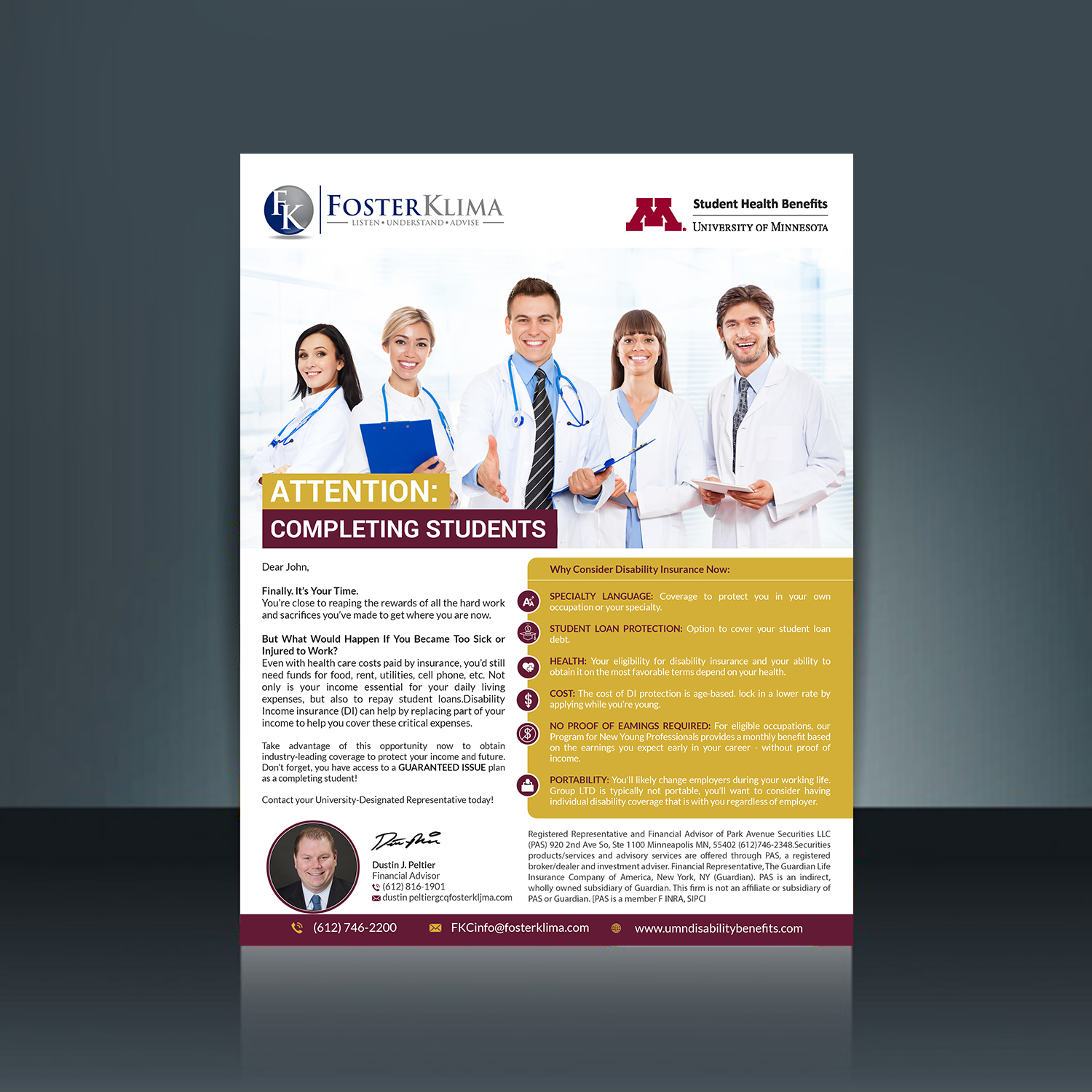
We are an endorsed vendor for disability insurance the the University of Minnesota. We work together with the University to promote this program. They send emails on our behalf but we send some too. I'm not confident the emails we send are as effective as they could be. I have attached examples of 2 versions of the same email we send students and residents. I would love your opinion on how to make these better and shorter. They are emails, not brochures. I have several others but starting with these. I would like to see consistency in all the pieces we email to the students and residents. I also feel like we have to many words in our pieces and they could be shortened up with better word smithing. Once we settle on a design of these emails and better wording I have about 5 other emails I would like to have looked at to coordinate with the one we are doing now. In each of these programs at the University we have an assigned Foster Klima representative. We do want to add their pictures to these too as one of the examples has.
Mises à jour
I forgot to mention that I need both logo's in the email. The Foster Klima logo and the University of Minnesota Office of Student Health Benefits logo. Do you need an electronic version of the email? Let me know. Thanks
Added Wednesday, January 3, 2018
Marché(s) Cible(s)
students and medical residents
Secteur / Type d'entité
Insurance
Styles de police à utiliser
Aspect
Chaque curseur illustre les caractéristiques de la marque client et le style que doit transmettre votre design de logo.
Élégant
Audacieux
Léger
Sérieux
Traditionnel
Moderne
Sympathique
Professionnelle
Féminin
Masculin
Coloré
Conservateur
Économique
Haut de gamme
Exigences
Doit avoir
- Short and worded to the point
- Can use maroon and gold coloring
Bien d'avoir
- Easier to read
Ne doit pas comporter
- Walls of words as students and residents dont have a lot of extra time on their hands.