Tech Blog Web Site Revamp
Vous souhaitez remporter un projet comme celui-ci ?
Ce client a reçu 77 web designs de la part de 21 designers. Il a choisi ce web design de Sixbase comme design gagnant.
Inscrivez-vous Trouvez des Projets de Design- Garanti
-
 US$700
-
 77 designs
-
 21 designers
Brief de Web Design
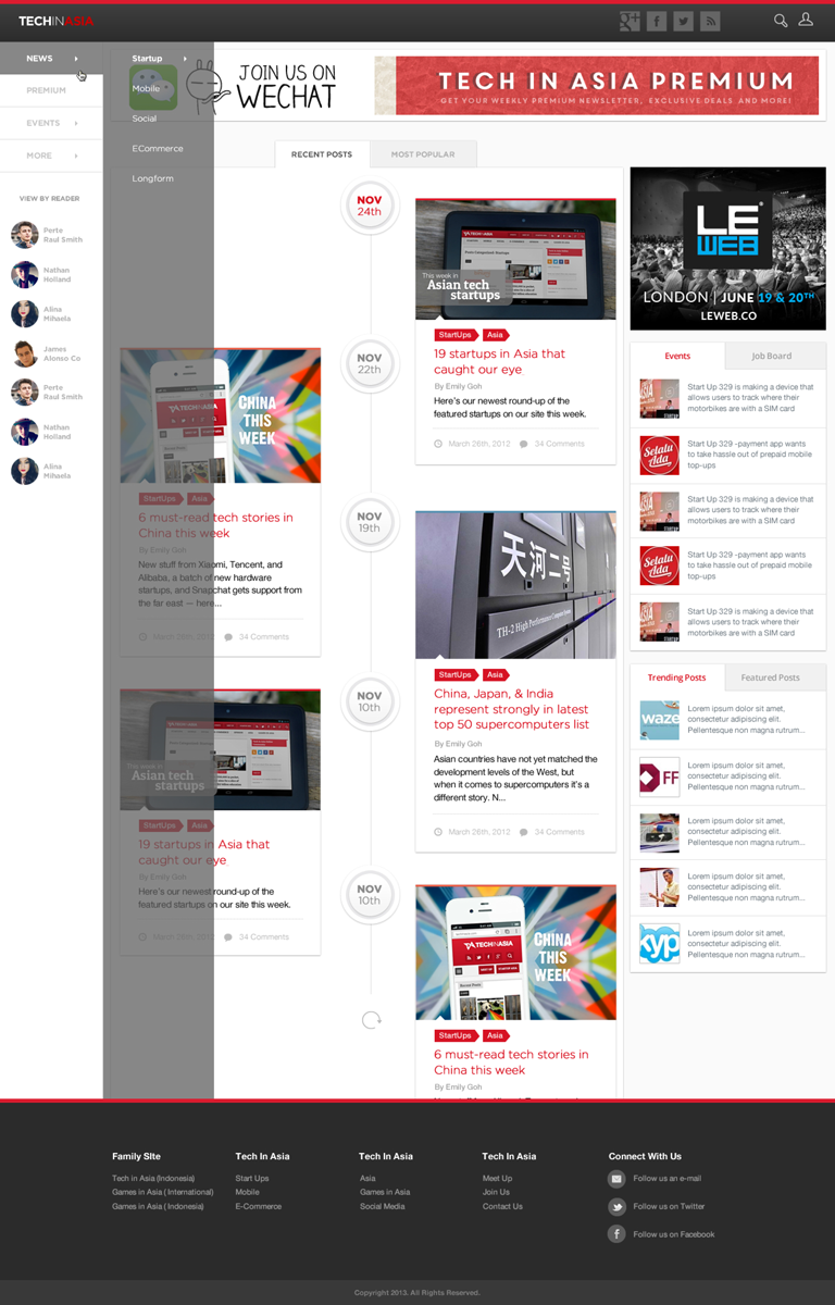
Revamp of the site www.TechinAsia.com.
A few changes to the original site which you may want to implement.
1. You may propose alternative advertisement space which is currently on the top, & a couple of square space on the bottom right.
2. You may propose a new tinge of red, the site may not be base with Red but Red is the company brand colour. You may embed the red subtlely like with www.techcrunch.com
3. Please use the same logo (We are redesigning the logo atm but for now please use same logo
4. 1 set Social media icons rather than 2 as shown on top and under TIA online community
Navigation Bar changes (Updated)
A) News
Trending (Column 1)
Startup
Mobile
Social
E-Commerce
Longform
Country (Column 2)
China
India
Indonesia
Japan
Korea
Vietnam
Philippines
Singapore
Thailand
Malaysia
Pakistan
B) Premium
C) Events
Startup Asia Singapore 2013
Startup Asia Jakarta 2013
Meetups
D) More
Tech In Asia (Indonesia)
Games in Asia (International)
Games in Asia (Indonesia)
Reference site
1. http://www.techcrunch.com/
2. http://www.gamespot.com/
We leave this open ended and want the most creative ideas. Do not be restricted by the current site. When design in PSD please use any banners/images from current www.TechinAsia.com to illustrate to us., Revamp of the site www.TechinAsia.com.
A few changes to the original site which you may want to implement.
1. You may propose alternative advertisement space which is currently on the top, & a couple of square space on the bottom right.
2. You may propose a new tinge of red, the site may not be base with Red but Red is the company brand colour. You may embed the red subtlely like with www.techcrunch.com
3. Please use the same logo (We are redesigning the logo atm but for now please use same logo
4. 1 set Social media icons rather than 2 as shown on top and under TIA online community
5. You may propose a entire new kind of navigation bar. We are actually looking at something like TechCrunch. Level 1 News, Region, Events. Level 2 everything will fall under.
6. You may switch to timeline display. (Refer to reference website)
Reference site
1. http://www.techcrunch.com/
2. http://www.gamespot.com/
We are looking for top-notch UI/UX different from most site so we leave this open ended and want the most creative ideas. If your initial design is good we will then ask you to refine the minor components. Do not be restricted by the current site. When design in PSD please use any banners/images from current www.TechinAsia.com to illustrate to us.
IMPT : Kindly propose Desktop design. However upon winning the competition, we need you to come up with the Tablet & Mobile version as well (Landing Page only).
Winner of the competition may be engaged(paid hourly) to design the rest of the pages as well.
Mises à jour
Hi all,
Added Tuesday, November 26, 2013
Please read the updated mus haves. Including the writers column.
Added Tuesday, November 26, 2013
Secteur / Type d'entité
It Company
Aspect
Chaque curseur illustre les caractéristiques de la marque client et le style que doit transmettre votre design de logo.
Élégant
Audacieux
Léger
Sérieux
Traditionnel
Moderne
Sympathique
Professionnelle
Féminin
Masculin
Coloré
Conservateur
Économique
Haut de gamme
Exigences
Doit avoir
- - Single column stream of posts
- Top posts of the week
- Navigation bar on the left
- Tumblr/Instagram style - infinite scroll feed style
- View by readers segment from http://allthingsd.com/
- Remove the top long horizontal banner ('Join us on WeChat')
- Remove all advertisements on the bottom right.
- Add a advertisement banner 300x250 here. https://storage.googleapis.com/support-kms-prod/SNP_2954603_en_v0
Bien d'avoir
- Reduce the amount of navigation ( All in one page )
Filtering of news based on user's preferences