Postcard design for online testing software
Vous souhaitez remporter un projet comme celui-ci ?
Ce client a reçu 66 designs de carte postale de la part de 21 designers. Il a choisi ce design de carte postale de Alexandar comme design gagnant.
Inscrivez-vous Trouvez des Projets de Design- Garanti
-
 US$190
-
 66 designs
-
 21 designers
Brief de Design de Carte Postale
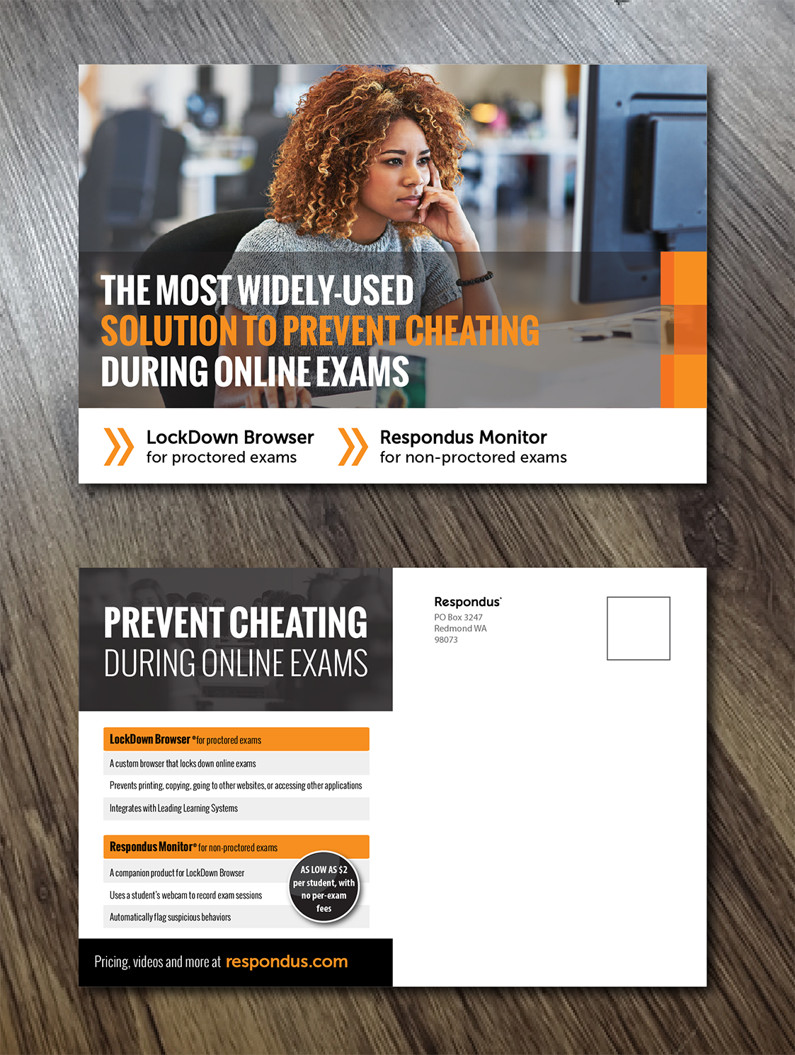
We need a postcard designed to promote two software applications for our online testing services, LockDown Browser and Respondus Monitor. These applications prevent cheating during online tests for colleges and universities. The audience includes distance learning managers, professors, IT administrators, and other faculty and staff.
We're seeking clean, professional and bright postcard designs that are eye-catching. The front will feature a striking, high quality photo of a student (teenager/early 20s, natural looking - not like a model) focused on taking an exam on a laptop or computer. It will also have a headline and product names. The back will include a tagline, 2 products with 2-3 bullets for each, and a call to action, along with mailing spaces.
Colors should be bright but appealing, featuring blue, green, or orange. Fonts should be contemporary, clean sans serif.
Details and content/text can be found on Word doc attached.
Marché(s) Cible(s)
Educators and administrators at colleges and universities
Secteur / Type d'entité
Education
Styles de police à utiliser
Couleurs
Couleurs choisies par le client et à utiliser dans le design de logo:
Aspect
Chaque curseur illustre les caractéristiques de la marque client et le style que doit transmettre votre design de logo.
Élégant
Audacieux
Léger
Sérieux
Traditionnel
Moderne
Sympathique
Professionnelle
Féminin
Masculin
Coloré
Conservateur
Économique
Haut de gamme
Exigences
Doit avoir
- The design must have a clean, professional design; a high quality photo of a student who looks like they could be taking an online test; an easy-to-read layout without extraneous visual elements that would distract from the text.
Ne doit pas comporter
- The design should not use colors that are pastel or too soft. The design should NOT pick up colors or elements from our main webpage at www.respondus.com, including the overlapping circles used on the site background.