FinancialAdviser.com Site Redesign
Vous souhaitez remporter un projet comme celui-ci ?
Ce client a reçu 52 web designs de la part de 10 designers. Il a choisi ce web design de pb comme design gagnant.
Inscrivez-vous Trouvez des Projets de Design- Projet Lié 1
-
 US$520
-
 52 designs
-
 10 designers
Brief de Web Design
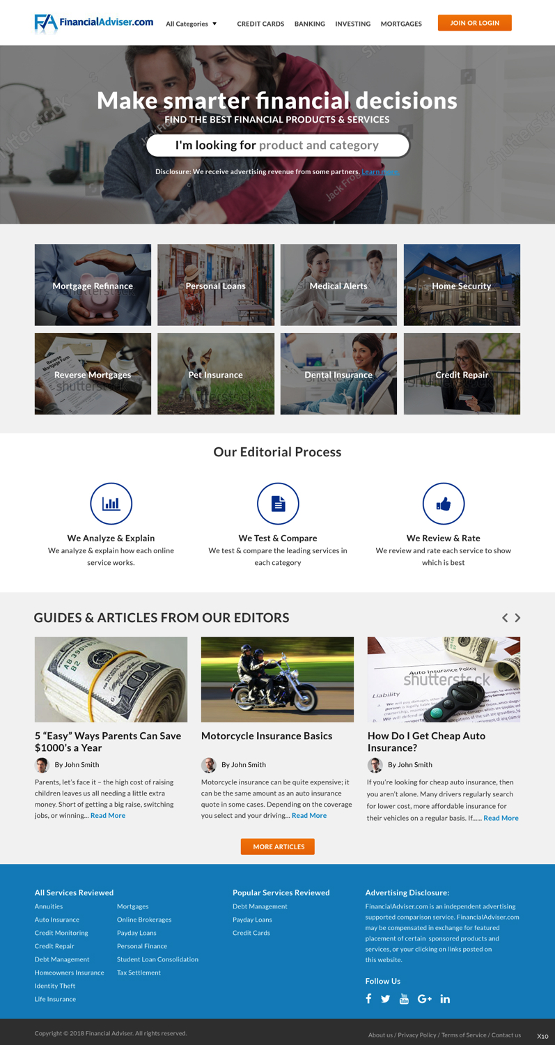
We are looking to redesign our FinancialAdviser.com site. This site is focused on helping consumers make smart financial decisions. We provide reviews and articles in various categories.
We are looking for a responsive design to run on wordpress. We will also have adsense advertisements on our page and will want some ad spot space. We are thinking of two column design vs. single column.
Here is an example of what our competitors look like:
ConsumersAdvocate.org (mostly reviews vs. articles)
Homepage - https://www.consumersadvocate.org/
Category Review Listing - https://www.consumersadvocate.org/mortgage-refinance/best-mortgage-refinance
Individual Review - https://www.consumersadvocate.org/mortgage-refinance/c/lending-tree-mortgage-refinance-review
- I like that the site is extremely clean. I like the fixed header in mobile
NextAdvisor
Homepage - https://www.nextadvisor.com/
Category Review Listing-https://www.nextadvisor.com/auto_insurance/index.php
Individual Review- https://www.nextadvisor.com/auto_insurance/geico_review.php
Articles - https://www.nextadvisor.com/blog/2017/11/20/going-on-a-holiday-road-trip-be-prepared-for-these-hazards/
What I Like? I like the two column layout in that it gives room for advertising.
What I Do NOT Like? The top navigation is a little cumbersome and old. Mobile view is not very good. Content seems a bit cluttered.
NerdWallet
Homepage - https://www.nerdwallet.com
Category Review Listing - https://www.nerdwallet.com/blog/insurance/best-car-insurance-companies/?trk=nw_gn1_4.0
Individual Review- https://www.nerdwallet.com/blog/insurance/amica-insurance-review/
What I Like? very clean. Like the use of white space and focus on bright color call to action buttons.
What I Do NOT Like? In mobile a lot of content is pushed below the fold because of the large image above the fold. Reviews are not well organized.
Mises à jour
Need extra days to review
Need extra days to review
Marché(s) Cible(s)
consumers interested in saving money and making smart financial decisions
Secteur / Type d'entité
Financial
Texte du logo
FinancialAdviser.com or FinancialAdviser
Code
Codé - Design et Code demandé
Nombre de Pages Demandé
5+ page
Styles de police à utiliser
Couleurs
Le designer choisit les couleurs à utiliser dans le design.
Aspect
Chaque curseur illustre les caractéristiques de la marque client et le style que doit transmettre votre design de logo.
Élégant
Audacieux
Léger
Sérieux
Traditionnel
Moderne
Sympathique
Professionnelle
Féminin
Masculin
Coloré
Conservateur
Économique
Haut de gamme
Exigences
Doit avoir
- -responsive design
- -room for ad space in the right column
Bien d'avoir
- -good use of white space
- -clean layouts
Ne doit pas comporter
- -clutter
Paiements
Total
US$520
Date limite du projet
01 janv. 2018 20:32:52 UTCOptions du projet
Projet(s) Lié(s)
- offrant un design de logo de US$69 au gagnant