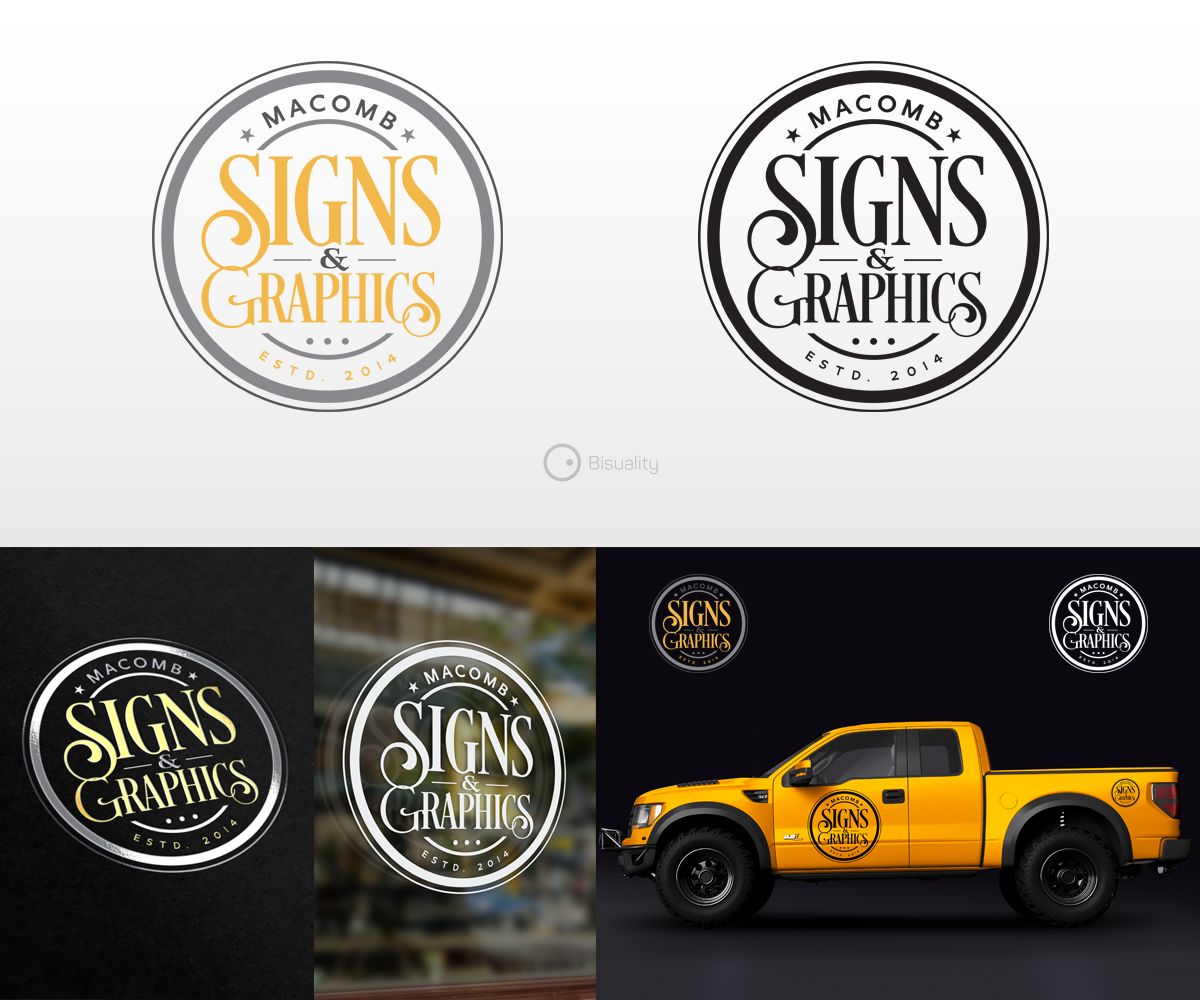
Company Logo for Macomb Signs and Graphics
Vous souhaitez remporter un projet comme celui-ci ?
Ce client a reçu 167 designs de logo de la part de 41 designers. Il a choisi ce design de logo de Bisuality comme design gagnant.
Inscrivez-vous Trouvez des Projets de Design- Garanti
-
 US$150
-
 167 designs
-
 41 designers
Brief de Design de Logo
I need an updated, professional look for my sign and graphics company.
I have designed dozens of my own ideas but unfortunately I will never decide on my own logo. I need to leave the creation to someone else! My creativity and skill only go as far as my indecisiveness will allow. Because my company offers creative services, it is important for me to have a more creative logo to help represent what I can do and look more professional and exciting.
I am attaching some sample images, including what my old (first file) and current (2nd file) "boring" logo looks like, as well as some ideas I've come up with, followed by some designs that I've seen which I like.
Mises à jour
Need extra days to review
Marché(s) Cible(s)
Small businesses, contractors, retail stores.
Secteur / Type d'entité
Outdoor Sign
Texte du logo
Macomb Signs & Graphics
Styles de logo qui vous intéressent
Logo d'Enseigne
Logo contenu dans une forme
Styles de police à utiliser
Couleurs
Le designer choisit les couleurs à utiliser dans le design.
Aspect
Chaque curseur illustre les caractéristiques de la marque client et le style que doit transmettre votre design de logo.
Élégant
Audacieux
Léger
Sérieux
Traditionnel
Moderne
Sympathique
Professionnelle
Féminin
Masculin
Coloré
Conservateur
Économique
Haut de gamme
Exigences
Doit avoir
- I want my logo to have a vintage/retro appeal but still somewhat contemporary. I would like the design to contain a banner graphic, some sort of unifying shape (circle, polygon, etc.) or "badge" style. I'm okay with random lines, stars, accents,etc.
Bien d'avoir
- I like the idea of an inline font, script font, and/or other simple retro fonts, or combination of these. 3D, chiseled or dimensional letters are nice.
- I prefer the ampersand instead of the word "and", which can be used as a creative element in the logo as well. "Macomb Signs & Graphics" is how it should read. I feel that emphasis should be on the word SIGNS. As an option, "Established 2014" can appear somewhere to help balance it out.
Ne doit pas comporter
- I do NOT want to look like a sign painter or classic sign artist. My media is vinyl graphics, not gold leaf, painting or metal. I don't want it to look too weathered or antique. The image should be easy to reproduce in computer-cut vinyl or printed media.