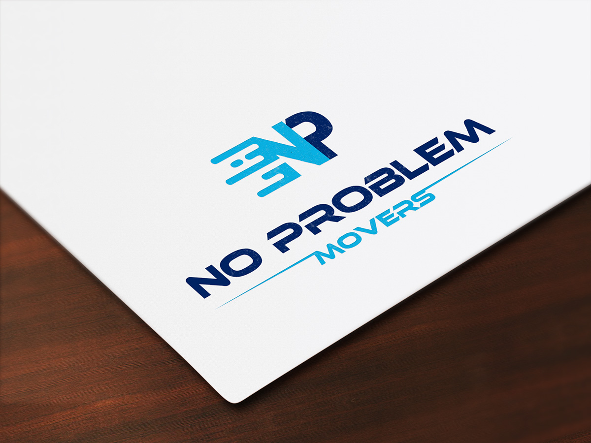
Moving Company Logo for "No Problem Movers"
Vous souhaitez remporter un projet comme celui-ci ?
Ce client a reçu 284 designs de logo de la part de 114 designers. Il a choisi ce design de logo de D Creative comme design gagnant.
Inscrivez-vous Trouvez des Projets de Design- Garanti
-
 US$420
-
 284 designs
-
 114 designers
Brief de Design de Logo
A logo for No Problem Movers, a moving company in the San Francisco Bay Area. No Problem Movers has been in business for over 30 years and has the experience to move a home or business safely and effectively. At No Problem Movers we pride ourselves on serving our customers well. Each member on staff is not only a skilled mover with the muscle handle large items, but they are also great communicators that can help address any needs that arise in the project.
We would like to see a design that includes blue as it's core color but are open to secondary colors to compliment the blue. The design should be simple and able to stand on it's own in black. We would like to see an icon element as a part of the logo instead of just a wordmark. Like the Apple logo, we'd like to be able to have the icon stand alone at times for things like an app icon. The logo is planned for application in embroidered t-shirts, large truck wraps and everything in between. The logo should be masculine, bold, and communicate the quality and dedication of the organization.
Try to avoid using heavily the generic representations of moving such as a box or truck. Not that that type of imagery can't be used, we just want to get across that this company is about serving people and not just about moving stuff.
Current business cards are attached to give a sense of the current branding and color used.
Marché(s) Cible(s)
Professionals in their late 30s that are busy working in Silicon Valley and need a trusted mover to transport their valuable belongings.
Secteur / Type d'entité
Mover
Texte du logo
No Problem Movers
Styles de logo qui vous intéressent
Logo pictural
Un objet réel (texte facultatif)
Logo abstrait
Conceptuel / symbolique (texte facultatif)
Styles de police à utiliser
Couleurs
Couleurs choisies par le client et à utiliser dans le design de logo:
Aspect
Chaque curseur illustre les caractéristiques de la marque client et le style que doit transmettre votre design de logo.
Élégant
Audacieux
Léger
Sérieux
Traditionnel
Moderne
Sympathique
Professionnelle
Féminin
Masculin
Coloré
Conservateur
Économique
Haut de gamme
Exigences
Doit avoir
- Logo must be strong both in color and black and white.
Bien d'avoir
- Clever use of white space like the FedEx logo.
Ne doit pas comporter
- Complex elements that get lost at small sizes. Feminine style lettering or feel.