

 Rafraîchir
Business Intelligence Application - Reporting Menu and Report Criteria Design
Vous souhaitez remporter un projet comme celui-ci ?
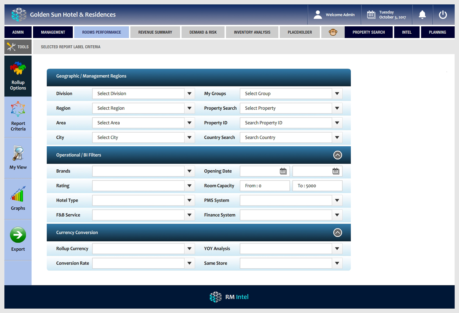
Ce client a reçu 69 web designs de la part de 6 designers. Il a choisi ce web design de -Marc- comme design gagnant.
Inscrivez-vous Trouvez des Projets de Design
- Garanti
-
 €365
€365
-
 69 designs
-
 6 designers
Brief de Web Design
Looking for a fresh, effective and user friendly view for the menu structure and reporting criteria screen format for a business reporting application. Initial format completed, content structure is in place, but we need the 'wow' design.. as its a serious professional report/BI tool it has to fall within certain guidelines for clarity and graphics..but we want it to be slick, friendly, great user experience. There is a large amount of complex content to fit into a small space and we need it to be very inviting, modern and intuitive.. If interested, please review the attachment. We have live screens in operation, but feel these could be improved and looking forward to seeing what great creative suggestions could be made. Please review work done to date in the attached.. We are not looking for a total re-design of everything, all the basic business content/structure is there.. but tell us what we could do to improve this in terms of graphic design... particularly the criteria screens.. thanks!

Mises à jour
Project Deadline Extended
Reason: Need a few more days to review designs - thanks for all submissions so far, we will make a selection shortly.
Added Saturday, October 14, 2017
Marché(s) Cible(s)
Business analysts, hotel operations teams, finance analysts hospitality industry
Secteur / Type d'entité
Hospitality
Code
Codé - Design et Code demandé
Nombre de Pages Demandé
4 page
Styles de police à utiliser

Autres polices appréciées:
- Candara, please see example in deck
Couleurs
Couleurs choisies par le client et à utiliser dans le design de logo:
Aspect
Chaque curseur illustre les caractéristiques de la marque client et le style que doit transmettre votre design de logo.
Élégant
Audacieux
Léger
Sérieux
Traditionnel
Moderne
Sympathique
Professionnelle
Féminin
Masculin
Coloré
Conservateur
Économique
Haut de gamme
Exigences
Doit avoir
- sharp clear, logical menu structure, (currently it has 'clicks to sub-menus, we need hover over, slide to sub-menus..) colour, styling.. and most focus on revision of criteria.. right now is somewhat heavy, cumbersome.. keep colour and friendly intuitive process steps.. its heavy analytical stuff.. best of luck!
Ne doit pas comporter
- No grey fonts on white or grey screens! many business apps are not readable or sharp.. or fonts are too small.. colourless, so please avoid that.. see our deck - sharp dark (navy) or black fonts on white, or light shading..