Corporate Identity - Visual language plus examples
Vous souhaitez remporter un projet comme celui-ci ?
Ce client a reçu 6 designs graphiques de la part de 3 designers. Il a choisi ce design graphique de OneSource Creative comme design gagnant.
Inscrivez-vous Trouvez des Projets de Design- Garanti
-
 US$500
-
 6 designs
-
 3 designers
Brief de Design Graphique
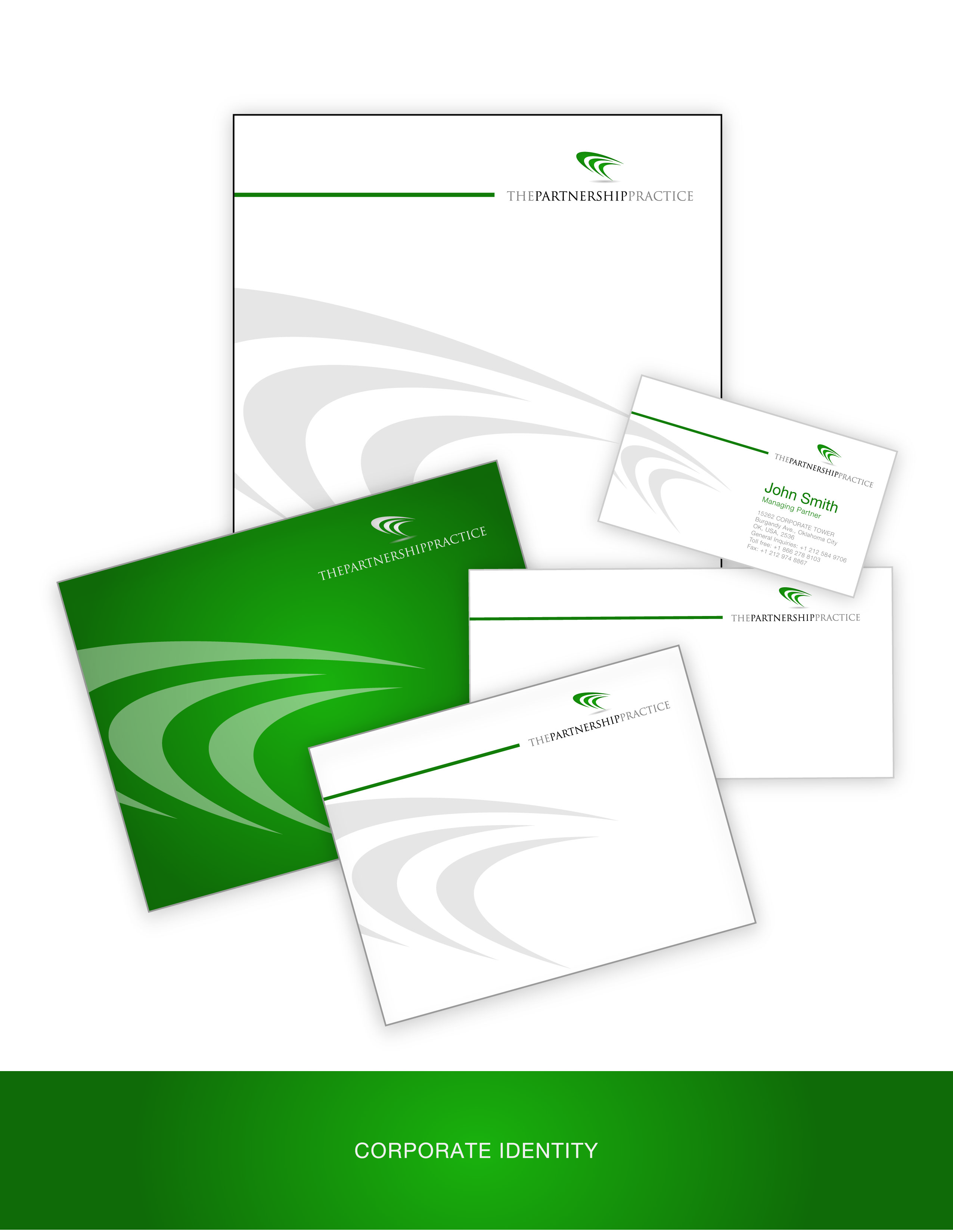
The Partnership Practice is a new marketing services company that specialises in finding, negotiating and leveraging partnerships.
For example, we might create a partnership between a beer brand and a basketball team ; a bank and a music event ; or a gas company and an Arts festival.
The business has 3 main areas of expertise - 1. Brand partnerships, 2. Business partnerships and 3. Partnership services.
The Partnership Practice has finalised a logo (see attached final logo jpeg and eps file for materials) and the business now needs a visual identity creating.
This visual identity will be used for everything from powerpoint to invoices, from the website to business cards. Therefore it has to easily work across many formats.
Marché(s) Cible(s)
The company is targeting large corporations of all kinds. All over the world.
This means the business has to be taken seriously so we cannot rely on gimmicks, stock or simple design styles.
We also need a fresh contemporary feel (to demonstrate creativity).
Secteur / Type d'entité
Graphic Design
Exigences
Doit avoir
- To ensure we have the right identity, we want you to propose a visual style and demonstrate how it works over the following materials :
1. Powerpoint template (title page and inside slide seperatey)
2. Business Card.
3. Letterhead.
4. HomePage visual (the company landing page). Attached is a topline site map for you to see what content we will be looking at including when we go live. Just focus on the homepage for now.
Things that the designer should consider :-
- Simple and clear, not too busy or cluttered !
- Clever, clever, clever - the business must look and feel dynamic !
- Be careful with color - should compliment green in logo and typeface if using other colors.
- Tone : fresh, dynamic, makes a statement
- Just like in the logo, the visual identity should reflect movement....partnership is a journey after all
- You may find it useful to consider that there are always 3 parties in our business dealings - the two partners and our business as the consultant (therefore you see the 3 parts to the icon in our logo).
Bien d'avoir
- Other examples of the style being brought to life would be nice to have but not necessary.
I think we will pobably be best working of a white base because solid color rarely translates easily into all materials. That being said the green in the logo could be a nice color to use on one side of the business card and one side of an invoice.
We like the soft green in the logo.
I have thought about different forms of movement e.g. electrical current. Maybe there is something in this thought ?
Ne doit pas comporter
- No use of simple design values - this brief will not be cracked with basic visual styling.
No use of imagery in business cards, stationary, or powerpoint. Imagery is just for online (see homepage ppt).