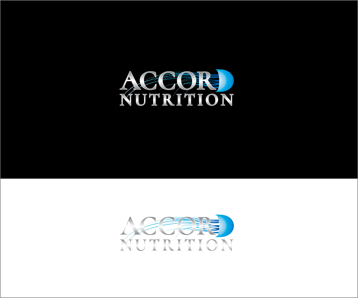
Nutritional supplement company needs a logo that reflects our values

Vous souhaitez remporter un projet comme celui-ci ?
Ce client a reçu 232 designs de logo de la part de 58 designers. Il a choisi ce design de logo de bijuak comme design gagnant.
Inscrivez-vous Trouvez des Projets de Design- Garanti
Brief de Design de Logo
Apologies in advance for the long description.
Accord Nutrition is an emerging nutraceutical supplement brand. We are focused on delivering the latest research results in the fields of longevity and metabolic optimization. We want our customers' biochemistry to operate at peak efficiency, so they can enjoy a higher quality of life, with an increased lifespan.
We chose the name Accord Nutrition for the meaning of harmony, agreement. We believe that our nutrition needs to work in concert with our genetics and biochemistry. Using the latest research, and making sure there is a consensus agreement in the scientific community about the usefulness of the chemical compounds being studied, forms the basis of how we select the ingredients for our supplements.
Our logo should reflect a sense of harmony, or balance, between our body, metabolism, nutrition and research. Of using our minds to improve the function of our body. There is no specific requirement on how concrete or abstract our logo should be, what colors to use, or anything else. We want to keep an open mind and let the designers express themselves to the best of their ability. We trust that our customers will understand the meaning of the logo, so please feel free to submit any design you believe will make our brand stand out.
A few things I would like to note:
(1) I am planning on using the Cormorant font for the website and for any printed materials. I would like the logo to either use it as well, or to work well with it
(2) I want to use jellyfish as a subtle theme for the company, for two reasons: the products are meant to help increase longevity, and the immortal jellyfish are the ultimate goal to strive for, and we seek to show the same transparency to our customers as the jellyfish shows to our world
(3) Something I thought could work is a black background with white text, and neon light blue colors (see http://www.accordnutrition.com)
Marché(s) Cible(s)
Educated customers who care about their health
Secteur / Type d'entité
Nutrition
Texte du logo
Accord Nutrition
Styles de police à utiliser
Autres polices appréciées:
- Cormorant (not dead set on it, something I liked)
Couleurs
Le designer choisit les couleurs à utiliser dans le design.
Aspect
Chaque curseur illustre les caractéristiques de la marque client et le style que doit transmettre votre design de logo.
Élégant
Audacieux
Léger
Sérieux
Traditionnel
Moderne
Sympathique
Professionnelle
Féminin
Masculin
Coloré
Conservateur
Économique
Haut de gamme
Exigences
Ne doit pas comporter
- I don't want to have designs that include plants, fruit, flowers, etc.