rework current logo's + add new one same style
Vous souhaitez remporter un projet comme celui-ci ?
Ce client a reçu 31 designs de logo de la part de 9 designers. Il a choisi ce design de logo de Freddie Paul comme design gagnant.
Inscrivez-vous Trouvez des Projets de Design- Garanti
-
 €100
€100
-
 31 designs
-
 9 designers
Brief de Design de Logo
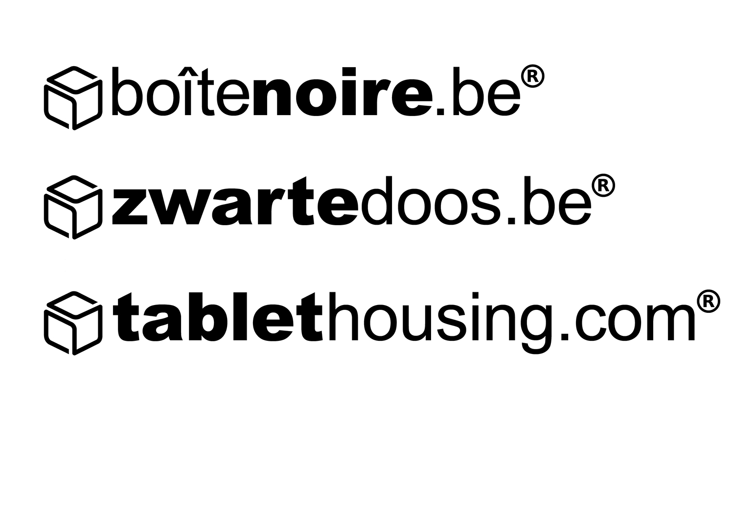
Rework current logo's :
- thickness of box symbol must be aligned with non bold character font drawing line's thickness
- be mindful of white spacing in symbol, we think it is better this is uniformed spaced (beginning, end and side/top size face)
- respect uniform spacing and gridlines over the total logo (text top & bottom should be aligned to top & bottom of the sides heights of the logo symbol
- new logo based on same design guidelines for product name "Tablethousing.com" (tablet in bold)
- size of symbol part and font size should be same for 3 variations
- input is requested how visually the right alignement vertically is done between first symbol part and text part.
Current logo's need to be put also in vector format.
Obviously is everbody with a bright out-of-the-box idea welcome : we are open for it
Mises à jour
Project Deadline Extended Reason: No realistic deadline. Sorry for this. Added Sunday, September 17, 2017
Texte du logo
See current enclosed logo's. (zwartedoos.be, boîtenoire.be, tablethousing.com)
Styles de logo qui vous intéressent
Logo abstrait
Conceptuel / symbolique (texte facultatif)
Styles de police à utiliser
Autres polices appréciées:
- Arial & Arial Black
Aspect
Chaque curseur illustre les caractéristiques de la marque client et le style que doit transmettre votre design de logo.
Élégant
Audacieux
Léger
Sérieux
Traditionnel
Moderne
Sympathique
Professionnelle
Féminin
Masculin
Coloré
Conservateur
Économique
Haut de gamme
Exigences
Ne doit pas comporter
- Color