

 Rafraîchir
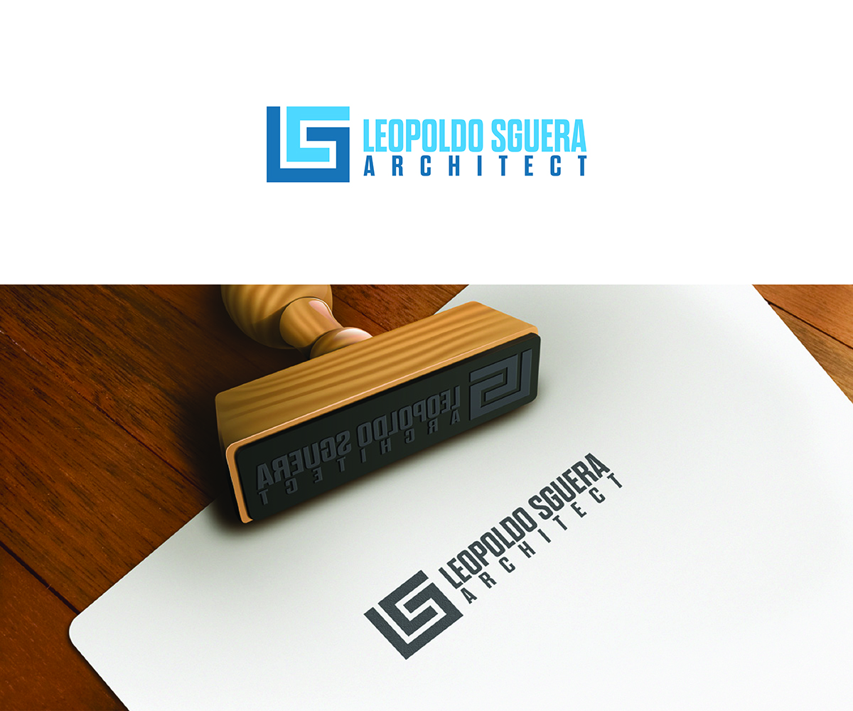
Logo and Business Card Design for an Architecture Office in New York
Vous souhaitez remporter un projet comme celui-ci ?
Ce client a reçu 274 designs de logo de la part de 65 designers. Il a choisi ce design de logo de Logico Artlines comme design gagnant.
Inscrivez-vous Trouvez des Projets de Design
- Garanti
-
 US$150
-
 274 designs
-
 65 designers
Brief de Design de Logo
We need a new logo for an Architecture office located in New York City. We are a small firm specializing in residential and hospitality projects. We are extremely good at spatial concepts along with exquisite detailing that reverberates with overarching spatial ideas.
We would like the design to work equally well on a white background and on a dark background. We are inspired by the use of negative space in Hanko/Inkan stamps from Japan as they allude to fine Japanese carpentry and detailing. The owner of the company and principal architect is Italian and there is fine craftsmanship in his home country as well (specifically in architecture, textiles, machinery, autos, etc). We are also interested in celtic or knot patterns as an inspiration but do not want anything that is not easily legible. The line work and detailing in the logo should be at once simple yet subtly complex.
The final design should communicate solidity, trust and refinement yet be fresh, exciting and based in the futuristic or abstract. We would prefer modern, abstract and geometric logo designs with the brand letters L and S (for Leopoldo Sguera) and possible variations with LSA (for Leopoldo Sguera Architect). Please see the basic design direction for the logo on our website www.leopoldosguera.com (logo sketch on upper left).
The Font should be modern yet mature and refined so that it does not become tiresome to look at. Our target market is a person who is 40-70 and has amassed enough money to build architectural projects at this point in their life. However, they probably have a hard time reading something too complex when it is small.
We have not yet decided on a hint of what color will appear very subtly on the website and on the business cards as of yet. We are open to your ideas on that but the use of color must be minimal and refined. We really try, in all our work, to amplify the existing light and shadow patterns we find through subtle composition and detailing to make it feel magical. We are inspired by architects who do this sort of alchemy on a daily basis: RCR Architects, Herzog and Demeuron, Jean Nouvel (see reference images). We would like the logo to allude to this type of alchemy or magic or shift in perception.
The design must work well in black and white when color is not available. We would like to use the logo alone as well as along side the text: Leopoldo Sguera Architect. This text should be placed to the right of the logo. The logo should be designed to work well next to the text.
Thanks in advance to all who participate!

Mises à jour
Project Deadline Extended
Reason: I have extended the deadline for the project as I am still not satisfied that we have arrived at the best design. Perhaps 5 days was too short. I am hoping some of the designs will be further developed and resubmitted. I would like all designers from this point forward to stay closer to the original design sketch (on my website) but have more detail added to that sketch.
Added Monday, September 18, 2017
Marché(s) Cible(s)
35-75
Secteur / Type d'entité
Architecture
Texte du logo
Leopoldo Sguera Architect
Styles de logo qui vous intéressent
Logo d'Enseigne
Logo contenu dans une forme



Logo abstrait
Conceptuel / symbolique (texte facultatif)



Logo mot symbole
Logo (texte seulement)


Logo de Lettermark
Acronyme ou logo texte (texte seulement)



Styles de police à utiliser

Couleurs
Le designer choisit les couleurs à utiliser dans le design.
Aspect
Chaque curseur illustre les caractéristiques de la marque client et le style que doit transmettre votre design de logo.
Élégant
Audacieux
Léger
Sérieux
Traditionnel
Moderne
Sympathique
Professionnelle
Féminin
Masculin
Coloré
Conservateur
Économique
Haut de gamme
Exigences
Doit avoir
- See description
- SQUARE LOGO
- TEXT TO THE RIGHT OF THE LOGO (NOT below the logo)
Bien d'avoir
- See description
- two letter "L"s bracketing the "S" (See sketch logo on the website. See description for website)
Ne doit pas comporter
- See description
- Any houses, buildings, compasses, pencils, triangles, etc. The design should be abstract and universal. Not literal.
- The design should not be based on the letter A. It should be based on the letter "L" and "S" only. If the letter A is included it would only be considered if it was very subtle and much less important than the other letters.


