Guarenteed! - Homepage Website Design - Coding not required- Winner to complete further pages
Vous souhaitez remporter un projet comme celui-ci ?
Ce client a reçu 107 web designs de la part de 17 designers. Il a choisi ce web design de Fuxxo Works comme design gagnant.
Inscrivez-vous Trouvez des Projets de Design- Garanti
-
 US$500
-
 107 designs
-
 17 designers
Brief de Web Design
Hi all,
We're looking at redesigning our current website with a few adjustments to other pages but the main adjustments will be on the homepage which is what this design request is for. Please note : any of these ideas can be changed if you have something particularly different / special in mind etc.
P.S Coding is not required, just a design.
- Our website -
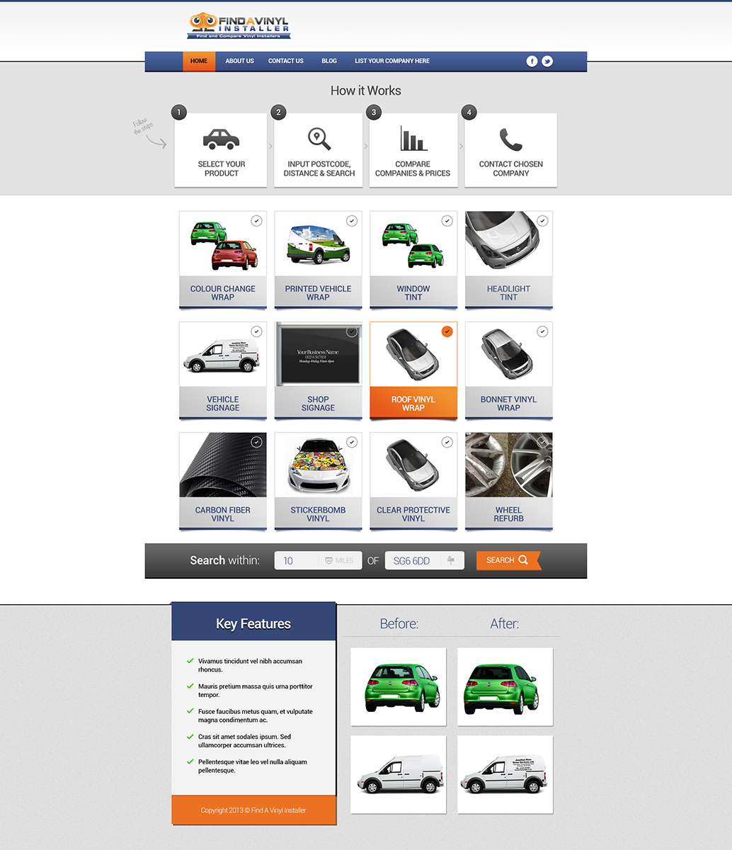
Our website is simply a price comparison website that allows customers to find companies within their area at the best price. The products available are mostly related to the vehicle trade and all refer to vinyl. This includes the likes of vehicle window tint, vehicle colour change vehicle wrap, vehicle signage as well as other cosmetic vinyl modifications. We allow the customer to search for their product within their chosen area and receive a list of companies who supply their product within that area. From here they can compare prices and view further details on the company.
- What we're looking to do -
We're looking first of all to adjust how the website homepage is displayed, this includes adding images and adjusting the colours that are explained below:
First of all, we look to spread out each of the 12 products (which can be seen on the website as it stands) and add an image to each of the products (all being spaced out as shown in our sketch)
We've been told the website looks too busy so we're thinking if we adjust the colours to more simplier neutral colours as well as the main focus of the website being on the 12 images, that would be great.
- Logo + Banner -
Logo to remain top left although banner may be removed / adjusted to make simplier.
- Colours -
Adjustments - Colours shades
We want the website to still look exciting but simplify the colours. Needs to be kept up to date with the colours / textures etc (bright colours to highlight keypoints)
We're still looking to use either blue or orange or maybe both to highlight these keypoints but the main website to be light colours and maybe even black on white background. The entire homepage can be adjusted colour wise if you feel it fits into your theme including menu bars, banners etc. The key is to get this right with being not too overpowering with the colours but still look interesting and up to date.
- 1 - 4 steps banner - (text may change)
This sits just under the logo and explains to the user how easy the website is to use and the steps they need to take. This may change to a 1 - 5 steps but we're looking to have this designed once the overall colours / theme of the website is sorted.
- 12 images - 4 x 3
This is the main focus of the website and will be the main focus of what the customer sees first of all. This will be where they select their product and then underneath, enter their postcode and distance they would like to search within. As explained further up, we have some of the product images available so if you can where possible add these to the design and then duplicate the images on those we currently don't have available.
- 12 Images -Titles -
These titles will be in this order from left to right and etc
- Colour Change Wrap
- Printed Vehicle Wrap
- Window Tint
- Headlight Tint
- Vehicle Signage
- Shop Signage
- Roof Vinyl Wrap
- Bonnet Vinyl Wrap
- Carbon Fibre Vinyl
- Stickerbomb Vinyl
- Clear Protective Vinyl
- Wheel Refurb
Text to be quite large, centered and with the o to the left of the title. Short titles like 'Window Tint' should fit on one line in the middle of the box where as titles such as ' Stickerbomb Vinyl Wrap' should have the 'Stickerbomb Vinyl' on the first line with the 'Wrap' on the line below. The background of this text is up to experient, might be worth just a simple colour or it might be worth using a bright blue or orange to keep in with the theme of the logo etc.
These will also have the circle tick box to the left of the title (as on the current website) where the customer clicks to select the product they have available.
We were also thinking that if when the customer ticks the circle on their selected box, the box is highlighted in some way to show this.
- Search Block -
This will appear under the 12 images and allows the customer to input their postcode and distance for the search criteria. Colours on this can of course be adjusted to keep in theme with the website.
- Under the 12 Images -
- Block underneath the 12 images and search block -
To the left will be some key bullet points about the website - maybe 4 or 5 with a green tick to the left of this. Background colour will probably be best to be a light colour, possibly grey.
Then to the right of this will appear 4 images, 2 before and 2 after when applying these products. Images to be used aren't fully decided on and we would like this stage of the design left to the end when the rest of the theme etc have been decided on.
Attached images are as follows :
- How the website looks as it stands
- The fold line on the website (obviously important)
- Our rough sketch of how we'd like the website homepage to look.
- We have 7 of the images ready that are all attached in this one file. Please duplicate the images on those that currently don't have the image available.
We will also be requesting a website developer to put this into action if our current designer falls through so please feel free to contact us if potentially interested.
The layout can change if you can think of something particular different / unique that works with this design. The main idea is to not only get the 12 products on view to the viewers but also the keypoints and before and after images.
Any questions, please ask away as we're bound to have forgotten a few things.
Thanks and good luck!
Mises à jour
Hi all, keep the designs coming.
Added Thursday, November 07, 2013
Hi all, this is a message to all the designers.
Added Thursday, November 07, 2013
Hi,
Added Tuesday, November 12, 2013
Thank you to everyone for your time and efforts with the design. It's hugely appreciated so thank you all once again.
Added Thursday, November 14, 2013
Secteur / Type d'entité
Trade
Styles de police à utiliser
Aspect
Chaque curseur illustre les caractéristiques de la marque client et le style que doit transmettre votre design de logo.