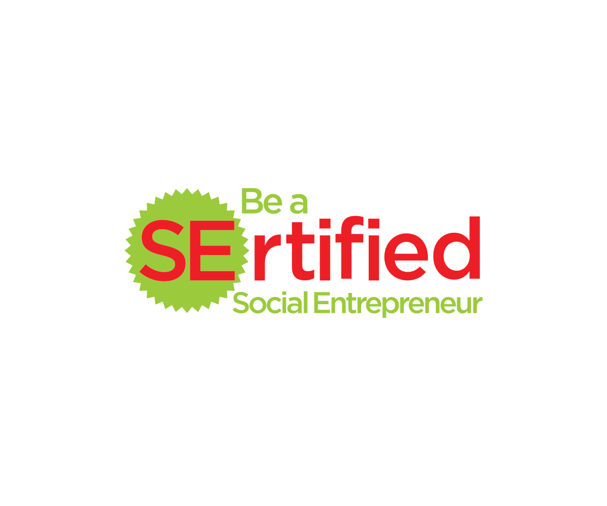
SErtified logo design that helps people to understand why it is spelled with an "S"
Vous souhaitez remporter un projet comme celui-ci ?
Ce client a reçu 161 designs de logo de la part de 52 designers. Il a choisi ce design de logo de Meong comme design gagnant.
Inscrivez-vous Trouvez des Projets de Design- Garanti
-
 US$150
-
 161 designs
-
 52 designers
Brief de Design de Logo
We are changing the name of Grassroots Entrepreneur Mission due to a trademark dispute. You can learn more about our mission by visiting http://gem.org. The new domain will be SErtified.org.
Please create a draft logo for SErtified that plays on the "S" as in "Social" and the "E" as in "Entrepreneur" without creating a separate and redundant "SE".
SErtified.org is a philanthropic endeavor to inspire and support wanna-be social entrepreneurs in earning a social entrepreneur certificate.
The tagline is "Be a SErtified Social Entrepreneur".
Mises à jour
Project Deadline Extended Reason: Designers:Thank you. I love the designs so far and I've learned that my "brief" wasn't complete enough. I've updated it. I'm really impressed with the designs that have incorporated a "badge" or "seal" into the logo and I'd like to allow more time to see where this takes us. We issue badges as people progress toward earning their Social Entrepreneur Certificate. I like putting a badge around the "SE" in "SErtificate". I also like the concept of putting then entire logo inside a badge / seal creating a round-ish logo.We don't need a separate standalone "SE". We also don't need random icons and imagery like swirls. Hearts can represent philanthropy and light bulbs can represent ideas and nobody incorporated that symbolism (yet), although this is NOT required, just ideas.Many thanks!John Added Tuesday, August 1, 2017
Marché(s) Cible(s)
Both individuals and corporate human resource departments. Please see http://gem.org to get a better idea.
Secteur / Type d'entité
Non-Profit
Texte du logo
SErtified Be a SErtified Social Entrepreneur
Styles de logo qui vous intéressent
Logo d'Enseigne
Logo contenu dans une forme
Logo mot symbole
Logo (texte seulement)
Logo de Lettermark
Acronyme ou logo texte (texte seulement)
Styles de police à utiliser
Couleurs
Couleurs choisies par le client et à utiliser dans le design de logo:
Aspect
Chaque curseur illustre les caractéristiques de la marque client et le style que doit transmettre votre design de logo.
Élégant
Audacieux
Léger
Sérieux
Traditionnel
Moderne
Sympathique
Professionnelle
Féminin
Masculin
Coloré
Conservateur
Économique
Haut de gamme
Exigences
Doit avoir
- Feature prominently the name of the project, "SErtified", in an easy-to-read and bold fashion because it is an intentional mis-spelling of "Certified".
Bien d'avoir
- Creative display of "SE" so that people can understand it is both pronounced and means "Certified" but that it is spelled "SErtified" to represent "Social Entrepreneur".
- I like the concept of putting the SE inside a badge in some fashion. We issue badges to social entrepreneurs. I also like the idea of incorporating the entire logo within a seal / badge creating a round logo or within a symbolic certificate creating a rectangular logo.
- Hearts could be used to represent philanthropy and lightbulbs to represent entrepreneurial creativity, although it is not necessary to incorporate this symbolism.
Ne doit pas comporter
- Please do not implement a separate, redundant and stand-alone "SE". We would prefer to highlight those letters within the name, for example by putting a seal / badge around them.
- Please do not put in random swooshes or swirls or make the letters hard to read.