UBYLEE WORKERS COMP HEALTHCARE GROUP LOGO
Vous souhaitez remporter un projet comme celui-ci ?
Ce client a reçu 504 designs de logo de la part de 115 designers. Il a choisi ce design de logo de Designs Box comme design gagnant.
Inscrivez-vous Trouvez des Projets de Design- Garanti
-
 US$450
-
 504 designs
-
 115 designers
Brief de Design de Logo
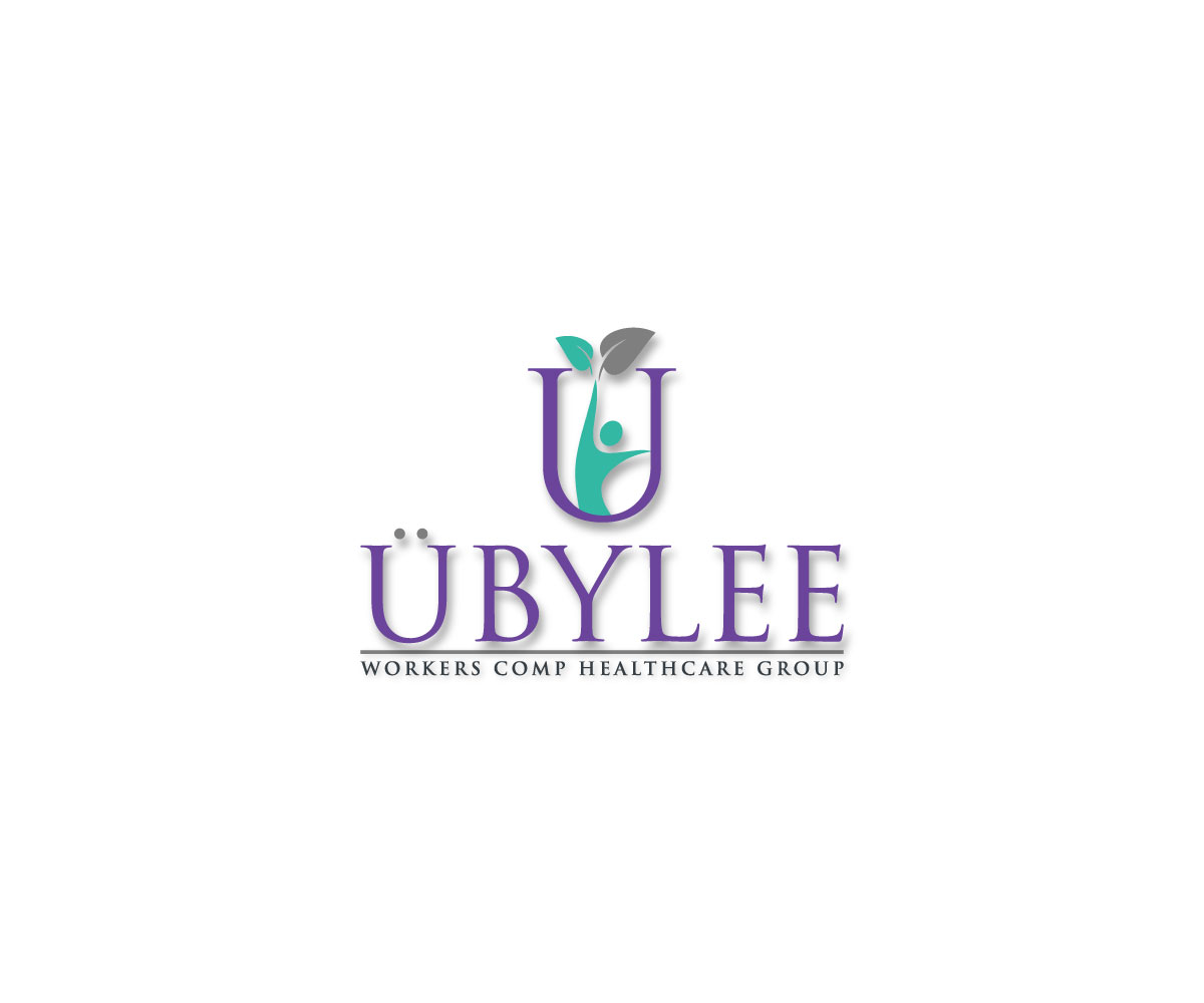
We launched this design challenge search to find an appropriate logo to represent an emerging upstart medical practice focusing on Workers Compensation and customized healthcare solutions for employees/employers. We would like to see logo designs incorporating the suggested design elements below:
1) We would like the color scheme of the logo mark to be in PURPLE, preferably something that emphasizes the "U" in Ubylee, also incorporating some experimentation with shading or shadowing in the logo mark to create some visual depth and dimension by possibly utilizing 2 complimentary colors (purple/violet being the primary color and teal/lighter green being the secondary color)
2) We would like to see the addition of an "umlaut" (the 2 phonetic dots over a vowel) placed over the "U" in Ubylee
3) We would like to see an underscore line beneath the "Ubylee" to delineate between our business title and our tagline identifier and provide more visual balance and separation between the two
4) We would like to change our identifier tagline from "The Workers Comp Company" to "Workers Comp Healthcare Group"
5) We would like a modernized font or typeface used
Thank you all for your submissions and design ideas, everyone at Ubylee will be eagerly awaiting the new designs incorporating the aforementioned graphic elements!
Mises à jour
Project Deadline Extended Reason: Hello,I am the VP of Operations for the Medical Provider who created this design challenge search to find an appropriate logo to represent our new medical practice brand. We have viewed all the current designs submitted and are currently in the process of narrowing down to our final favorites before choosing a design. We've seen some nice work thus far; however, we would like to see a few more logo designs incorporating the suggested design elements below:1) We would like the color scheme of the logo to be in purple, preferably something that emphasizes the "U" in Ubylee, also incorporating some experimentation with shading or shadowing in the logo mark to create some visual depth and dimension, we are also interested in seeing a few logos utilizing 2 different complimentary colors in the "U" of the actual logo mark (purple/violet being the primary color and possibly teal as a secondary color) 2) We would like to see the addition of an "umlaut" (the 2 phonetic dots over a vowel) placed over the "U" in Ubylee3) We would like to see an underscore line beneath the "Ubylee" to delineate between our business title and our tagline identifier and provide more visual balance and separation between the two 4) We would like to change our identifier tagline from "The Workers Comp Company" to "Workers Comp Healthcare Group"5) We would like a modernized font or typeface usedThank you all for your submissions and design ideas, everyone at Ubylee will be eagerly awaiting the new designs incorporating the aforementioned graphic elements!VP of OperationsUbylee Workers Comp Healthcare Group Added Friday, August 4, 2017
Project Deadline Extended Reason: Please extend project deadline so we can work more w designers. Added Thursday, August 10, 2017
Project Deadline Extended
Reason: Excellent options reviewing all.
Added Monday, August 14, 2017
Project Deadline Extended
Reason: Need to fine tune design selections
Added Wednesday, August 23, 2017
Marché(s) Cible(s)
Workers Compensation Insurance Carriers, Nurse Case Managers, Injured Workers, Employers, Industry Specific Business Clients, etc.
Secteur / Type d'entité
Health Care
Texte du logo
UBYLEE WORKERS COMP HEALTHCARE GROUP
Styles de logo qui vous intéressent
Logo abstrait
Conceptuel / symbolique (texte facultatif)
Logo de Lettermark
Acronyme ou logo texte (texte seulement)
Styles de police à utiliser
Couleurs
Couleurs choisies par le client et à utiliser dans le design de logo:
Aspect
Chaque curseur illustre les caractéristiques de la marque client et le style que doit transmettre votre design de logo.
Élégant
Audacieux
Léger
Sérieux
Traditionnel
Moderne
Sympathique
Professionnelle
Féminin
Masculin
Coloré
Conservateur
Économique
Haut de gamme
Exigences
Doit avoir
- 1) We would like the color scheme of the logo mark to be in PURPLE, emphasizing the "U" in Ubylee, also incorporating some experimentation with shading or shadowing in the logo mark to create some visual depth and dimension by possibly utilizing 2 complimentary colors (purple/violet being the primary color and teal/lighter green being the secondary color)
- 2) We would like to see the addition of an "umlaut" (the 2 phonetic dots over a vowel, rounded and not "square shaped" dots) placed over the "U" in Ubylee
- 3) We would like to see an underscore line beneath the "Ubylee" to delineate between our business title and our tagline identifier
- 4) We would like to change our identifier tagline from "The Workers Comp Company" to "Workers Comp Healthcare Group"
- 5) An interesting, modernized font style
Bien d'avoir
- Experimentation with shading or shadowing for dimension within the large "U" of the logo (keeping in mind this logo mark needs to translate well to grey-scale)
Ne doit pas comporter
- 1) Too many different fonts
- 2) Too many different colors (purple/violet is a MUST HAVE for the primary color with teal or a lighter shade of green as a secondary color to compliment the purple and add dimension)
- 3) Must not be too "busy" within the actual logo mark design, we like simple and streamlined