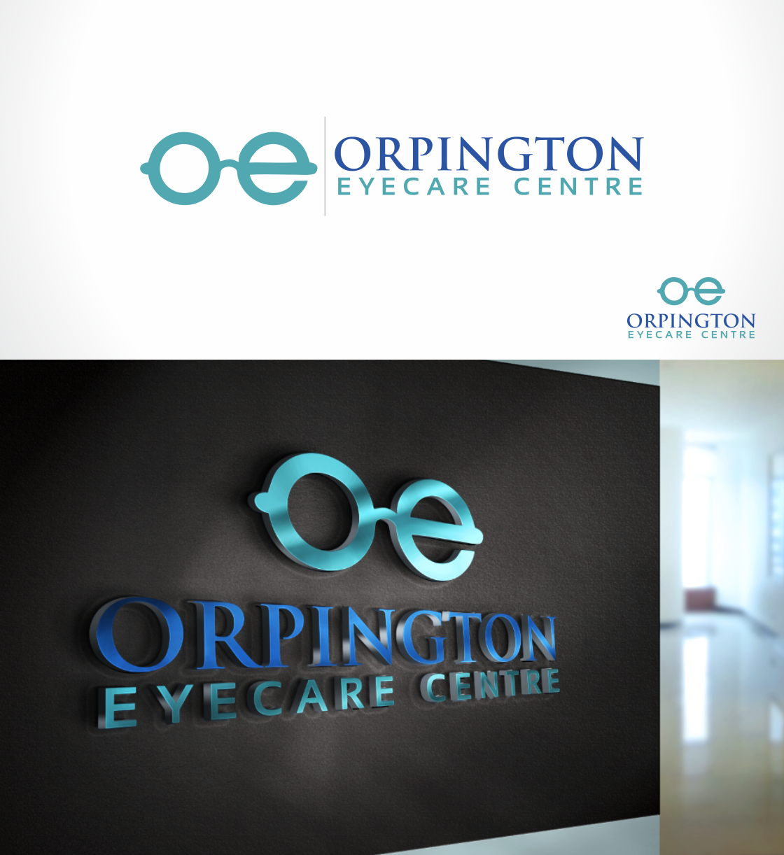
ORPINGTON EYECARE CENTRE'S BRAND LOGO
Vous souhaitez remporter un projet comme celui-ci ?
Ce client a reçu 124 designs de logo de la part de 45 designers. Il a choisi ce design de logo de Jake Owen comme design gagnant.
Inscrivez-vous Trouvez des Projets de Design-
 £110
£110
-
 124 designs
-
 45 designers
Brief de Design de Logo
LOGO NEEDS TO BE
1.PROFESSIONAL,
2.MODERN & FRESH,
3.WELCOMING TO CUSTOMERS,
4.REPRESENT THE BUSINESS INDUSTRY WE ARE IN
OPTICIANS WILL BE BASED IN THE HEART OF A BUSY HIGH STREET WITH MANY OTHER COMPETITORS, NEED TO HAVE THE WINNING EDGE.
There are many opticians on the high street, so we need to stand out but also many young professionals in the area so we want to come across stylish and modern but not loose the tradtional meaning of opticians.
need to appeal to all that want an eye test etc
Marché(s) Cible(s)
children all the way up to 80years old
Secteur / Type d'entité
Optician
Texte du logo
ORPINGTON EYECARE CENTRE
Styles de logo qui vous intéressent
Logo d'Enseigne
Logo contenu dans une forme
Logo pictural
Un objet réel (texte facultatif)
Logo abstrait
Conceptuel / symbolique (texte facultatif)
Logo mot symbole
Logo (texte seulement)
Logo de Lettermark
Acronyme ou logo texte (texte seulement)
Styles de police à utiliser
Couleurs
Le designer choisit les couleurs à utiliser dans le design.
Aspect
Chaque curseur illustre les caractéristiques de la marque client et le style que doit transmettre votre design de logo.
Élégant
Audacieux
Léger
Sérieux
Traditionnel
Moderne
Sympathique
Professionnelle
Féminin
Masculin
Coloré
Conservateur
Économique
Haut de gamme
Exigences
Doit avoir
- protrayed logo of an Opticias
- target audience should clearly be able to see from the logo that we are an opticians welcoming all ages
Bien d'avoir
- 1) needs to be bold and to the point
- 2) stand out to the ongoing public
Ne doit pas comporter
- silly images
- look childish