

 Rafraîchir
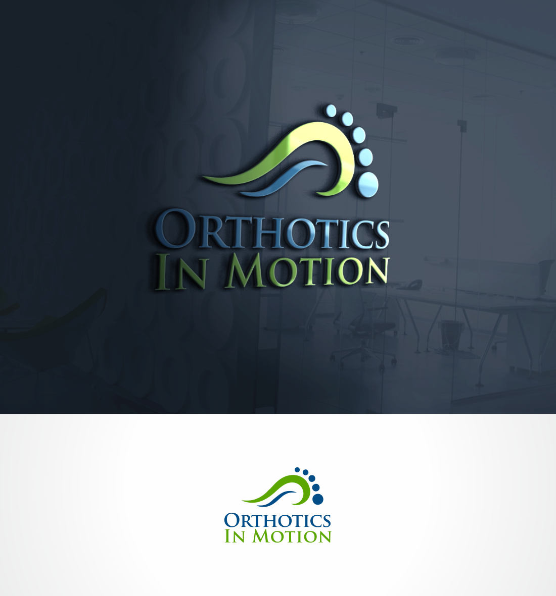
Updating the look of our medical sales company (foot orthotics).
Vous souhaitez remporter un projet comme celui-ci ?
Ce client a reçu 85 designs de logo de la part de 33 designers. Il a choisi ce design de logo de Paulazi comme design gagnant.
Inscrivez-vous Trouvez des Projets de Design
- Garanti
-
 C$150
-
 85 designs
-
 33 designers
Brief de Design de Logo
We would like to freshen up the look of the existing logo- I believe the current logo has some stengths, namely being very clear on what we do, and representing our company colors, which are white and blue, as this is the color of the materials used for our most popular product. I hope to find more of an artistic rendition of the foot matrix, and possibly the orthotic, rather than a "computer generated" logo. I am looking for a new age/sketch-type design, yet still professional. What sets us apart from our competitors is the service that goes along with the product, the time we spend educating our patients, and the quality product that we make in house. Help us rebrand our company, and create the basis for an eventual vehicle wrap, new business card design and even work clothing. Thank you!
Marché(s) Cible(s)
Medical professionals, 30-60 yr old active public
Secteur / Type d'entité
Medical
Texte du logo
"Orthotics In Motion" only. Logo on the left, or above, and then the company name on the right, with a fresh but professional font.
Styles de logo qui vous intéressent
Logo de figurine
Logo avec illustration ou personnage

Styles de police à utiliser

Couleurs
Couleurs choisies par le client et à utiliser dans le design de logo:
Aspect
Chaque curseur illustre les caractéristiques de la marque client et le style que doit transmettre votre design de logo.
Élégant
Audacieux
Léger
Sérieux
Traditionnel
Moderne
Sympathique
Professionnelle
Féminin
Masculin
Coloré
Conservateur
Économique
Haut de gamme
Exigences
Doit avoir
- A clear message as to what we do. I don't want just a happy elderly couple walking in a park smiling, like most other wellness/physiotherapy/footwear companies. Company colors are a result of our most popular product-picture attached- therefore white and "reflex" blue. I will incorporate examples of my favorite logos found online, and the "Taste of Ink The Inspired Network Financial Group" example as a matrix example I like. The "Equilust" horse adaptation is also a favorite.
Bien d'avoir
- Many strengths to our current logo: the matrix of the foot indicates the complexity of the foot, and how we view the foot as part of the solution. The orthotic supporting the foot is good. This logo will be the basis for a vehicle wrap, a wall display in our reception area, our website and business card redesign, and new workplace clothing- it would be nice to have a 2nd version of the logo in inverted colors, or hollow vs solid design, for various uses. (Examples attached)
Ne doit pas comporter
- I do not want a hand supporting the foot-used too often, outdated.


