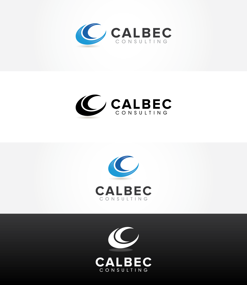
New consultancy launch needing first rate logo / identity

Vous souhaitez remporter un projet comme celui-ci ?
Ce client a reçu 64 designs de logo de la part de 15 designers. Il a choisi ce design de logo de Nazmul comme design gagnant.
Inscrivez-vous Trouvez des Projets de Design- Garanti
Brief de Design de Logo
We need a logo design to pave the way for a new corporate identity. Our new company is called Calbec Consulting and is a UK-based finance / commercial consultancy for businesses that lack 'in house' skills in relation to finance, fund raising, business planning, strategy or general management.
Our target market is smaller corporate businesses (possibly family owned) that are looking to take the 'next step' and need guidance to do so - eg, acquiring a company, raising external borrowing, reorganise activity in order to take on 'bigger things'. We want to give the impression of being professional, experienced, resourced (punching above our weight....we are only small at the moment), modern, clear/unfussy, friendly.
If the design could incorporate some kind of identifier/symbol/graphic that could be used across the corporate identity (ie, Nike swoosh, McDonald arch kind of thing) as well as the company name that would be great. We'd like the focus of the name to be 'Calbec' with the 'Consulting' part less prominent as our brand identity will be referenced in this way.
We want the design to stand out on a white background as it will feature on lots of white documents.
Mises à jour
Thanks for all submissions to date. We have had a good number of submissions. The designs that are favoured by the team are the simpler, 'cleaner', professional ones. The team have not been keen on too many colours, overly complex symbols or overly prominent use of the word 'consulting'. None of the designs to date have managed to combine both the modern, simple designs that we like with a reference to the Battle of Hastings origin, although we accept this is difficult and, as outlined in the brief, not essential.
Added Tuesday, October 29, 2013
Many thanks for all the amazing designs that have been sent to us. We had 60+ different designs and it was extremely hard to cut this down to a final two preferred designs. We will be finalising our choice between the two tomorrow. Please do not submit any further designs as we are closing this down now.
All the best and thanks, Calbec
Added Wednesday, November 06, 2013
Texte du logo
Calbec Consulting
Aspect
Chaque curseur illustre les caractéristiques de la marque client et le style que doit transmettre votre design de logo.
Élégant
Audacieux
Léger
Sérieux
Traditionnel
Moderne
Sympathique
Professionnelle
Féminin
Masculin
Coloré
Conservateur
Économique
Haut de gamme
Exigences
Doit avoir
- Use a font that is generally available - eg, in Word - rather than unusual
Bien d'avoir
- The Calbec name is based on The Battle of Hastings in 1066. Calbec Hill is believed by some to be the actual location of the famous battle. Some reference in the design to this link may be interesting but isn't essential