Simply English Language Academy
Vous souhaitez remporter un projet comme celui-ci ?
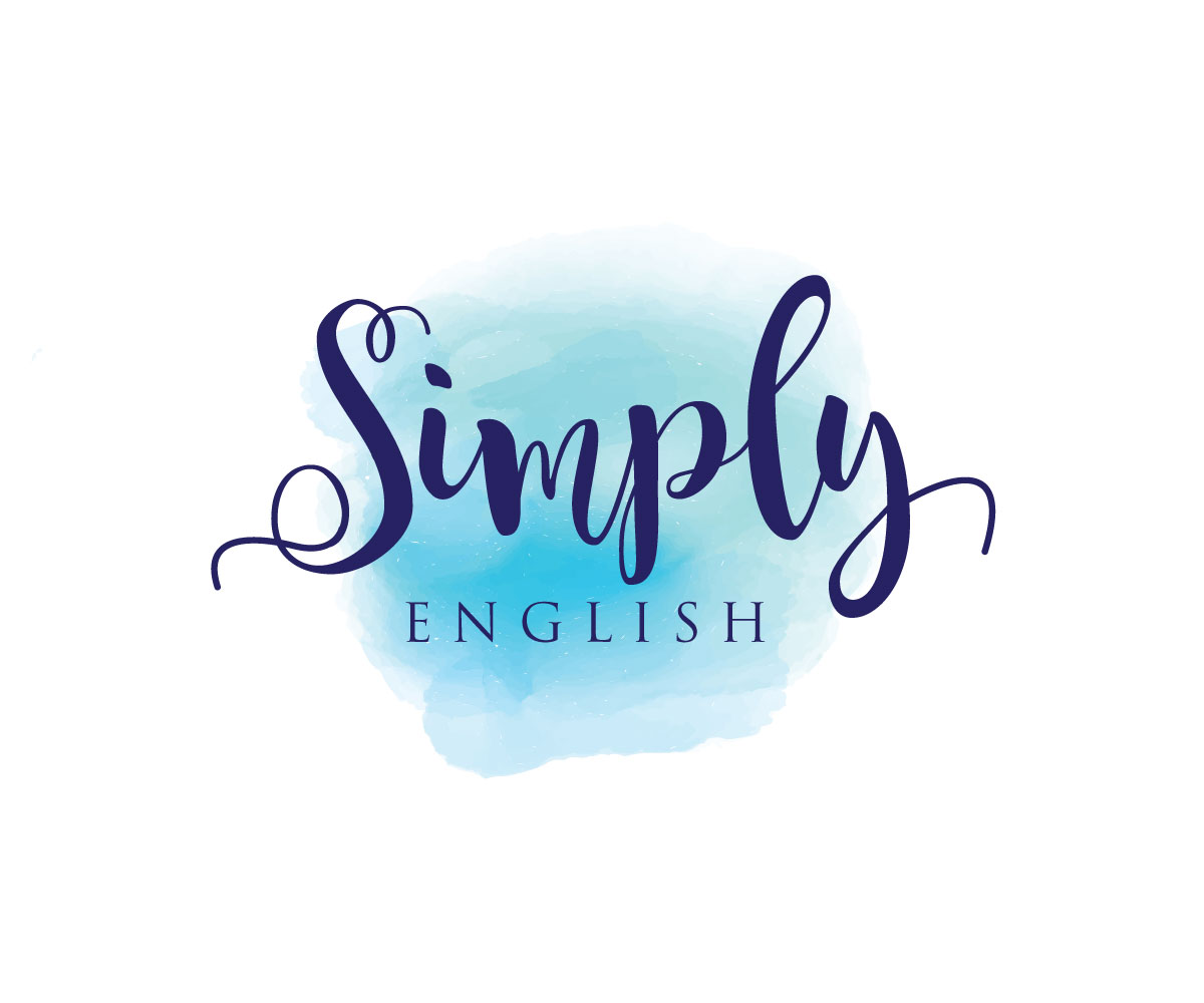
Ce client a reçu 62 designs de logo de la part de 22 designers. Il a choisi ce design de logo de logoguider comme design gagnant.
Inscrivez-vous Trouvez des Projets de Design- Projet Lié 2
-
 €110
€110
-
 62 designs
-
 22 designers
Brief de Design de Logo
We are two language teachers in the south of Spain who are opening up our first language academy in the upcoming school year. We've been teaching in our house for a while and we currently have a logo that is just a cloud with Simply English in it, but it's obviously done on MS paint... Moving forward, we want a logo that reflects having a professional business and inspires confidence in us as a high quality service.
We don't have any specific target audience as we teach children up to adults, so we want our logo to be modern but still playful, not intimidating. As people we're really fun, light hearted, and our main goal is to make people enjoy coming to class, so if it could toe that line between professional and fun, that'd be amazing. Our current logo is blue, but we're open to any colour scheme you as an artist think might catch people's eye (except orange). Our logo is 'Fun. Effective. Simple.', but it doesn't necessarily need to be on our logo, though we would love it to be on our stationary/business cards.
For a better idea about us, you can see our website at www.simplyenglishutrera.com. The website itself is very cookie-cutter, but we want to start to shape it into our identity (as we get one), so don't take this as a rule but more of an inspiration. One thing we would caution away from is putting British/American flags. Every other academy in the area does that and it looks very cheesy in my personal opinion. (Also, no comic sans..)
We have included images of our current logo (which we don't like too much), our facebook background and current ad (to get an idea of where we were at before, these were made on my ipad because we needed an ad and so, I tried! These aren't necessarily the direction we think we HAVE to be in)
Marché(s) Cible(s)
Students -- both children and adults
Secteur / Type d'entité
Education
Coordonnées pour la Carte de Visite
Just standard size, with room for our name, logo, wesbsite, an email for info, the phone number (possibly 2 of them), and address (2 lines)
Texte du logo
Simply English
Styles de logo qui vous intéressent
Logo d'Enseigne
Logo contenu dans une forme
Logo pictural
Un objet réel (texte facultatif)
Logo abstrait
Conceptuel / symbolique (texte facultatif)
Logo mot symbole
Logo (texte seulement)
Styles de police à utiliser
Couleurs
Le designer choisit les couleurs à utiliser dans le design.
Aspect
Chaque curseur illustre les caractéristiques de la marque client et le style que doit transmettre votre design de logo.
Élégant
Audacieux
Léger
Sérieux
Traditionnel
Moderne
Sympathique
Professionnelle
Féminin
Masculin
Coloré
Conservateur
Économique
Haut de gamme
Exigences
Bien d'avoir
- We like the idea of watercolour splashes as it seems playful and is quite trendy, but we don't know how it would fit in, we also like the geometric shape trend.
Ne doit pas comporter
- Tons of flags/comic sans
Fichiers
Télécharger tous les fichiers - 6,7 MB
Paiements
Total
€110
Date limite du projet
02 juil. 2017 19:56:06 UTCOptions du projet
Projet(s) Lié(s)
- offrant un design de papeterie de €35 au gagnant
- offrant un design de carte de visite de €29 au gagnant