

 Rafraîchir
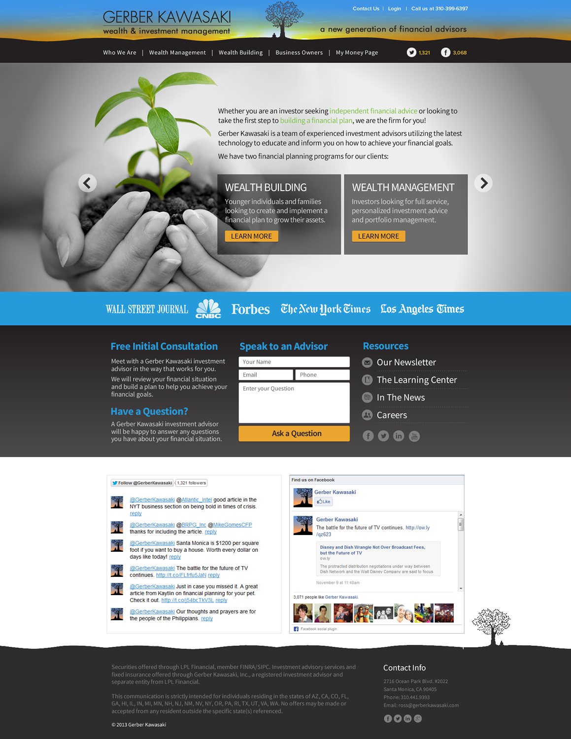
Full Screen Design for Santa Monica Financial Advisor
Vous souhaitez remporter un projet comme celui-ci ?
Ce client a reçu 42 web designs de la part de 5 designers. Il a choisi ce web design de TechWise comme design gagnant.
Inscrivez-vous Trouvez des Projets de Design
- Garanti
-
 US$650
-
 42 designs
-
 5 designers
Brief de Web Design
Our site is at http://gerberkawasaki.com. It's a responsive site using the skeleton framework - http://www.getskeleton.com/. So any designs need to kept as simple as possible and work with a 960px grid at large screen sizes. In general we are looking for a full site design with full screen background images for the home page, a full screen width header, and for other pages to appear full width by keeping the background color the same.
Logo - We need four pages done and the header logo reworked to fill the full screen. The logo needs to retain the text and the tree, buddha, and sunrise but needs to fill 100% width, be shorter, and look better and less dark but fit with the site color scheme.
Page 1 - For the home page we currently have slides and would like to stick with something like that, but the images should fill all of the screen width and height, and should have interesting looking navigation that also provides a clue about the slide.
Page 2 - We also need a contact us page based on the /contact-us page. The design for the form should also include feedback a successful form submit and for errors like 'email is required'. Simple and elegant with a few well placed images is ideal. Something like https://www.personalcapital.com/contact-us.
Page 3 - And an informational page. You can use the /wealth-building page as a starting point and for copy. We just want something a little more visually compelling here.
Page 4 - https://gerberkawasaki.com/my-money-page/get-started. This is the landing page for the app and gives some idea of what we're looking for with the full screen design. This page just needs a designer's touch.

Mises à jour
Project Deadline Extended
Reason: The project was upgraded to guaranteed payment
Added Monday, November 11, 2013
We've put up a page at http://gerberkawasaki.com/fullscreen that is basically want we would like but better designed. The copy on the page needs to stay the same. Presentation on the slide should be improved. The header is just hacked together so it's not quite lined up and doesn't extend all the way across the screen smoothly but is the basic idea. There should be a psd with the header attached. Let us know if that's not the case.
The in the news section has the actual media companies we want. Feel free to that image or any other from the page.
The speak to an advisor row needs to remain on the same row and just needs to look better.
The twitter and facebook row doesn't need much since it's a facebook widget. The layout for the tweets could be better if you want to tackle that.
The disclaimer row at the bottom doesn't need much but as with any of the full screen rows feel free to change backgrounds, typography, colors, etc.
Added Tuesday, November 12, 2013
Project Deadline Extended
Reason: Still finalizing
Added Thursday, November 21, 2013
Secteur / Type d'entité
Financial
Aspect
Chaque curseur illustre les caractéristiques de la marque client et le style que doit transmettre votre design de logo.
Élégant
Audacieux
Léger
Sérieux
Traditionnel
Moderne
Sympathique
Professionnelle
Féminin
Masculin
Coloré
Conservateur
Économique
Haut de gamme
Exigences
Doit avoir
- - layered PSD
- full screen look with any content in a 960px wide grid
- any columns should follow the skeleton css grid layout (http://www.getskeleton.com/)
- the design needs only to be for the desktop version but should be kept simple enough to work responsively down to mobile where columns are smaller and stacked on top of one another
- any fonts used
Bien d'avoir
- Unless it's just impossible the slides on the home screen should be the same images that the site is currently using with the bodhi leaf, couple on the bench, etc. They should just be expanded to fit the width of the screen.