A Logo that Springs! International sports and medical device company.
Vous souhaitez remporter un projet comme celui-ci ?
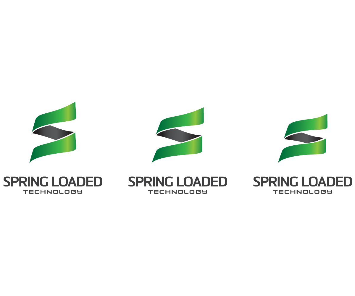
Ce client a reçu 489 designs de logo de la part de 76 designers. Il a choisi ce design de logo de Anthony comme design gagnant.
Inscrivez-vous Trouvez des Projets de Design- Garanti
-
 US$620
-
 489 designs
-
 76 designers
Brief de Design de Logo
At Spring Loaded, we are developing new knee bracing technology that can effectively enhance the strength and power of the leg muscles, for the first time.
Our main knee brace product works by storing energy in a spring-loaded hinge when the user flexes their knee (e.g. into a leg-squat position). This energy is released (in an entirely customizable way), upon extension of the knee, thereby assisting the movement to make it stronger, more powerful, or more explosive.
The possibilities are huge. Our product will allow athletes to do things that previously weren’t possible – for example, executing awesome new tricks in freestyle skiing, jumping higher in basketball, and exploding faster out of the corners in a hockey rink. Paratroopers will be able to fly in faster, land harder, yet completely comfortably with our knee brace absorbing the impact. Manual labourers will be able to lift heavier objects than ever, while their legs remain strong and ready to keep working. Individuals with a movement disability will be able to get out of their chairs to play with their grandchildren, hit the golf course, or dance with their partners.
Check us out here: www.springloadedtech.com
In this project, we want a master logo to simultaneously communicate strength, stability, and energy. We want the logo to entice people enough that they have a sense for why we're unique, and want to know more. We want customers to be proud to display our logo on a t-shirt, the hinge of their knee brace, or a patch on their gym bag. Of course, we'll also be using it on our website, etc.
We're looking for sturdiness, strength, and performance to be communicated in a modern upscale logo. Anything with a spring should have a solid, strong looking spring. Can anything be done as a letter mark/image with the the S? the SL or the SLT? Can a spring be incorporated into the letters in a nice balanced way? Alternatively, designs that portray enhanced mobility will be considered, but nothing sport-specific should be portrayed.
Nothing using heavy shading to create any 3D effects please. THIS IS KEY: All designs should be "rubber-stampable" - to look good if it was stamped, engraved, printed, etc. Balance is key as well.
Mises à jour
A winner to be picked Wednesday.
Added Monday, November 04, 2013
Simplicity and Strength are key!
Added Monday, November 04, 2013
Project Deadline Extended
Added Monday, November 04, 2013
Project Deadline Extended
Reason: We have added a second and third place spot, each with prizes of $100. We'd like some more submissions, and some revisions to the existing submissions.
The winners will all be simple designs that can be "rubber-stamped".
Blue and Grey are preferred colour schemes.
Red also works if you prefer.
Added Thursday, November 21, 2013
Project Deadline Extended
Added Friday, November 22, 2013
Added Friday, November 22, 2013
All designs should have a simple, (though unique/not generic) balanced icon of some sort. The icon should be able to stand alone. We don't want just a straight letter mark.
Added Monday, November 25, 2013
Secteur / Type d'entité
Medical
Texte du logo
Either: "Spring Loaded Technology" or simply, "Spring Loaded"
Styles de logo qui vous intéressent
Logo d'Enseigne
Logo contenu dans une forme
Logo pictural
Un objet réel (texte facultatif)
Logo de Lettermark
Acronyme ou logo texte (texte seulement)
Styles de police à utiliser
Aspect
Chaque curseur illustre les caractéristiques de la marque client et le style que doit transmettre votre design de logo.
Élégant
Audacieux
Léger
Sérieux
Traditionnel
Moderne
Sympathique
Professionnelle
Féminin
Masculin
Coloré
Conservateur
Économique
Haut de gamme
Exigences
Doit avoir
- We're looking for sturdiness, strength, and performance to be communicated in a modern logo. Anything with a spring should have a solid, strong looking spring. Can anything be done as a letter mark/image with the the S? the SL or the SLT? Can a spring be incorporated into the letters in a nice balanced way? Alternatively, designs that portray enhanced mobility will be considered, but nothing sport-specific should be portrayed.
Bien d'avoir
- NOTE: AFTER this project, which is only focused on our master logo, we are interested in working with the best candidates to develop additional logos that are specific to certain markets/applications, including skiing/snowboarding, hockey, para-trooping, and mobility assistance. We are also interested in re-designing the website. If we like your work, we may hire you back specifically for those jobs (if you're interested).