Spinal Cord Injury Support and Care Logo
Vous souhaitez remporter un projet comme celui-ci ?
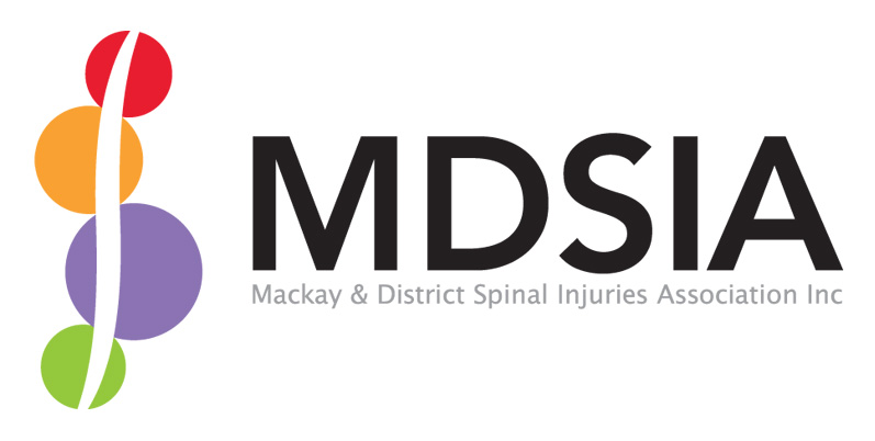
Ce client a reçu 91 designs de logo de la part de 28 designers. Il a choisi ce design de logo de Innerworld Designs ltd. comme design gagnant.
Inscrivez-vous Trouvez des Projets de Design- Garanti
-
 A$400
A$400
-
 91 designs
-
 28 designers
Brief de Design de Logo
We need a completely new logo for our organisation, we do currently have a logo but we are looking for something different that is eye catching as most organisation do.
I have provided details below about our association
MDSIA (Mackay & District Spinal Cord Injuries Association), is a non-profit organisation who specialize in helping those with SCI (spinal cord injuries), and other physical disabilities. We provide; care to people living in the community, offer respite support, transitional accommodation to help people rehabilitate and adapt after a injury, provide SCI awareness and information. Our main goal is just to help people so they live and do what they want. This may be help to go back to work, study, continue with rehab, sports, events, paperwork and generally improving their independences. We do have a website at www.mdsia.org.au but it is very outdated and a new one is currently being made, plus a facebook page at https://www.facebook.com/mdsia.paravilla
We are Mackay based but our services are accessed state-wide (Queensland)
SCI occurs mostly in young men (motorcycles, sports, driving, swimming etc) so take in account that most of our new clients are men aged 18-35
UPDATE:
Thankyou for all your designs submitted so far. I just wanted to provide so general feedback of things we have realised and certain issues we have seen while looking over some of the logo's that might help you.
1) "MDSIA" must be legible in the logo. Our name is long so sometimes we will be using the acronym logo without the unabbreviated name next to it so it is important people can read the letters. One exception is the "S", like our current logo and a few we have received so far replacing it by using a spine and/ or a spinal cord to represent it is fine.
2) If you choose to use a image outside of MDSIA most of the logo's look better when the image colour blends or compliments the text. Having plain black text with a one tone bright blue image doesn't look good to us.
3) if do include a image in the logo it is better if it represents us. We have seen a lot of logo's that look great but the image looks like it represents a preschool or we scratch our heads trying to work out what it stands for or how it relates to us.
4)It’s fine you are putting spines and/ or spinal cords in some of the logo’s but please don’t make the logo look like it should be for a chiropractor, doctor or physio centre. Most of our new clients go into hospital for up to 12 months before they see us so the last thing we want them to see is us as medical organisation. We are a non-profit organisation (non-government) who let our clients live their life as they see fit and support their decisions to do so.
Mises à jour
- "MDSIA" must be legible in the logo. Our name is long so sometimes we will be just using the acronym logo without the unabbreviated name next to it so it is important people can read the letters. One exception is the "S", like our current logo and a few we have received so far replacing it with a spine and/ or a spinal cord to represent it is fine.
- If you choose to use a image outside of MDSIA most of the logo's look better when the image colour blends or compliments the text. Having plain black text with a one tone bright blue image doesn't look good to us.
- If you include a image to the logo it is better if it represents us. We have seen a lot of logo's that look great but the image looks like it represents a preschool or we scratch our heads trying to work out what it stands for or how it relates to us.
Added Tuesday, November 05, 2013
Brief Update
4) It’s fine you are putting spines and/ or spinal cords insome of the logo’s but please don’t make the logo look like it should be for achiropractor, doctor or physio centre. Most of our new clients go into hospitalfor up to 12 months before they see us so the last thing we want them to see isus as medical organisation. We are a non-profit organisation (non-government)who let our clients live their life as they see fit and support their decisionsto do so.
Mistake Note: In the beginning of the brief I left out “Association”when I unabbreviated MDSIA. You do not have to update any current designs youhave submitted and it won’t affect the decision making process when picking awinner. However if your design is chosen you may have to add it to you designif you used our unabbreviated name in your logo.
Added Wednesday, November 06, 2013
Marché(s) Cible(s)
SCI mostly occurs in young men (motorcycles, sports, driving, swimming etc) so take in account that most of our new clients are men aged 18-25 but SCI can happen to anyone at any age
Secteur / Type d'entité
Accommodation
Texte du logo
MDSIA
Styles de logo qui vous intéressent
Logo d'Enseigne
Logo contenu dans une forme
Logo pictural
Un objet réel (texte facultatif)
Aspect
Chaque curseur illustre les caractéristiques de la marque client et le style que doit transmettre votre design de logo.